
Thank you! Your submission has been received!
Oops! Something went wrong while submitting the form.
Get SaaSFrame Pro
Monthly
$18
Quarterly
$48
Yearly
$180
Upgrade to access this feature
Browse all screens & flows
Filter and search screens & flows
Access Figma files
Access mobile versions
Bookmark screens & flows
Join now
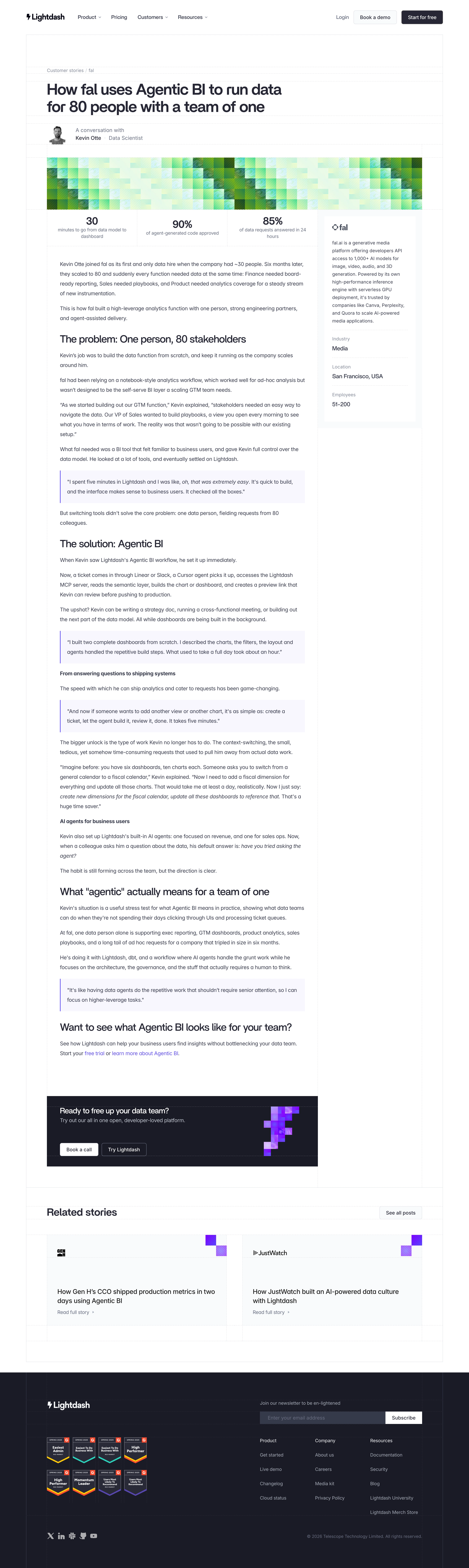
Lightdash Customer Stories

Lightdash
The open-source AI native BI platform
Designed by


Bookmark
Bookmark

Design with AI
Thank you! Your submission has been received!
Oops! Something went wrong while submitting the form.
# Design from Reference: Lightdash Customer Stories
Create an original, high-fidelity visual design inspired by the reference. Prioritize composition, typography, colors, spacing, and component styling over technical implementation.
## Reference
- **Product:** Lightdash
- **Category:** Customer Stories
- **Screenshot:** https://cdn.prod.website-files.com/5e9dc792e1210c5325f7ebbc/6acad337d5603a17eba5b5d4_6acad0c1b3daa04f542638ba_cms-32a92b47dc4ef3955290d3d1.webp
Analyze the screenshot first. If inaccessible, request it rather than guessing.
## Content
{{content.instructions}}
{{content.data}}
Preserve essential messaging and factual accuracy. Adapt structure and copy length for visual balance; never invent product claims.
## Visual Design
### Overall aesthetic
- **Character:** An editorial customer story uses dark navy sans-serif type, a visible fine construction-grid motif, green pixel artwork and purple quotation accents on white.
- **Evidence:** The original measures 2880 × 9622 pixels. All four readable portions were inspected; CSS sizes assume an unverified 2× capture density.
### Page composition
- **Header:** Brand and dropdown navigation align left, with login, demo and dark free-start actions at right.
- **Article opening:** A breadcrumb precedes a large two-line headline, interviewee portrait/byline and broad green pixel-pattern banner.
- **Body grid:** Three headline metrics span the article column above long-form copy. A narrow right company card contains logo, description and industry/location/employee metadata.
- **Article content:** Section headings, paragraphs, bold subheads and four pale quotation blocks form the main narrative, ending in inline conversion links and a dark call-to-action panel.
- **Closing regions:** Two related-story cards precede a dark footer containing brand, award badges, newsletter form, three link columns, social icons and copyright.
### Information hierarchy
- **Headline:** The large article title establishes the customer and outcome; the byline adds a human source.
- **Results:** Three bold metrics create a quick scan before the detailed story.
- **Narrative:** Large section headings divide problem, solution and implications; short bold subheads subdivide longer sections.
- **Quotes:** Pale lavender fills and thin purple left rules distinguish customer voice from surrounding paragraphs.
- **Actions:** Inline trial links, the dark article CTA and related-story links provide distinct next steps.
### Typography
- **Headline:** Approximately 46–48 pixels semibold with around 52-pixel leading and tight tracking.
- **Section headings:** Roughly 30–32 pixels medium-to-semibold; article subheads are about 16 pixels bold.
- **Body:** Approximately 16 pixels with 29–30-pixel leading, creating long readable paragraphs.
- **Metrics:** Values are around 32 pixels bold, with smaller centered labels below.
- **Identity:** A modern geometric sans-serif is visible; exact family is unverified. Footer and sidebar metadata use smaller muted type.
### Colors & surfaces
- **Measured palette:** ICC-to-sRGB sampling identifies #FFFFFF as the canvas, #1A1B25 as the dark CTA/footer, #F9FAFB as pale card surfaces and #F8F7FF as quotation fills.
- **Measured supporting darks:** #36394A and #272835 appear in dark text/surface areas.
- **Artwork:** Green/mint pixel blocks form the main banner; vivid purple pixel motifs decorate related cards and the dark CTA.
- **Grid treatment:** Fine pale solid/dashed rules trace content boundaries, metric columns and section edges without heavy shadows.
### Components
- **Article frame:** A centered roughly 1280-pixel-wide bordered region contains an approximately 830-pixel article column and 320-pixel company rail.
- **Byline:** A small grayscale headshot sits beside two short text lines, separated from adjacent regions by grid rules.
- **Company card:** A pale outer panel holds a white inset description/metadata card with dashed internal separators.
- **Quote blocks:** Full-column pale rectangles use about 20-pixel padding and a thin purple left border; inline italic emphasis appears within some quotes.
- **Article CTA:** A dark horizontal panel pairs heading/supporting sentence and two buttons with a purple pixel illustration at right.
- **Related cards:** Two wide pale panels contain customer logos, large titles, small read links and corner pixel decoration.
- **Footer:** Newsletter input and white Subscribe action align above three link groups; eight compact award badges sit in a two-row cluster at left.
### Visual rhythm
- **Grid alignment:** Headline, byline, artwork, metrics, article and related stories follow shared structural edges.
- **Reading cadence:** Paragraphs have generous leading and roughly 20–24-pixel separation; headings introduce larger pauses.
- **Asymmetry:** The company rail occupies only the upper story while the lower article continues beside blank space.
- **Section contrast:** White editorial content transitions to a dark CTA, back to pale related cards, then a dark full-width footer.
### Responsive
- **Observed scope:** One desktop article layout is visible; dropdowns, newsletter feedback and mobile states are not shown.
- **Recommended layout:** Stack the company profile below the opening summary, reduce headline size and make metrics wrap or stack.
- **Recommended reading:** Keep body line length constrained, retain quote padding and stack CTA/related cards on narrow screens.
- **Recommended footer:** Stack newsletter and link groups while preserving readable badges and social labels.
### Adaptation guidance
- **Case-study pattern:** Lead with customer/outcome, expose quantitative proof and source, then develop a structured narrative with quotations.
- **Visual system:** Reuse fine grid lines, restrained dark typography and pixel artwork as a distinctive editorial motif.
- **Content accuracy:** Use verified metrics and customer quotations; do not derive product behavior from the article's narrative alone.
- **Implementation:** Confirm fonts/density, provide artwork alternatives where meaningful and define accessible newsletter/navigation/focus states.
Use this context to reproduce the reference's visual language: layout, typography, colors, spacing, borders, radii, and distinctive elements. The screenshot takes priority if descriptions conflict.
## Direction
{{preferences.fidelityInstructions}}
## Output
{{output.instructions}}
Deliver a polished, cohesive design with precise alignment, hierarchy, and spacing. Produce the requested visual artifact, not just a description. If unsupported, explain the limitation.


Category
Patterns
No items found.
Tech Stack

Added on
July 15, 2026
Similar screens




Upgrade to SaaSFrame Pro now to see similar examples.
Monthly
$18 /month
Billed $18 monthly
Browse all screens & flows
Filter and search screens & flows
Search text in screenshots
Access Figma files
Access mobile versions
Join now
Quarterly
$16 /month
Billed $48 quarterly
Browse all screens & flows
Filter and search screens & flows
Search text in screenshots
Access Figma files
Access mobile versions
Join now
Yearly
$15 /month
Billed $180 yearly
Browse all screens & flows
Filter and search screens & flows
Search text in screenshots
Access Figma files
Access mobile versions
Join now