Overall Style and Aesthetic
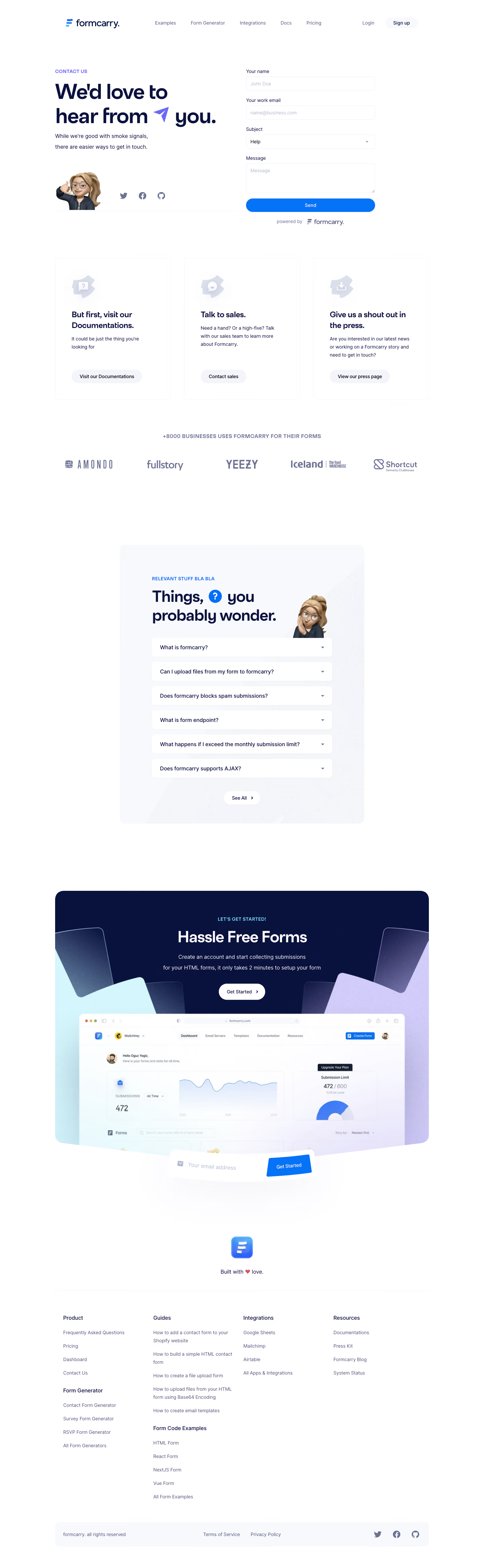
Formcarry’s contact page embodies a distinctly minimalist and modern vibe, with crisp edges, abundant whitespace, and a clutter-free interface. The overall aesthetic feels highly professional but approachable, targeting startups and teams that value efficiency and clarity in their SaaS tools. Layout and Structure
The page features a straightforward, one-column layout centered on a clean contact form. Above the fold, a concise intro headline welcomes visitors, setting a clear purpose. There’s little distraction—no testimonials, pricing, or feature overload—directing all attention to user action. A simple top navigation maintains sitewide consistency, while a slim footer reinforces brand continuity. Visual Elements
The design leverages subtle line icons and soft, illustrative accents rather than photos or heavy graphics. Rounded input fields and gentle shadows provide visual depth, while the brandmark sits above the form, echoing the logo’s simplicity. Color Palette and Typography
A cool, clean palette—primarily off-whites, soft greys, and a signature azure blue—brings focus to key elements. Bold typography (likely using geometric sans-serif fonts such as Inter or Nunito) creates a clear visual hierarchy, with a prominent headline, legible form labels, and understated button text. User Experience Patterns
Navigation remains easily accessible at the top, with a clear “Back to Home” or logo link for seamless site traversal. The primary CTA—“Send Message”—is emphasized with strong color contrast. The form itself is short and intuitive, reducing user friction. Real-time input highlights and subtle hover states provide reassuring feedback during interactions. Unique or Notable Design Choices
Formcarry’s avoidance of noise—no extra sections, promotional clutter, or distracting visuals—makes the contact experience lightning-fast and focused. The single-minded structure, coupled with brand-cohesive illustration and precise visual language, exudes reliability and innovation without unnecessary flourish.