Overall Style and Aesthetic
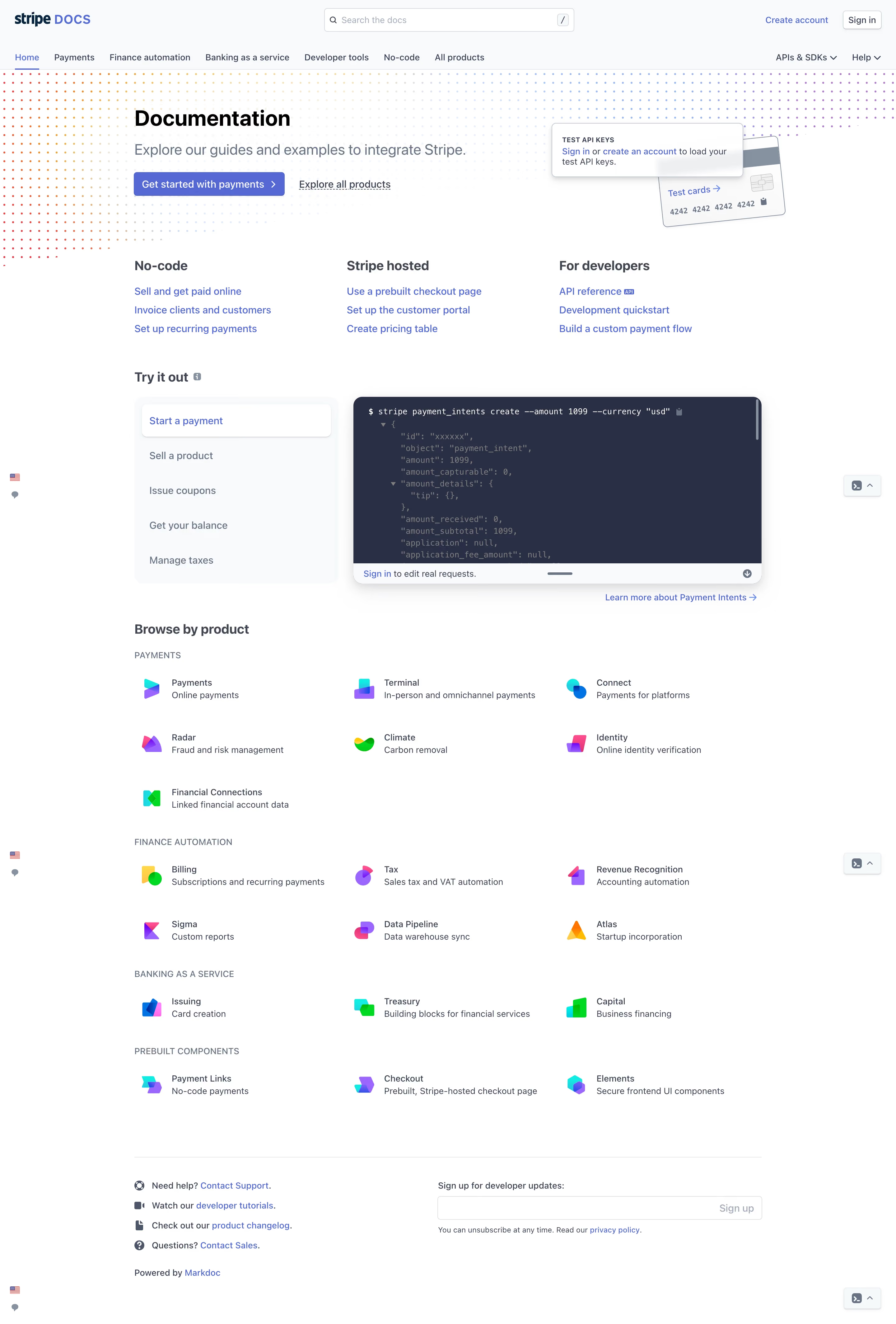
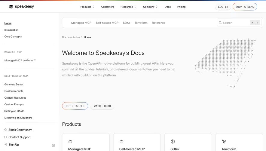
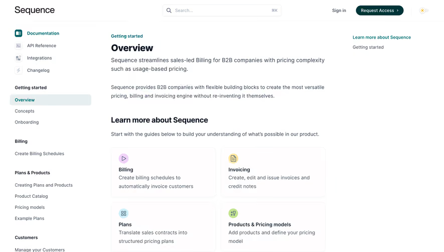
Stripe’s Docs page epitomizes modern minimalism, balancing white space and thoughtfully placed color accents to evoke professionalism and focus. The interface feels sophisticated yet approachable, with a design that conveys reliability and technical excellence without feeling cold or clinical. Layout and Structure
The page utilizes a generous hero section, swiftly orienting users with a concise headline, subtext, and prominent search bar. Below, content is meticulously organized into expandable navigation menus and resource tiles, fostering effortless exploration. Rather than overwhelming visitors, information is revealed progressively, supporting both newcomers and seasoned developers. Visual Elements
Crisp SVG iconography and subtle micro-animations animate interaction: menus slide, icons subtly shift, and code snippets highlight, guiding the eye without distraction. The absence of busy illustrations or photography heightens clarity, reinforcing the page’s utility-first purpose while still offering visual depth. Color Palette and Typography
A core palette of deep navy, soft grays, and accents of indigo and blue create a sleek, technical vibe that feels cutting-edge. Typography leans on Stripe’s branded sans-serif, combining clear headers and easy-reading body text. Hierarchy is strong: headings are bold and confident, links and CTAs stand apart in strong color blocks. User Experience Patterns
Navigation is streamlined—with a sticky side menu, breadcrumb trails, and instant search—ensuring users can always find their place. Call-to-action and feedback elements are understated but ever-present, fostering continuous exploration. Pages load swiftly with smooth, non-intrusive transitions. Unique or Notable Design Choices
What stands out is the page’s laser-focus on utility balanced with brand character—placing practical elements (like code samples and persistent navigation) front and center while maintaining Stripe’s unmistakable visual DNA. The tone throughout is confident, calming, and quietly innovative, making it an ideal reference point for SaaS product teams aiming for clarity and trust.