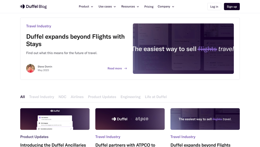
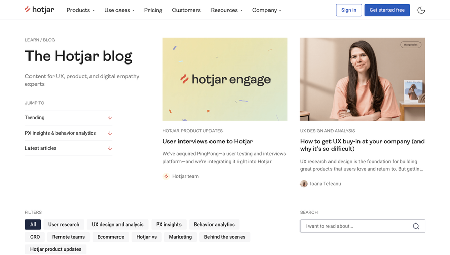
Generate a new design based on this screen using your own content.
Thank you! Your submission has been received!
Oops! Something went wrong while submitting the form.
# Design from Reference: Decipad Blog Feed
Create an original, high-fidelity visual design inspired by the reference. Prioritize composition, typography, colors, spacing, and component styling over technical implementation.
## Reference
- **Product:** Decipad
- **Category:** Blog Feed
- **Screenshot:** https://cdn.prod.website-files.com/5e9dc792e1210c5325f7ebbc/6436f9af230e3575ef11a965_tuYuc7iWcGK9wfVmr3DWdAEd7HMbP2WK2YJ0eFPXZsA.webp
Analyze the screenshot first. If inaccessible, request it rather than guessing.
## Content
{{content.instructions}}
{{content.data}}
Preserve essential messaging and factual accuracy. Adapt structure and copy length for visual balance; never invent product claims.
## Visual Design
Use this context to reproduce the reference's visual language: layout, typography, colors, spacing, borders, radii, and distinctive elements. The screenshot takes priority if descriptions conflict.
## Direction
{{preferences.fidelityInstructions}}
## Output
{{output.instructions}}
Deliver a polished, cohesive design with precise alignment, hierarchy, and spacing. Produce the requested visual artifact, not just a description. If unsupported, explain the limitation.
Decipad’s blog page embraces a modern, minimalist aesthetic with abundant white space that gives content room to breathe. The overall vibe is polished and professional, yet feels welcoming—an excellent balance for SaaS brands wishing to convey both authority and approachability.
Layout and Structure
Content is organized intuitively: a clean hero section introduces the blog with a sharp headline and succinct subtext, immediately establishing context. Blog cards are carefully aligned in a responsive grid, drawing attention to fresh articles without clutter. There’s a fixed top navigation bar for smooth site-wide access, and a sticky footer with links, giving visitors a sense of structure and closure.
Visual Elements
Instead of stock images, custom illustrations and playful iconography are used on blog cards, fostering brand recognition and visual consistency. These graphics add a hint of personality and keep the interface dynamic without overcomplicating it. Subtle hover effects and loading animations add vibrancy while maintaining a lightweight experience.
Color Palette and Typography
A crisp palette dominated by tranquil blues, soft greys, and vibrant accent hues signals clarity and trust. Sans-serif fonts provide a clean reading experience; headings are bold and slightly larger, establishing clear hierarchy, while body text remains legible and inviting.
User Experience Patterns
Clear CTAs (“Read More,” “Subscribe”) are strategically placed with sufficient white space, preventing visual overwhelm. Navigation is streamlined and frictionless, with subtle cues and microinteractions enhancing discoverability. Digestible summaries beneath each blog title help scanning users find what they’re looking for, supporting efficient browsing.
Unique or Notable Design Choices
What stands out is the seamless blend of editorial feel and SaaS functionality—content feels curated, yet the interface is unmistakably product-led. The use of branded illustration instead of photography is both fresh and memorable, reinforcing Decipad’s innovative, user-focused reputation.