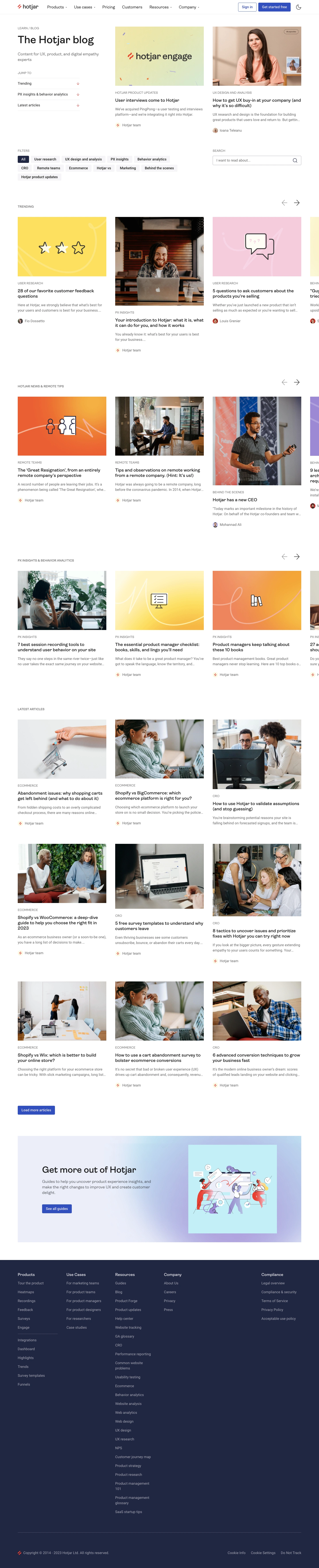
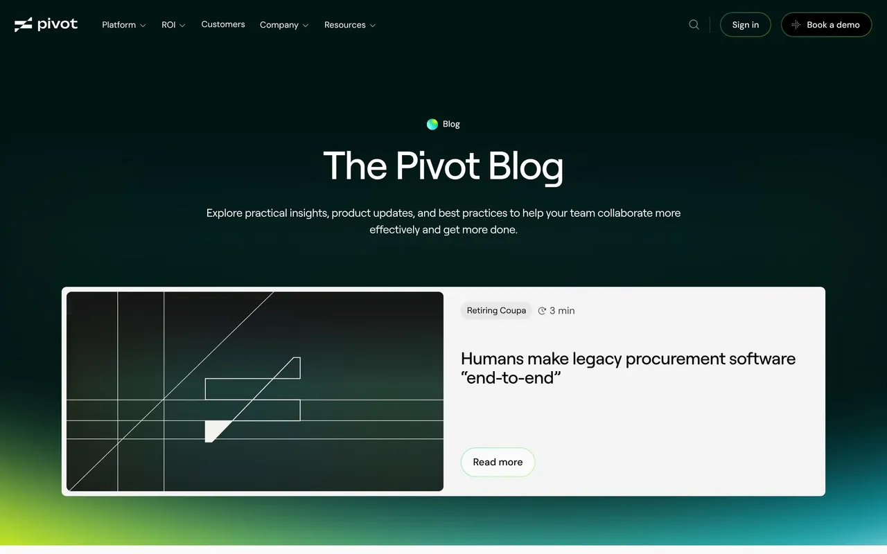
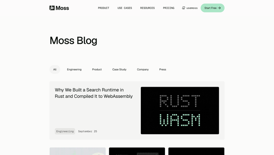
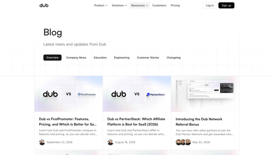
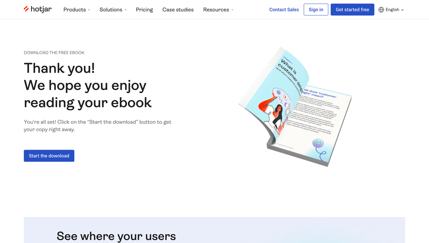
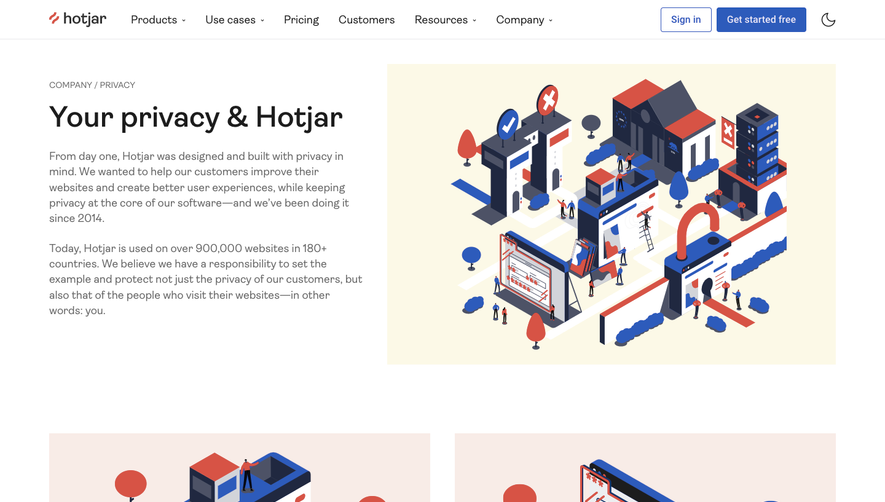
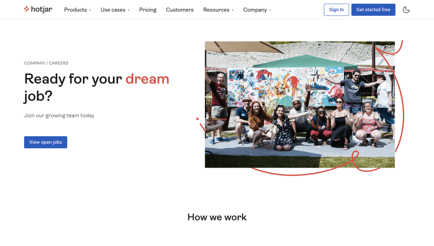
Hotjar’s blog page radiates a modern, accessible, and highly professional vibe, softened by playful accents. Its minimalist foundation is brightened with lively illustrations and expressive iconography, creating an inviting, user-friendly environment that successfully balances authority with approachability.
Layout and Structure
The structure is thoughtfully modular, starting with a clean header and search-driven hero section that instantly clarifies value for the visitor. Below, content is split into easy-to-scan cards and sections, featuring trending topics, curated category filters, and standout recent posts. The page finishes with a concise footer, offering seamless navigation to core resources.
Visual Elements
Vivid flat-style illustrations punctuate the page, delivering warmth and character without overwhelming the content. Playful branded icons guide users through categories and highlights. The absence of heavy photography keeps everything crisp, while subtle hover animations on CTAs and cards add life and interactivity.
Color Palette and Typography
Signature Hotjar reds and oranges pop against soft whites and grays, guiding the eye and reinforcing brand energy. The typography employs rounded sans-serif fonts, using clear visual hierarchy with bold, accessible headlines and generous whitespace to improve readability and invite exploration.
User Experience Patterns
Effortless navigation is achieved through a sticky top menu, intuitive category filtering, and persistent search. Clear, unambiguous CTAs (“Read More,” “Subscribe”) maintain momentum. The entire page is optimized for smooth, digestible scrolling, ensuring users feel guided rather than overwhelmed.
Unique or Notable Design Choices
Distinctive category tags, whimsical line art, and smooth microinteractions set the Hotjar blog apart. The page’s energetic yet reliable tone inspires trust while making discovery enjoyable—exemplifying best practices for SaaS blog design in both usability and visual delight.
 SaaSFrame