
Thank you! Your submission has been received!
Oops! Something went wrong while submitting the form.
Get SaaSFrame Pro
Monthly
$18
Quarterly
$48
Yearly
$180
Upgrade to access this feature
Browse all screens & flows
Filter and search screens & flows
Access Figma files
Access mobile versions
Bookmark screens & flows
Join now
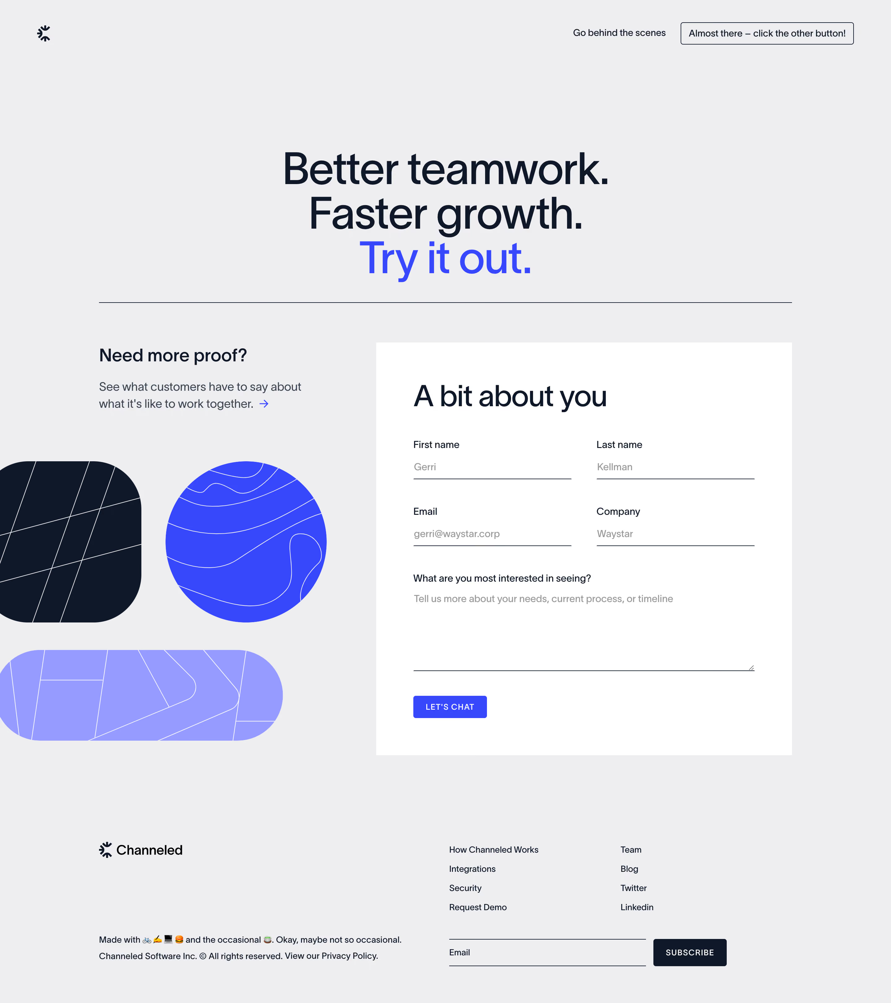

Channeled Demo Request

Channeled
Turn customer success into company success
Designed by
No items found.

Bookmark
Bookmark

Design with AI
Thank you! Your submission has been received!
Oops! Something went wrong while submitting the form.
# Design from Reference: Channeled Demo Request
Create an original, high-fidelity visual design inspired by the reference. Prioritize composition, typography, colors, spacing, and component styling over technical implementation.
## Reference
- **Product:** Channeled
- **Category:** Demo Request
- **Screenshot:** https://cdn.prod.website-files.com/5e9dc792e1210c5325f7ebbc/6acb69955e515b69c7964e3e_6acb67dab206c0d3f8f1b576_cms-94a3c405b27575e18bfb10fe.webp
Analyze the screenshot first. If inaccessible, request it rather than guessing.
## Content
{{content.instructions}}
{{content.data}}
Preserve essential messaging and factual accuracy. Adapt structure and copy length for visual balance; never invent product claims.
## Visual Design
### Overall aesthetic
- **Character:** A graphic demo-request page pairs a light gray canvas with navy typography, electric blue accents and abstract contour-pattern shapes.
- **Tone:** Large regular-weight headlines and underline-only fields create an editorial, contemporary feel rather than a conventional boxed marketing form.
### Page composition
- **Capture scale:** The source measures 2880 × 3242 image pixels. CSS estimates below assume a 2× capture; device-pixel ratio is unverified.
- **Header:** A small symbol sits left; two compact navigation/action items sit right.
- **Hero:** A centered three-line headline occupies the upper region, with its final line in blue. A thin horizontal rule separates it from the main content.
- **Main split:** A proof prompt and oversized abstract shapes occupy the left; a large white form panel occupies the right.
- **Form:** A large heading precedes four fields in a two-column arrangement, a full-width textarea and compact submission button.
- **Footer:** A brand block and small ownership copy sit left of navigation columns and an underline-style email subscription form.
### Information hierarchy
- **Hero promise:** Three large centered lines establish the page, with blue emphasis on the final invitation.
- **Form priority:** The white panel and large form heading dominate the lower body.
- **Fields:** Small dark labels sit above gray example/placeholder content and thin bottom rules.
- **Supporting proof:** A short left-column heading, explanation and arrow link provide an alternative exploration path.
- **Actions:** A small blue Let's Chat button submits the form; the footer subscription action is dark navy.
### Typography
- **Family:** A clean sans serif is visible; exact identity is unverified.
- **Hero:** Approximately 68–72 px CSS, regular/medium, with tight line spacing.
- **Form heading:** Approximately 46–48 px, regular. Supporting left-column heading is around 28 px.
- **Fields and copy:** Approximately 14–18 px with 24–28 px leading; labels are smaller than hero/body display text.
- **Buttons:** Compact uppercase labels use slightly expanded tracking.
### Colors & surfaces
- **Measured canvas:** ICC-aware sRGB sampling yields #EEEEF0.
- **Measured panel and text:** White #FFFFFF contrasts with navy #0F1829.
- **Measured accents:** Electric blue #3647FC and lavender #959BFF fill abstract shapes and selected actions.
- **Measured muted text:** #999999 appears in field content; dark slate #394351 supports explanatory copy.
- **Surface treatment:** The form panel is a crisp white rectangle without a prominent shadow or rounded card silhouette.
### Components
- **Header action:** A thin navy outlined rectangular control has small corners and compact padding.
- **Abstract graphics:** A cropped navy rounded square, blue circle and lavender capsule contain fine white contour/grid lines.
- **Form panel:** Approximately 670 px CSS wide, with generous roughly 60 px internal padding.
- **Inputs:** Four underline-only fields form two equal columns with a broad gutter; the textarea spans the full inner width and shows a resize handle.
- **Submission:** A small blue rectangular button uses white uppercase text and subtle rounding.
- **Footer signup:** A long underline field aligns beside a compact navy Subscribe button.
### Visual rhythm
- **Large gaps:** Broad spacing separates header, hero, form and footer.
- **Two-column balance:** Graphic shapes create mass on the left opposite the dense white form.
- **Field cadence:** Consistent label/value/rule spacing and aligned baselines organize the input grid.
- **Edge alignment:** The main horizontal rule, body columns and footer share a broad centered container.
### Responsive
- **Evidence boundary:** Only a desktop state is shown; responsive behaviors are recommendations.
- **Stacking:** Place the form before or after the supporting proof block in a single-column mobile flow.
- **Field layout:** Collapse paired inputs to one column and keep the textarea full width.
- **Graphics/footer:** Scale decorative shapes independently and stack footer navigation/subscription controls without overflow.
### Adaptation guidance
- **Request pattern:** Reuse a short benefit promise, a focused contact form and optional customer-proof route.
- **Input accessibility:** Provide persistent labels, visible focus treatment and explicit validation beyond the thin underline.
- **Dynamic content:** Treat example names, email and company values as replaceable data rather than copying them.
- **State boundaries:** Submission, validation and success states are not shown.
- **Scale calibration:** Validate the assumed 2× scale before implementing CSS dimensions.
Use this context to reproduce the reference's visual language: layout, typography, colors, spacing, borders, radii, and distinctive elements. The screenshot takes priority if descriptions conflict.
## Direction
{{preferences.fidelityInstructions}}
## Output
{{output.instructions}}
Deliver a polished, cohesive design with precise alignment, hierarchy, and spacing. Produce the requested visual artifact, not just a description. If unsupported, explain the limitation.


Category
Patterns
Tech Stack

Added on
May 24, 2023
Similar screens
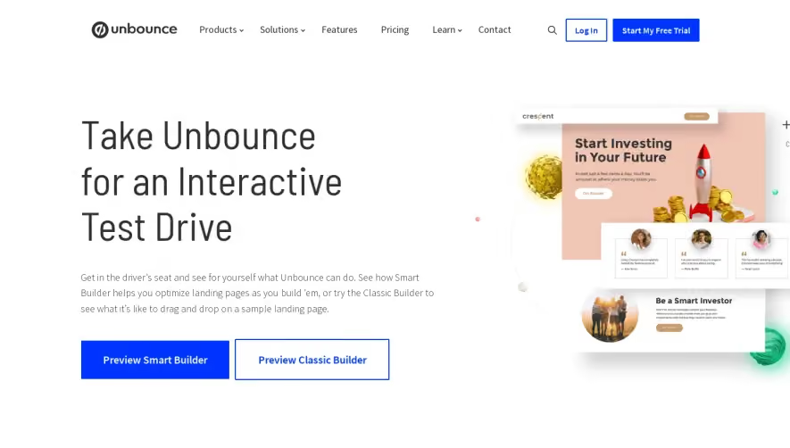


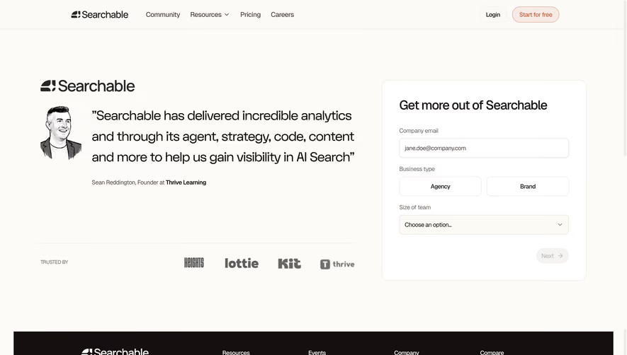

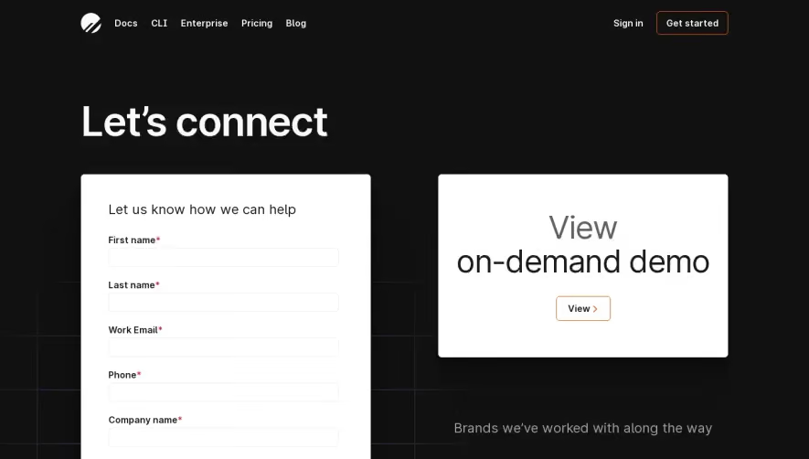

Upgrade to SaaSFrame Pro now to see similar examples.
Monthly
$18 /month
Billed $18 monthly
Browse all screens & flows
Filter and search screens & flows
Search text in screenshots
Access Figma files
Access mobile versions
Join now
Quarterly
$16 /month
Billed $48 quarterly
Browse all screens & flows
Filter and search screens & flows
Search text in screenshots
Access Figma files
Access mobile versions
Join now
Yearly
$15 /month
Billed $180 yearly
Browse all screens & flows
Filter and search screens & flows
Search text in screenshots
Access Figma files
Access mobile versions
Join now