Prompt 1,352 words Copy
# Design from Reference: Unbounce Demo Request

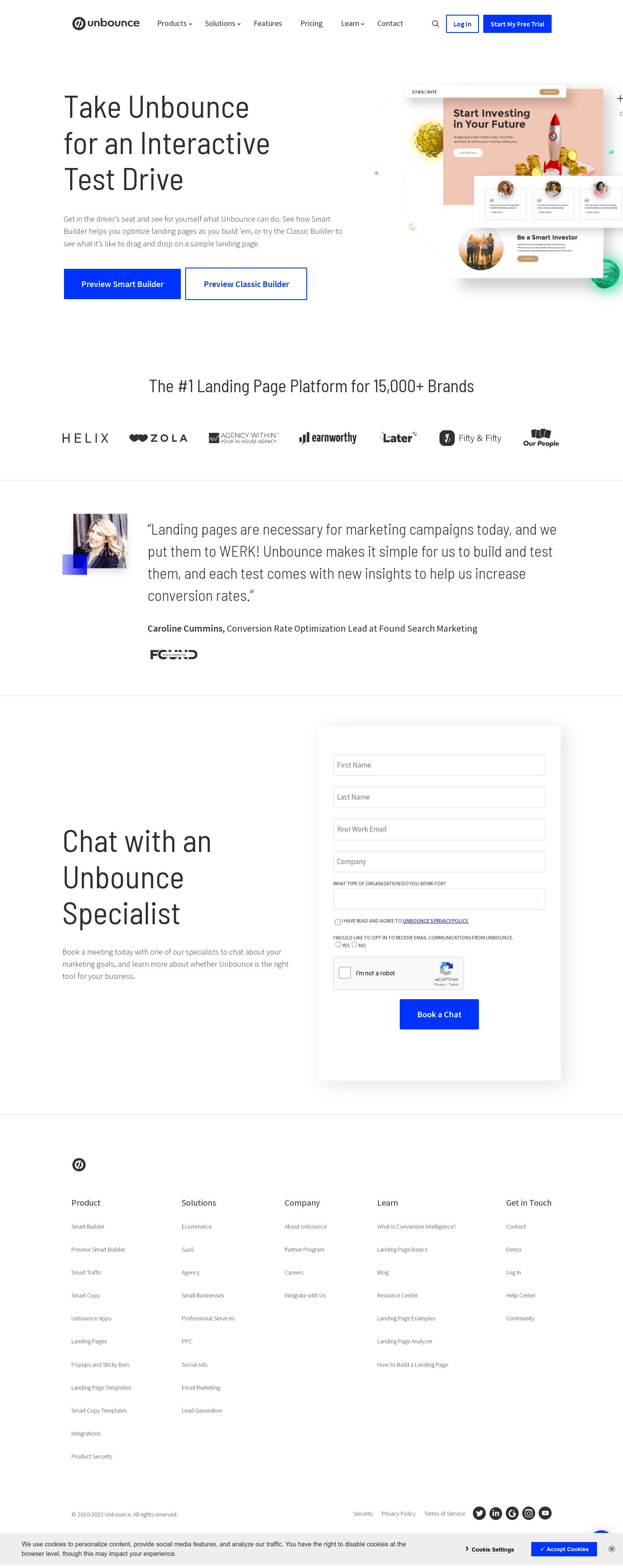
Create an original, high-fidelity visual design inspired by the reference. Prioritize composition, typography, colors, spacing, and component styling over technical implementation.

## Reference

- **Product:** Unbounce
- **Category:** Demo Request
- **Screenshot:** attached to this message (also available at https://media.saasframe.io/o/8696c2ff7a27fb886b12.webp)
- **Source:** https://unbounce.com/demo/

Analyze the attached screenshot first. If no image is attached, open the screenshot link; if neither is accessible, ask for it rather than guessing.

## Visual Design Context

### Overall aesthetic
- **Character:** Spacious white marketing/demo page with tall light-weight sans-serif headings, charcoal body text and sharp electric-blue actions.
- **Visual balance:** A large landing-page collage supplies color in the hero, while the rest of the page relies on logos, a testimonial and a clean lead form.
- **Capture:** The screenshot measures 1440 × 3622 image px and was inspected in three readable portions. Dimensions below are image estimates; CSS scale is unverified.

### Page composition
- **Header:** A centered horizontal bar holds the wordmark, product/navigation links, search icon and two account actions.
- **Hero:** A large three-line interactive-test-drive heading and explanatory paragraph sit left, with two adjacent preview buttons beneath. A layered example landing-page collage extends toward the right viewport edge.
- **Proof strip:** A centered platform-positioning heading and seven dark customer logos sit below the hero.
- **Testimonial:** A full-width section bounded by fine rules pairs a small portrait left with a large multi-line quote and attribution/logo on the right.
- **Lead section:** A large left headline and short paragraph invite a specialist conversation. A tall shadowed white form panel occupies the right half.
- **Footer:** Five link columns and a brand symbol lead to a lower copyright/legal/social row. A light-gray cookie banner overlays the bottom edge.

### Information hierarchy
- **Primary proposition:** The oversized hero title establishes a hands-on preview. Filled Smart Builder and outlined Classic Builder buttons distinguish the two options.
- **Credibility:** Customer marks and the large quote form two separate proof layers before the contact request.
- **Lead task:** The specialist heading is visually dominant on the left; the right form progresses from identity/contact/company details to organization type, consent, optional communications choice and verification.
- **Submission:** A centered blue Book a Chat button is the form's strongest action. No submitted, error or success state is shown.
- **Persistent consent UI:** The cookie banner includes explanatory text, settings, acceptance and close controls, separate from the lead form's own privacy controls.

### Typography
- **Family:** Tall, relatively narrow sans-serif display text contrasts with conventional sans-serif navigation/buttons. Exact font identities are unverified.
- **Hero and lead headings:** Approximately 66–70 image px with light weight and about 82 px leading, deliberately wrapping into three lines.
- **Supporting copy:** Approximately 17–18 px with 28 px leading in muted gray.
- **Proof and quote:** The customer heading is around 38–40 px; the testimonial quote around 33–35 px with generous 50 px leading.
- **Form and footer:** Input text is about 16 px. Consent/radio prompts use very small uppercase text; footer links and legal text are around 12–14 px.
- **Buttons:** Blue actions use heavier sans-serif captions around 17–18 px, clearly distinct from the light headings.

### Colors & surfaces
- **Measured canvas:** ICC-aware sRGB sampling yields #FFFFFF as the dominant background.
- **Measured brand colors:** Electric blue #0033FF appears in primary buttons/outlines and links; charcoal #303030 appears in text and logos.
- **Measured neutral surface:** #EEEEEE is prominent in the cookie strip and light interface areas.
- **Measured illustration color:** Peach #F0C6B4 occurs in the hero landing-page collage. Gold, coral and green accents remain inside the artwork.
- **Depth:** The hero collage has soft layered shadows; the lead form uses a broad diffuse shadow against white. Thin gray rules divide major sections.

### Components
- **Header actions:** A small blue-outlined login button sits beside a filled blue trial action; both use nearly square corners.
- **Preview buttons:** Two large adjacent rectangular actions, roughly 270–280 × 70 image px, use filled and outlined blue treatments with bold centered labels.
- **Hero collage:** Overlapping website panels include a peach investment-themed hero, rocket/coin imagery and testimonial cards. These are decorative page examples rather than active form controls.
- **Testimonial block:** A small portrait has a blue geometric accent behind its lower corner; quote and attribution align to a wide text column.
- **Lead inputs:** Four white outlined fields stack above a labeled organization dropdown. Controls have thin pale borders, small corners and consistent full width.
- **Consent controls:** A privacy checkbox/link, a yes/no communications radio pair and a visible CAPTCHA widget precede the submit action. No checkbox/radio is visibly selected.
- **Cookie banner:** A full-width gray strip contains small text left and settings/blue acceptance/close controls right, with a small floating blue shape partly visible behind it.

### Visual rhythm
- **Macro spacing:** Large white gaps separate hero, proof strip, testimonial and contact section, giving each a distinct reading stage.
- **Alignment:** Header and content use a centered container, while the hero illustration intentionally reaches toward the viewport boundary.
- **Form cadence:** Inputs have roughly 24–26 px vertical gaps; smaller consent elements group more tightly beneath the dropdown.
- **Footer density:** Broadly spaced columns contrast with the small, closely packed legal/cookie text at the bottom.
- **Action contrast:** Sharp blue rectangles remain visually consistent across hero previews, header signup and form submission.

### Responsive
- **Evidence limit:** Only desktop is available; the following are recommendations.
- **Hero:** Collapse navigation, stack text above the collage and reduce display size while preserving readable line breaks.
- **Actions/logos:** Let preview buttons stack and customer logos wrap into balanced rows.
- **Lead form:** Place explanatory copy above a fluid-width form, retain explicit labels and keep consent/CAPTCHA controls usable without horizontal scrolling.
- **Footer/banner:** Reflow footer groups and allow cookie content/actions to wrap without obscuring the submit button.

### Adaptation guidance
- **Reusable structure:** Offer an immediate product preview, follow with layered credibility and provide a separate specialist-contact path.
- **Visual system:** Pair light narrow headings with bold electric-blue actions and broad white space; reserve decorative color for a focused hero example.
- **Form clarity:** Use visible field labels, accessible consent groups and clear validation. Do not infer successful booking from the captured pre-submit form.
- **Accessibility:** Preserve contrast for small gray copy, keyboard access to dropdown/consent controls and accessible alternatives for CAPTCHA and cookie preferences.

## Content

**Instructions:**

Generate realistic example content that fits the selected design reference.

Create appropriate headlines, descriptions, labels, buttons, and supporting copy based on the type of interface being designed.

If a product or business description is provided, use it to guide the content.

Otherwise, invent a plausible fictional SaaS product appropriate for the reference.

Keep the content concise, coherent, and visually balanced.

Do not present fictional statistics, customer names, or testimonials as verified facts.

## Design Direction

**Instructions:**

Use the reference screenshot as the main source of visual inspiration rather than a strict layout template.

Preserve its most distinctive design characteristics, such as typography, visual rhythm, color relationships, component treatments, and overall aesthetic.

Feel free to modify section arrangements, proportions, spacing, and individual components to better suit my content.

Introduce original design decisions where they improve usability, composition, or brand consistency.

The result should clearly reflect the reference's visual language without looking like a direct reproduction.

Follow the visual identity of the reference design.

Use its typography, color palette, component styling, and overall aesthetic as the primary design direction.

Do not introduce an unrelated visual identity.

## Output

**Instructions:**

Generate a high-fidelity visual mockup of the requested interface.

Present the design as a polished, realistic website or product UI screenshot.

Prioritize visual composition, typography, spacing, colors, alignment, and component details.

Use the available image-generation or visual-design capabilities.

Do not replace the mockup with source code, a written design specification, or a textual description.

If direct visual generation is unavailable, clearly explain the limitation.

## Constraints

- Use the actual screenshot as the primary visual reference.
- Preserve essential messaging and factual accuracy.
- Prioritize visual quality and consistency.
- Do not invent unsupported product claims.
- Adapt structure and copy length for visual balance.
Reference image Attach it to your message: assistants can’t open image links. Open in ChatGPT ↗ Open in Claude ↗
Build it in Lovable ↗ v0 ↗ Figma Make ↗
Opening a tool copies the screenshot so you can paste it with your prompt.
 SaaSFrame