
Thank you! Your submission has been received!
Oops! Something went wrong while submitting the form.
Get SaaSFrame Pro
Monthly
$18
Quarterly
$48
Yearly
$180
Upgrade to access this feature
Browse all screens & flows
Filter and search screens & flows
Access Figma files
Access mobile versions
Bookmark screens & flows
Join now
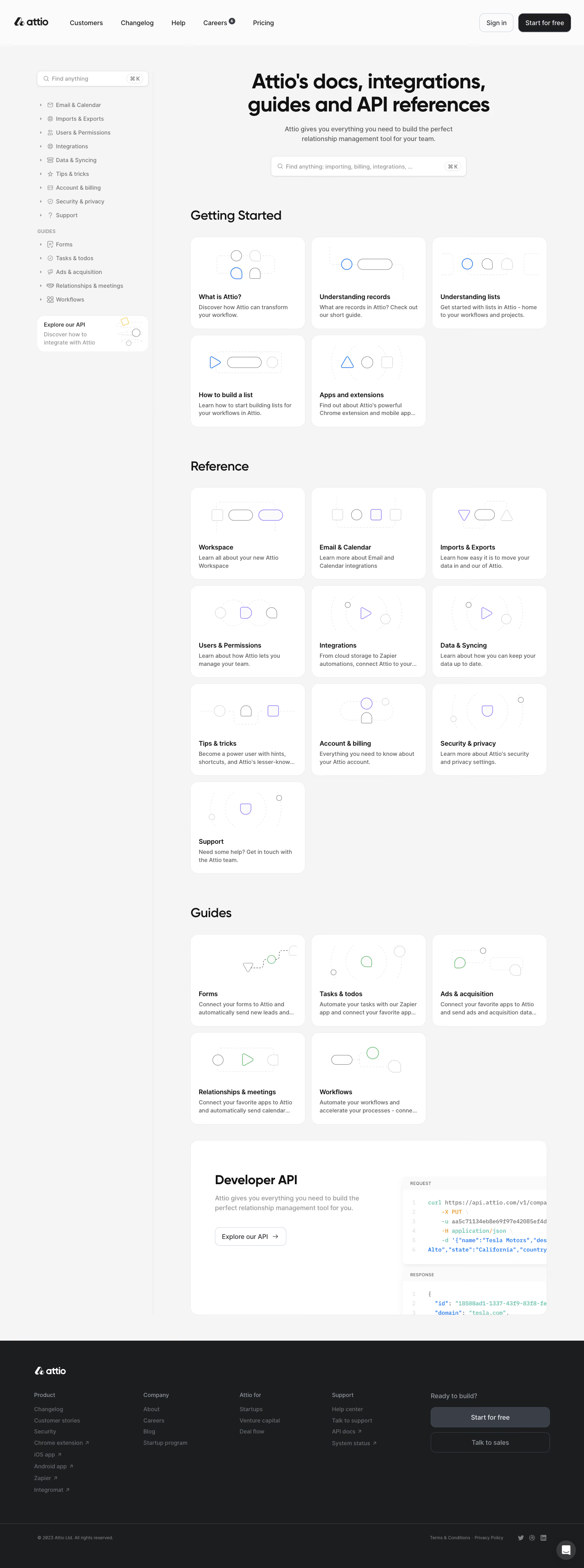

Attio Documentation

Attio
Customer relationship magic
Designed by
No items found.

Bookmark
Bookmark

Design with AI
Thank you! Your submission has been received!
Oops! Something went wrong while submitting the form.
# Design from Reference: Attio Documentation
Create an original, high-fidelity visual design inspired by the reference. Prioritize composition, typography, colors, spacing, and component styling over technical implementation.
## Reference
- **Product:** Attio
- **Category:** Documentation
- **Screenshot:** https://cdn.prod.website-files.com/5e9dc792e1210c5325f7ebbc/6acc0f675d6cd572f289cbb2_6acc09d9a15ed315114363cb_cms-be263c28f14abb7113b624a8-v3.webp
Analyze the screenshot first. If inaccessible, request it rather than guessing.
## Content
{{content.instructions}}
{{content.data}}
Preserve essential messaging and factual accuracy. Adapt structure and copy length for visual balance; never invent product claims.
## Visual Design
### Overall aesthetic
- **Character:** A light documentation hub with large rounded white cards, delicate geometric diagrams and a dark footer.
- **Evidence scale:** Original 1440 × 3869 pixels, inspected through all three readable crops. Dimensions are approximate image pixels; CSS scale and font identities are unverified.
### Page composition
- **Header:** Attio branding and company/product links occupy a white top bar; Sign in and dark Start for free sit at right.
- **Sidebar:** Approximately 290 px navigation region includes a search field, nine reference categories, five guide links and a small API promotion card.
- **Main:** A centered large two-line hub heading, short subtitle and wide search field precede three card groups.
- **Groups:** Getting Started has five cards in a three-column layout; Reference has ten cards; Guides has five cards.
- **API feature:** A wide white panel pairs explanatory copy/action left with cropped request/response code panes right.
- **Footer:** Full-width charcoal area contains brand, four link groups and a two-button conversion block, followed by legal/social controls and a chat bubble.
### Information hierarchy
- **Hero:** Heavy heading and prominent search make discovery the main task.
- **Section labels:** Large dark headings separate beginner material, reference and guides.
- **Card anatomy:** A delicate diagram sits above bold title and short gray description; several descriptions visibly truncate.
- **Navigation:** Small category icons and disclosure arrows organize the sidebar without filled active states.
- **API emphasis:** A larger horizontal panel distinguishes developer documentation from ordinary topic cards.
### Typography
- **Hero:** Unverified sans-serif, approximately 48 px bold with 56 px line height and tight tracking.
- **Section headings:** Approximately 32 px semibold with 40 px line height.
- **Card titles:** Around 16 px semibold; descriptions around 14 px regular, 20 px line height.
- **Navigation/actions:** Approximately 14–16 px regular/medium.
- **Code imagery:** Small monospaced syntax-colored text appears inside request/response illustrations; exact code content is not needed to reproduce the visual.
### Colors & surfaces
- **Canvas:** Measured light gray #F5F5F5.
- **Cards/header:** White #FFFFFF and near-white #FBFBFB surfaces.
- **Primary ink:** Near-black #111111 and deep #1C1D1F.
- **Secondary:** Gray #393E47 and lighter grays support descriptions/navigation.
- **Accents:** Blue beginner diagrams, violet reference diagrams and green guide diagrams; a tiny yellow accent appears in the sidebar API illustration.
- **Footer:** Charcoal #1C1D1F with muted gray links and light text.
### Components
- **Search fields:** White bordered rounded controls with leading magnifier and trailing keyboard-shortcut pill; hero search roughly 480 × 50 px.
- **Topic cards:** Approximately 283 × 228 px, 18 px radii, fine pale borders and about 20 px text padding.
- **Diagrams:** Thin circles, capsules, triangles and rounded abstract shapes connected by pale dashed paths, with one accent-colored shape per image.
- **Sidebar API card:** Small rounded white horizontal promotion, title/copy left and miniature diagram right.
- **API feature:** Wide rounded shell with a left outlined arrow button and layered code cards cropped at the right boundary.
- **Footer actions:** Wide filled gray Start for free button above an outlined sales action; dark circular chat control at bottom right.
### Visual rhythm
- **Grid:** Approximately 16 px gaps between equal cards; partial final rows preserve left alignment.
- **Section spacing:** Roughly 80 px separates card groups.
- **Card internals:** Illustration area receives most of the upper half; title/description form a compact bottom block.
- **Page framing:** A fine vertical rule separates the tall sidebar from the main content.
### Responsive
- **Observed limit:** Desktop only; mobile navigation and search behavior are unverified.
- **Recommendation:** Collapse the sidebar and reduce the card grid from three columns to two and then one.
- **Feature/footer:** Stack API text above code imagery and wrap footer groups without clipping actions.
### Adaptation guidance
- **Retain:** Combine prominent search with visually consistent topic cards and clear documentation tiers.
- **Implement:** Use thin abstract diagrams, pale borders and restrained category accents.
- **Verify:** Confirm actual fonts, CSS dimensions and topic/search navigation separately; embedded code is illustrative screenshot content only.
Use this context to reproduce the reference's visual language: layout, typography, colors, spacing, borders, radii, and distinctive elements. The screenshot takes priority if descriptions conflict.
## Direction
{{preferences.fidelityInstructions}}
## Output
{{output.instructions}}
Deliver a polished, cohesive design with precise alignment, hierarchy, and spacing. Produce the requested visual artifact, not just a description. If unsupported, explain the limitation.


Category
Patterns
No items found.
Tech Stack



Added on
March 5, 2023
Similar screens
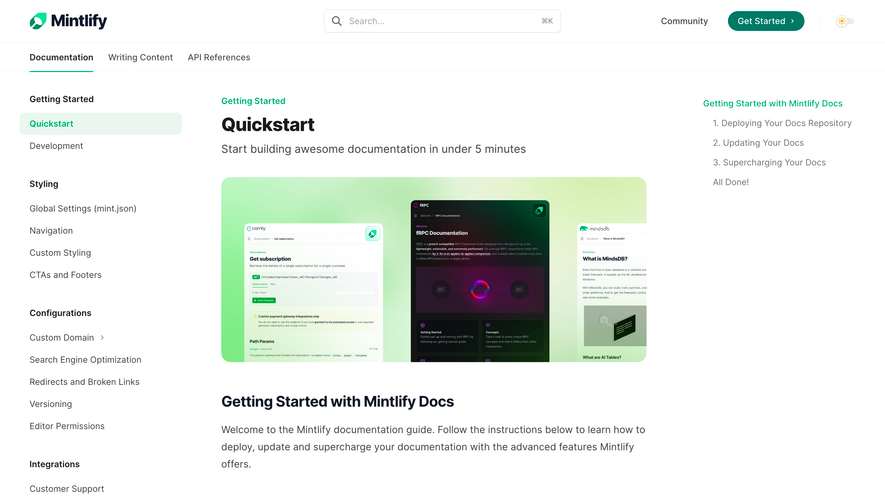


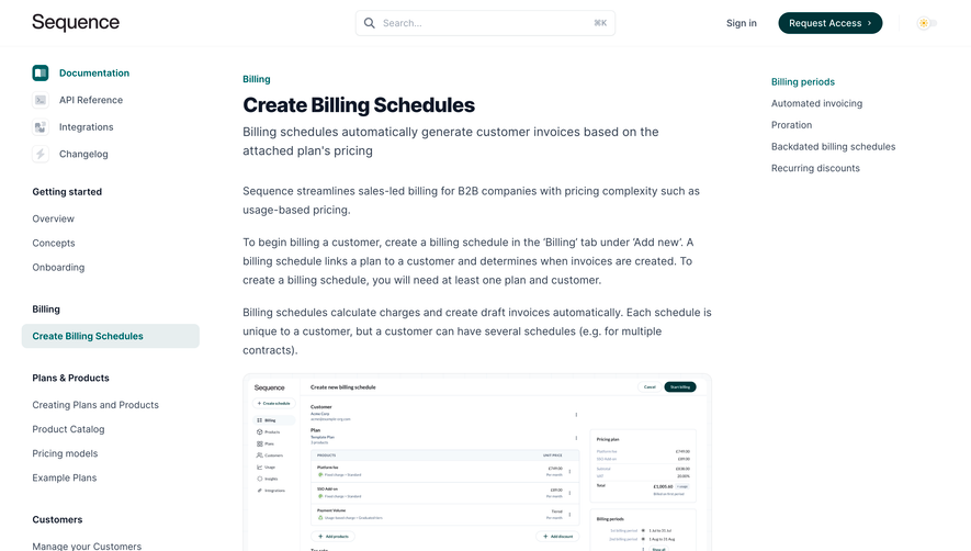

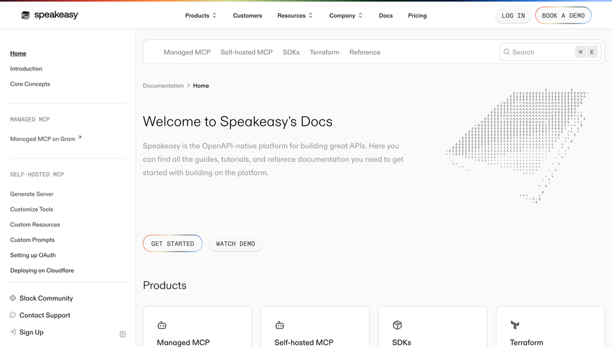

Upgrade to SaaSFrame Pro now to see similar examples.
Monthly
$18 /month
Billed $18 monthly
Browse all screens & flows
Filter and search screens & flows
Search text in screenshots
Access Figma files
Access mobile versions
Join now
Quarterly
$16 /month
Billed $48 quarterly
Browse all screens & flows
Filter and search screens & flows
Search text in screenshots
Access Figma files
Access mobile versions
Join now
Yearly
$15 /month
Billed $180 yearly
Browse all screens & flows
Filter and search screens & flows
Search text in screenshots
Access Figma files
Access mobile versions
Join now