
Thank you! Your submission has been received!
Oops! Something went wrong while submitting the form.
Get SaaSFrame Pro
Monthly
$18
Quarterly
$48
Yearly
$180
Upgrade to access this feature
Browse all screens & flows
Filter and search screens & flows
Access Figma files
Access mobile versions
Bookmark screens & flows
Join now
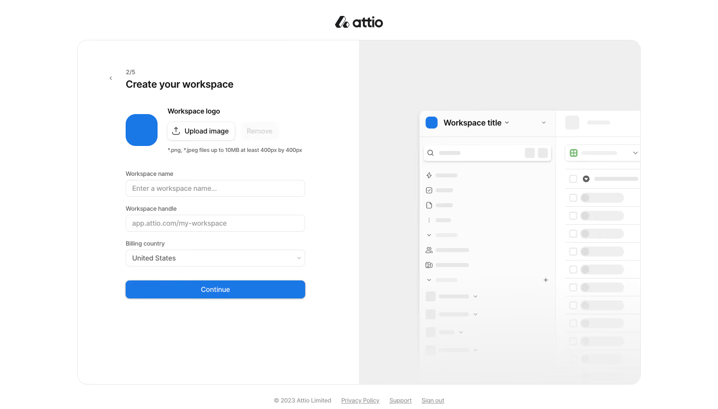
Attio Company Setup

Attio
Customer relationship magic
Designed by
No items found.

Bookmark
Bookmark

Design with AI
Thank you! Your submission has been received!
Oops! Something went wrong while submitting the form.
# Design from Reference: Attio Company Setup
Create an original, high-fidelity visual design inspired by the reference. Prioritize composition, typography, colors, spacing, and component styling over technical implementation.
## Reference
- **Product:** Attio
- **Category:** Account Setup
- **Screenshot:** https://cdn.prod.website-files.com/5e9dc792e1210c5325f7ebbc/6acbb9f9d37e66e942ffbb60_6acb70aa5e515b69c7979345_cms-85c714b18489f6dcb82619da.webp
Analyze the screenshot first. If inaccessible, request it rather than guessing.
## Content
{{content.instructions}}
{{content.data}}
Preserve essential messaging and factual accuracy. Adapt structure and copy length for visual balance; never invent product claims.
## Visual Design
### Overall aesthetic
- **Character:** A restrained workspace-creation step with a white form, a pale illustrative preview and a single blue primary action. Fine borders and generous empty space keep the screen calm.
- **Image basis:** Observed on a 1440 × 821 screenshot, inspected at approximately 1400 × 798. Sizes below are approximate inspection pixels; CSS scaling and device pixel ratio are unverified.
### Page composition
- **Outer frame:** A centered Attio logo sits above an approximately 1098 × 672 px onboarding shell positioned around x151, y78. The shell has a thin light border and roughly 20 px outer corners.
- **Form half:** The left white half is about 549 px wide. A roughly 350 px form column contains a back control, step indicator, heading, logo controls, three fields and a full-width Continue button.
- **Preview half:** A light-gray right panel contains a partially cropped white workspace preview starting around x818, y215. Its navigation and rows fade toward the bottom.
- **Outside footer:** Small centered copyright and policy/support/sign-out links sit beneath the shell.
### Information hierarchy
- **Step orientation:** A subdued “2/5” indicator and back chevron precede the stronger workspace-creation title.
- **Input sequence:** Workspace image controls come first, followed by name, handle and billing-country fields. The blue Continue button closes the sequence.
- **Secondary illustration:** A workspace title, small blue icon and gray navigation/data shapes preview the destination without competing with the form.
- **Observed state:** Name and handle show placeholder treatment; country displays a selected value. No error, focus or validation state is visible.
### Typography
- **Heading:** The form title is approximately 20 px, semibold, in a clean sans-serif. Font identity is unverified.
- **Field roles:** External labels are approximately 12 px with medium emphasis; input text and button labels are approximately 13–14 px.
- **Helper roles:** Upload guidance is approximately 11 px in light gray, with compact line-height. The step indicator and footer links are similarly understated.
- **Preview roles:** The workspace title is darker and stronger than the surrounding gray skeleton-like lines, which function as illustrative content rather than readable body copy.
### Colors & surfaces
- **Measured foundations:** White #FFFFFF dominates the form and preview. Sampled light neutrals include #FBFBFB, #F9F9F9, #F1F1F1, #F0F0F0 and #EFEFEF.
- **Measured accent:** Blue #1977E6 supplies the primary action and workspace-image emphasis.
- **Measured detail:** Gray #E7E7E7 appears among fine boundaries and preview elements. Dark neutral text supplies hierarchy without additional accent colors.
- **Surface distinction:** A subtle gray right-hand panel separates the preview from the white interactive area; the surrounding page remains bright.
### Components
- **Workspace image:** An approximately 62 px square blue tile has roughly 20 px corners. An outlined Upload image button, about 133 × 36 px, sits alongside it, followed by a pale Remove control.
- **Text fields:** Name and handle inputs are approximately 350 × 33 px with fine gray borders, roughly 7 px corners and modest horizontal padding. Labels sit outside above them.
- **Country selector:** A similarly sized dropdown displays United States and a right-side chevron.
- **Primary action:** Continue spans the 350 px form width and is approximately 36 px high, with blue fill, white centered text, roughly 7 px corners and a small shadow.
- **Preview frame:** A white mock workspace uses a small blue icon, header text, sidebar marks, checkboxes and pale rounded row elements. Its fading treatment is illustrative; no live loading behavior is established.
- **Navigation:** The back chevron is compact and separated from the fields. Footer text links remain visually secondary.
### Visual rhythm
- **Alignment:** Heading, labels, inputs and primary action share one left edge and one consistent form width.
- **Spacing:** A generous gap separates the title from image controls; smaller repeated vertical intervals organize field labels and inputs. The final action has a distinct gap above it.
- **Balance:** The form's compact dark text is counterweighted by the larger, low-contrast workspace preview. Broad panel padding prevents either half from feeling crowded.
- **Geometry:** Soft outer corners, smaller input radii and the more rounded workspace tile create a consistent but graduated corner treatment.
### Responsive
- **Evidence limit:** Only the desktop split-panel arrangement is visible.
- **Recommended layout:** Stack or hide the decorative preview on small screens, keeping the form first and preserving its natural reading order.
- **Recommended sizing:** Use a fluid form width capped near the observed 350 px, with comfortable side gutters and larger touch targets where needed.
- **Recommended footer:** Allow utility links to wrap without crowding the primary form. Keep labels visible and associate helper text with its upload control.
### Adaptation guidance
- **Preserve:** Retain the quiet white/gray frame, one blue primary action, external labels and restrained destination preview.
- **Build:** Reuse a labeled-field component, upload-control group, country selector and full-width primary button with consistent boundaries and padding.
- **Separate decoration:** Keep the faded preview outside the interactive form's accessibility order unless it conveys essential information.
- **Validate:** Establish real focus, error, disabled and upload states, confirm keyboard behavior and test text contrast. These states and exact font metrics cannot be inferred from this screenshot.
Use this context to reproduce the reference's visual language: layout, typography, colors, spacing, borders, radii, and distinctive elements. The screenshot takes priority if descriptions conflict.
## Direction
{{preferences.fidelityInstructions}}
## Output
{{output.instructions}}
Deliver a polished, cohesive design with precise alignment, hierarchy, and spacing. Produce the requested visual artifact, not just a description. If unsupported, explain the limitation.


Category
Tech Stack



Added on
March 5, 2023




Similar screens






Upgrade to SaaSFrame Pro now to see similar examples.
Monthly
$18 /month
Billed $18 monthly
Browse all screens & flows
Filter and search screens & flows
Search text in screenshots
Access Figma files
Access mobile versions
Join now
Quarterly
$16 /month
Billed $48 quarterly
Browse all screens & flows
Filter and search screens & flows
Search text in screenshots
Access Figma files
Access mobile versions
Join now
Yearly
$15 /month
Billed $180 yearly
Browse all screens & flows
Filter and search screens & flows
Search text in screenshots
Access Figma files
Access mobile versions
Join now