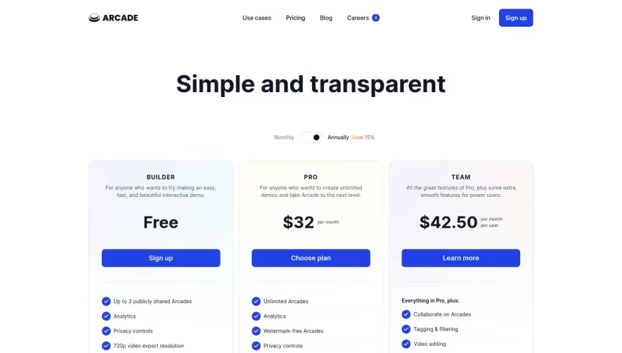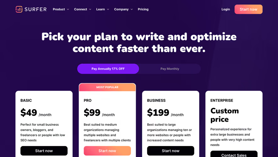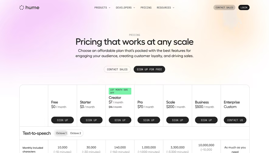

1. Header The page opens with a header that contains the Appcues logo and a navigation bar. The navigation bar allows users to access other parts of the Appcues website. 2. Title Section Below the header is a bold title section that introduces the pricing plans available on Appcues. The title section displays the Appcues pricing philosophy, which emphasizes simplicity and flexibility. 3. Plan Selection The page then displays three different pricing plans that users can choose from. The three plans are the Growth plan, the Scale plan, and the Enterprise plan, each with different pricing levels and features. 4. Plan Details Each plan has its own section that provides details on what it offers. The section displays a comparison chart highlighting the features available in each plan. 5. Request Demo After detailing the three plans, there is a Request a Demo button that allows users to sign up for a demo of the Appcues platform. Users are prompted to fill out a form with their contact information to schedule a demo with a representative. 6. Exit Intent Before a user attempts to leave the page, an exit intent strategy detects the action and prompts a message to act as a final attempt to get the user's attention. 7. Additional Information At the footer of the page, there are links leading to additional information about Appcues, such as the company's blog, help center, and contact information. 8. CTA to start Located at the very bottom are two buttons encouraging users to either start their free trial for 14 days or view a demo.


Appcues Pricing Page

Appcues
The Product-Led Growth Platform
Designed by
No items found.
Category
Patterns
No items found.
Tech Stack
Added on
April 28, 2020