Design with AI
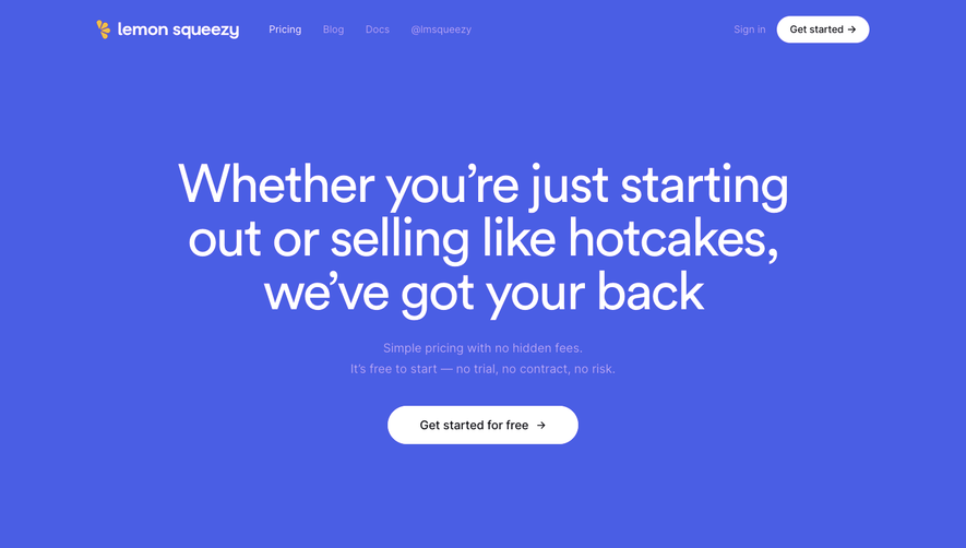
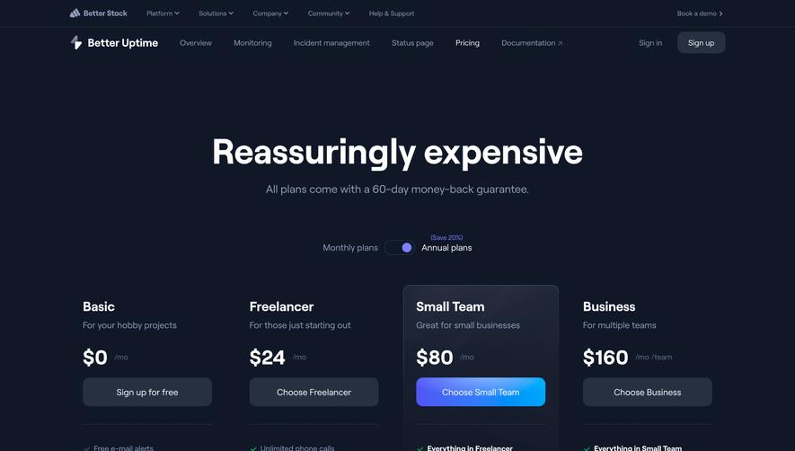
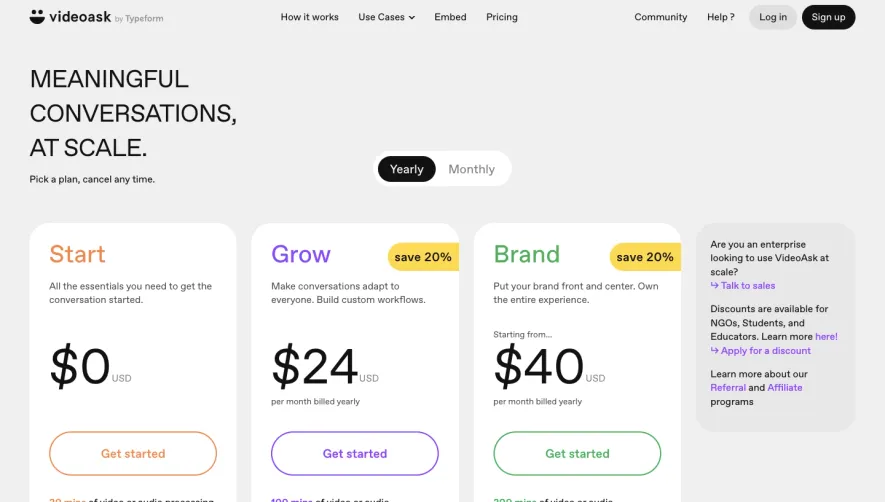
Generate a new design based on this screen using your own content.
# Design from Reference: Arcade Pricing Page
Create an original, high-fidelity visual design inspired by the reference. Prioritize composition, typography, colors, spacing, and component styling over technical implementation.
## Reference
- **Product:** Arcade
- **Category:** Pricing Page
- **Screenshot:** https://cdn.prod.website-files.com/5e9dc792e1210c5325f7ebbc/63dd9c5dc436ef820d34ca70_screenshot.webp
Analyze the screenshot first. If inaccessible, request it rather than guessing.
## Content
{{content.instructions}}
{{content.data}}
Preserve essential messaging and factual accuracy. Adapt structure and copy length for visual balance; never invent product claims.
## Visual Design
### Overall aesthetic
- **Style:** A clean three-plan pricing page with navy type, saturated blue actions, and very faint pastel card washes.
- **Character:** Simple and approachable, with conventional comparison hierarchy and little decoration.
### Page composition
- **Capture and scale:** 1680 × 1485 screenshot pixels. Sizes below are approximate screenshot pixels; CSS scale is unverified.
- **Opening:** A centered content frame contains logo/navigation/account actions, a large centered heading, and monthly/annual switch.
- **Plans:** Three equal-height cards present Builder, Pro, and Team. Each stacks description, large price, full-width action, divider, and checkmarked features.
- **Footer:** A thin rule separates the plans from a brand statement/social group left and three compact link groups right.
### Information hierarchy
- **Decision:** Plan titles and prices establish comparison, followed by aligned actions and feature lists.
- **Billing:** The annual side is dark and selected-looking, with a small colored savings label.
- **Inheritance:** Team includes a bold introductory line before its incremental features.
### Typography
- **Family:** Neutral sans serif; exact identity unverified.
- **Display:** Main heading approximately 64–68 px bold; prices around 44–48 px bold.
- **Roles:** Plan labels are uppercase 16 px bold with tracking; body/features 14–16 px with comfortable leading. Button labels approximately 18 px semibold.
### Colors & surfaces
- **Foundation:** Sampled sRGB #FFFFFF dominates. Near-white variants #FEFDF9, #FEFEFC, and #FCFEFF support subtle warm/cool card washes.
- **Action:** Sampled blue #2141E6 fills buttons and circular feature checks.
- **Ink:** Dark navy headings contrast with gray descriptions. Card boundaries are fine light gray rather than heavy shadows.
### Components
- **Cards:** Roughly 390 px wide and 670 px high, with approximately 16 px radii and 34 px padding.
- **Actions:** Blue buttons span the card interior, about 48 px high, with 6–7 px radii.
- **Features:** White checks sit in small blue circles, aligned with compact text rows.
- **Footer:** Unboxed groups use bold small labels, gray links, and pale circular social buttons.
### Visual rhythm
- **Spacing:** Allow broad whitespace around headline/switch and approximately 16–20 px card gutters.
- **Alignment:** Keep prices, buttons, dividers, and list starts aligned across plans despite differing feature counts.
### Responsive
- **Observed state:** Desktop only.
- **Recommended reflow:** Stack cards or use a readable two/one-column progression, keeping billing selector above all plans.
### Adaptation guidance
- **Preserve:** Retain the quiet three-card system, blue action/check accents, aligned plan anatomy, and subtle pastel surfaces.
- **Adapt:** Use real plan pricing, billing states, and inclusions.
- **Avoid:** Do not copy prices or savings claims from the reference.
Use this context to reproduce the reference's visual language: layout, typography, colors, spacing, borders, radii, and distinctive elements. The screenshot takes priority if descriptions conflict.
## Direction
{{preferences.fidelityInstructions}}
## Output
{{output.instructions}}
Deliver a polished, cohesive design with precise alignment, hierarchy, and spacing. Produce the requested visual artifact, not just a description. If unsupported, explain the limitation.