Onboard users effectively with interactive SaaS Product Tour and Walkthrough designs. Discover how to use tooltips, hotspots, and guided checklists to show users your 'Aha!' moment without disrupting their workflow.
Browse 132 real SaaS Product Tour with modern UI patterns and conversion strategies.
We sell SaaSFrame licenses on Gumroad, a secured online selling platform for creators.
What about future updates and versions?
SaaSFrame gets updated all the time! Every new update and version will immediately be made available to all SaaSFrame users.
I didn't receive my licence key, what should I do?
The licence key required to create your SaaSFrame account is send by Gumroad once you made your purchase. If this email is blocked by your email client, send me an email at antoine[at]unmake[dot]io so I can resend the licence key.
Can you send me an invoice?
You can generate an invoice on Gumroad once you purchased SaaSFrame. You will find the link in the order confirmation email.
Can I get a refund?
If you're not satisfied, you can ask for a refund within 7 days. Just send me an email at antoine[at]unmake[dot]io
Product Tour Design Guide
A SaaS product tour explains a small part of the interface at the moment a user can use that explanation. It can orient people to a dashboard, point out a control, or introduce a new capability. The tour should support a task rather than become a substitute for an understandable product.
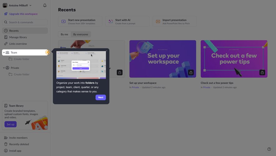
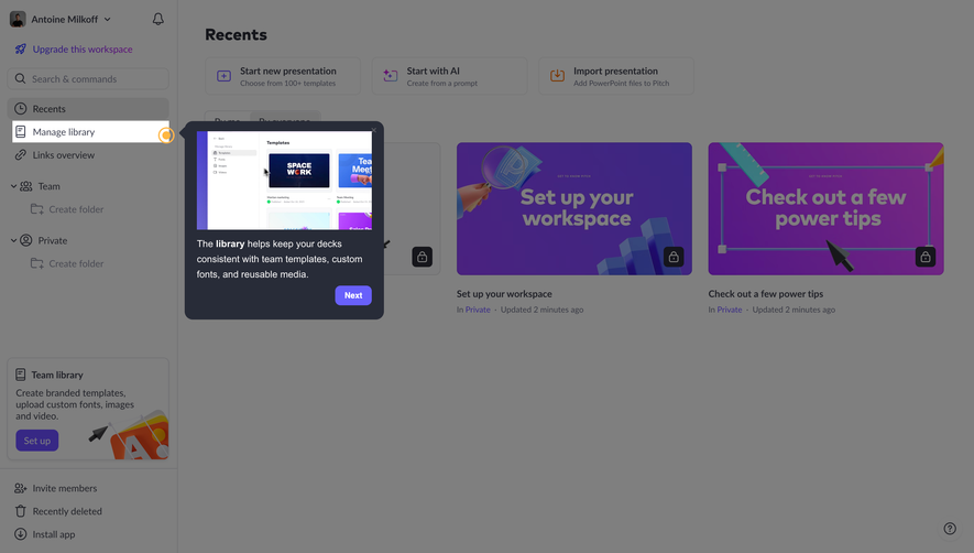
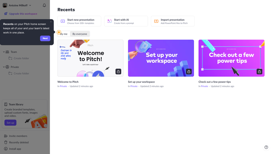
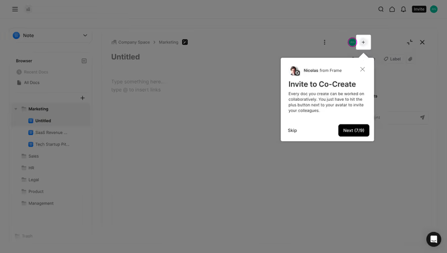
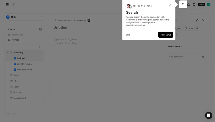
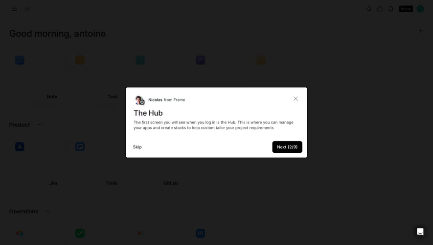
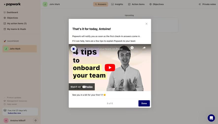
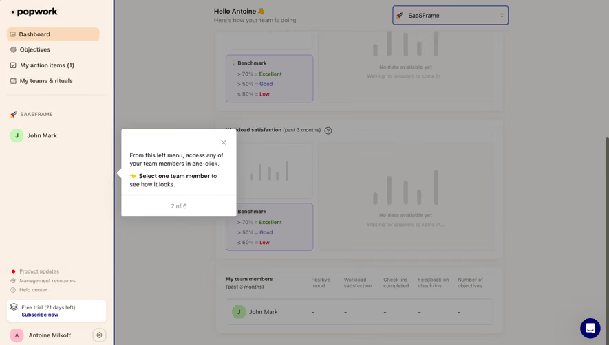
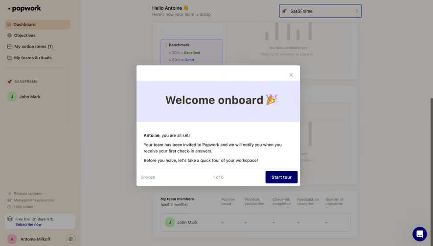
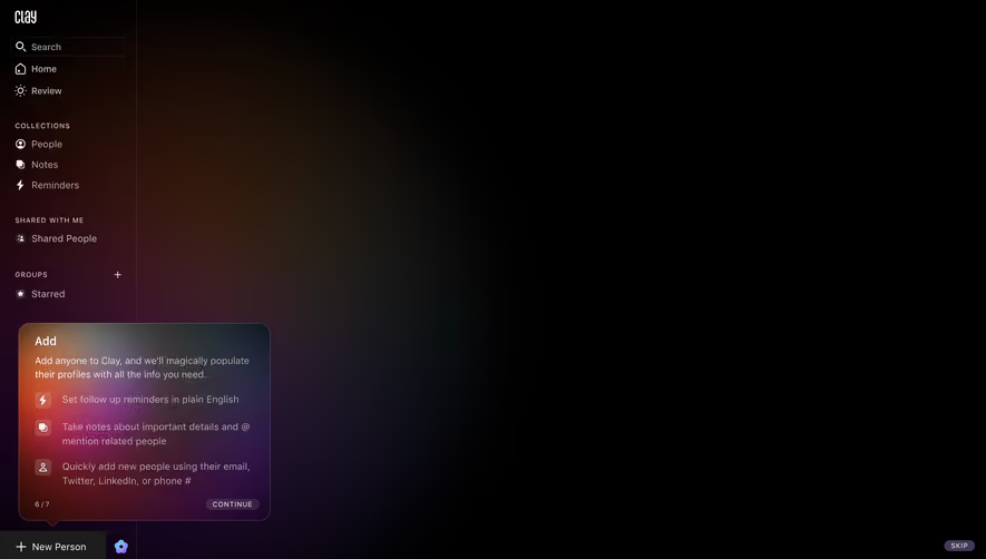
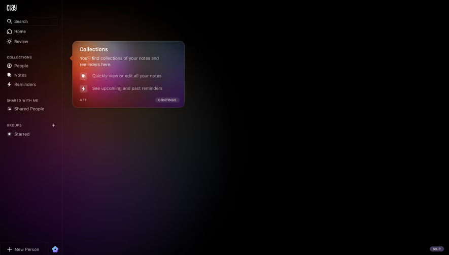
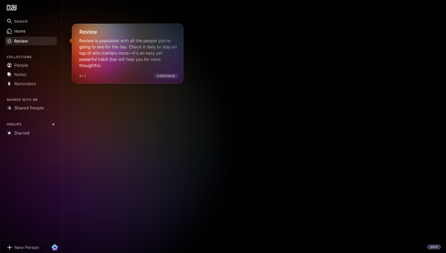
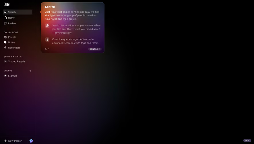
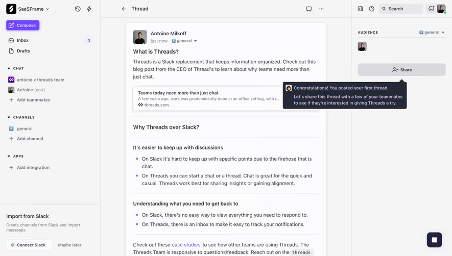
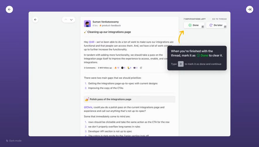
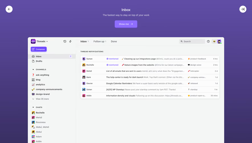
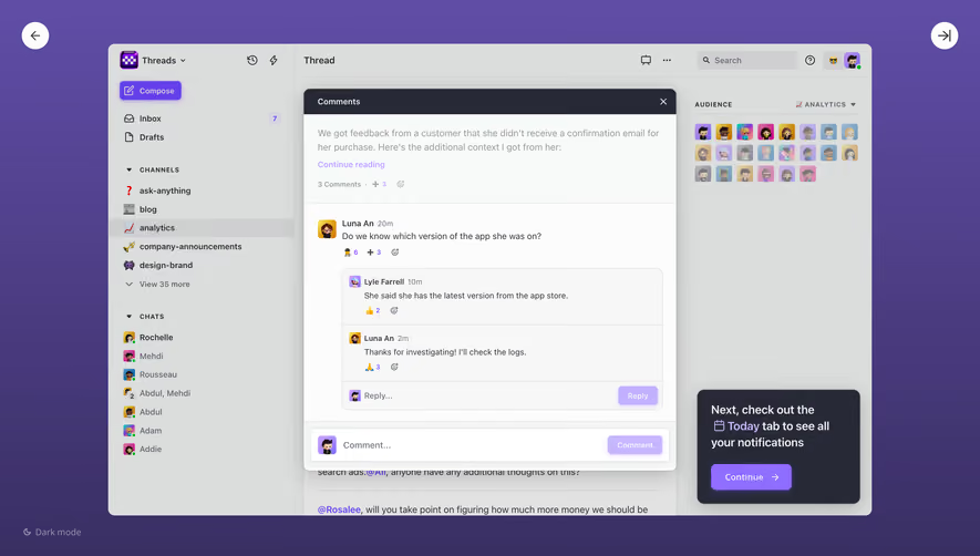
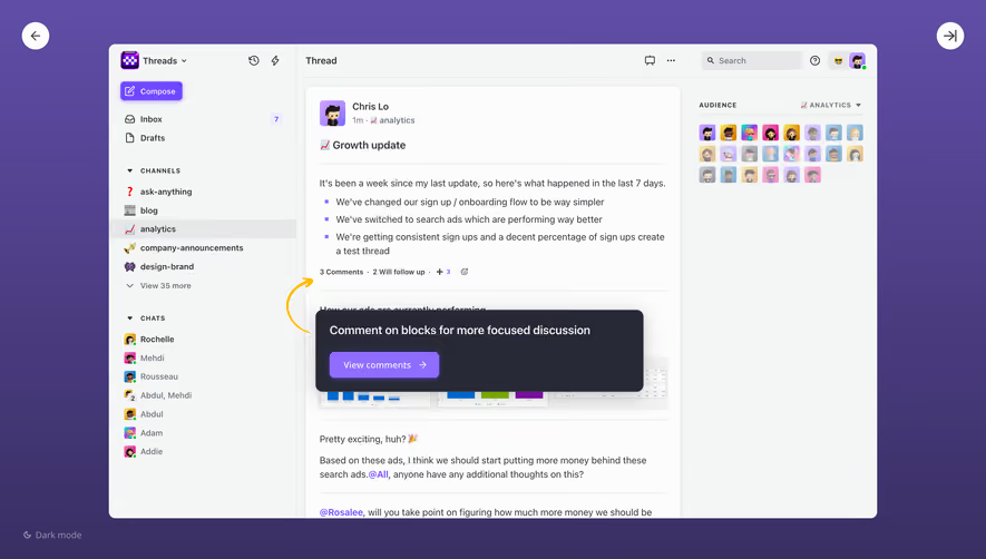
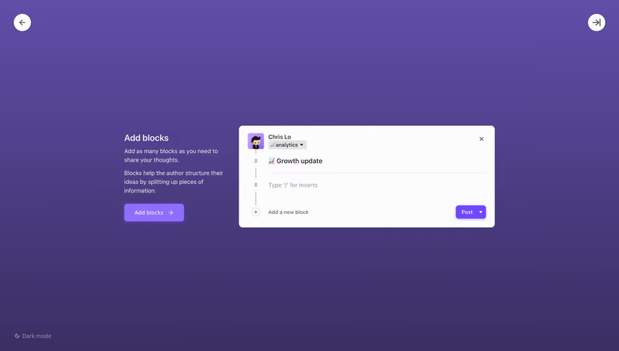
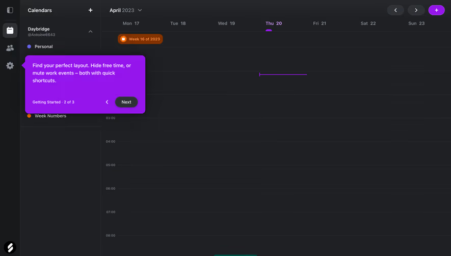
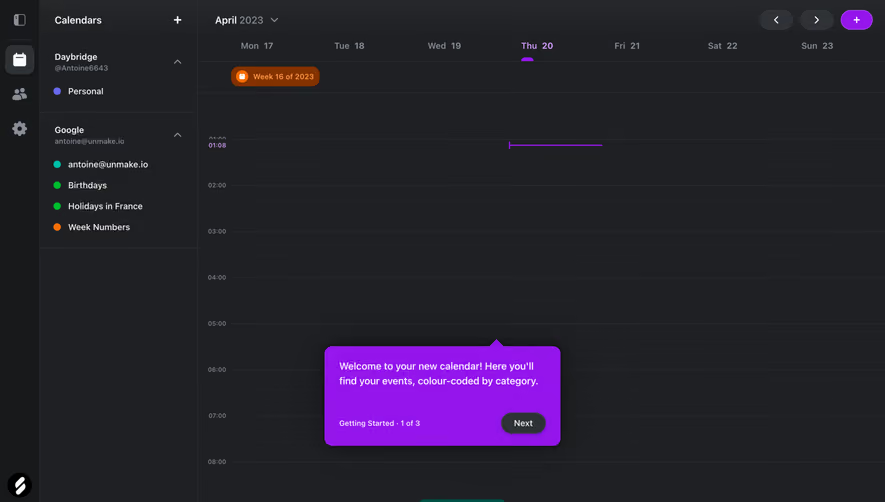
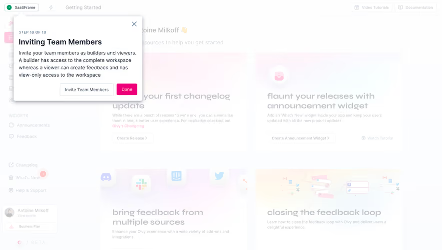
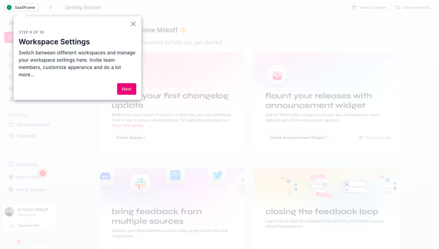
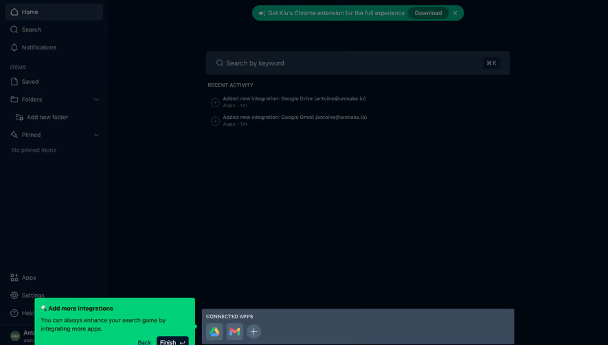
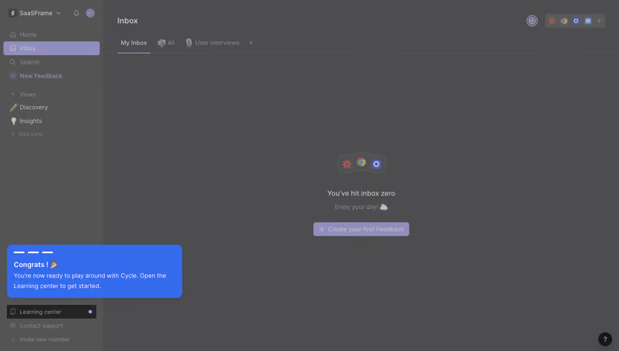
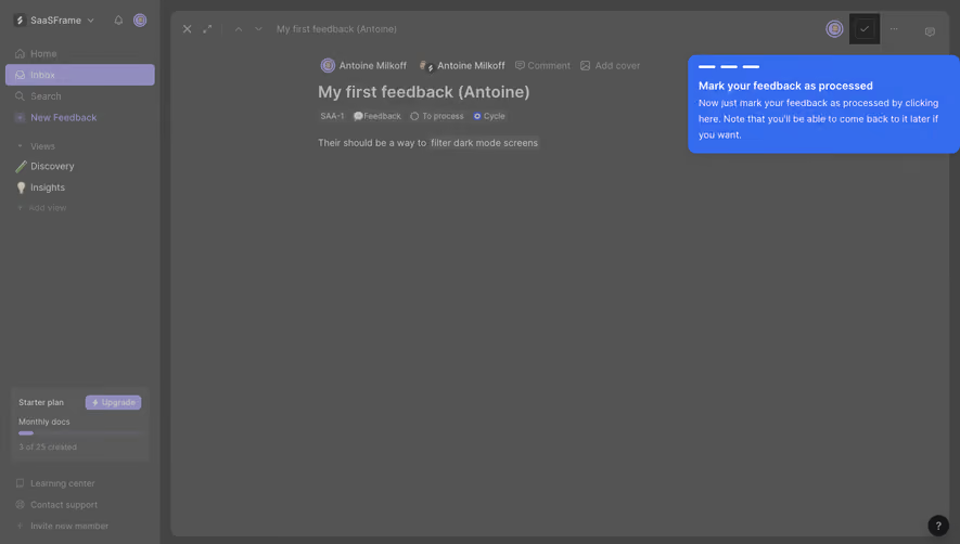
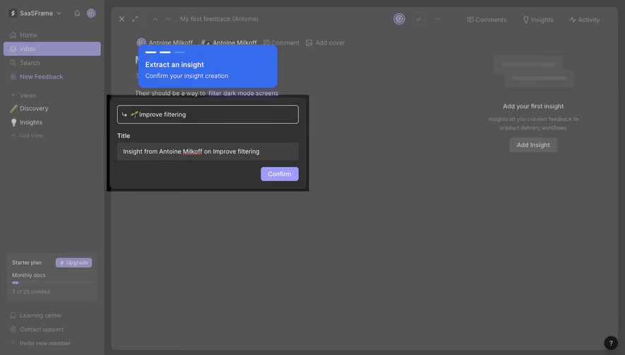
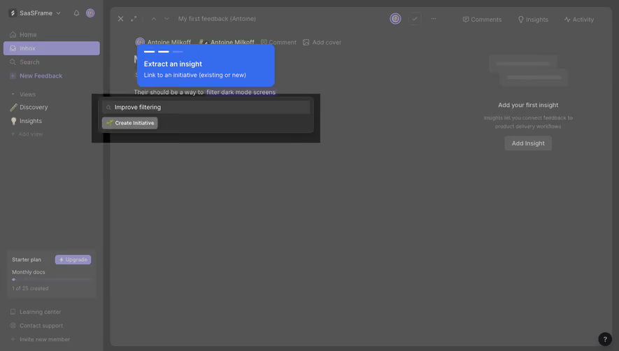
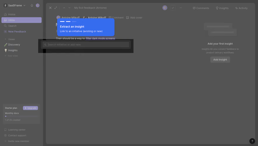
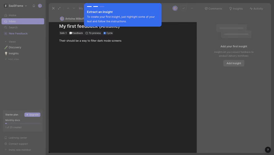
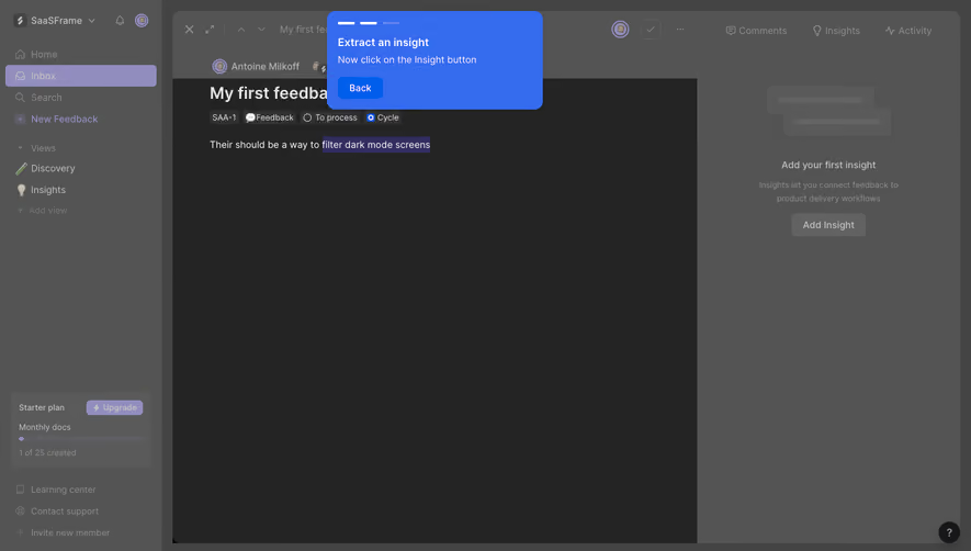
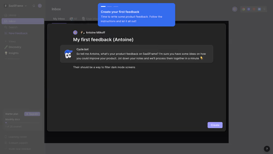
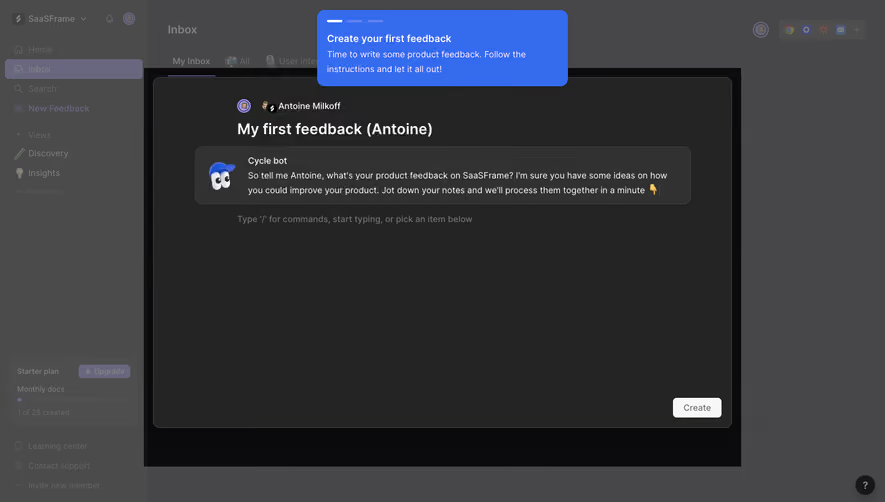
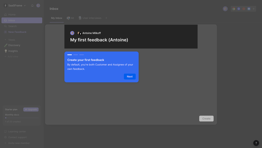
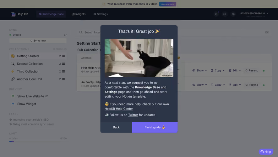
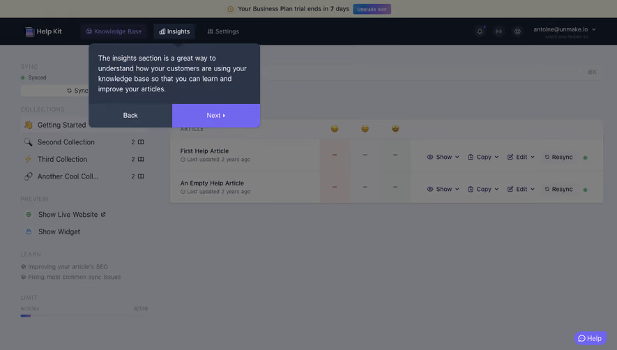
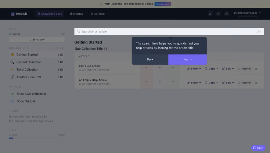
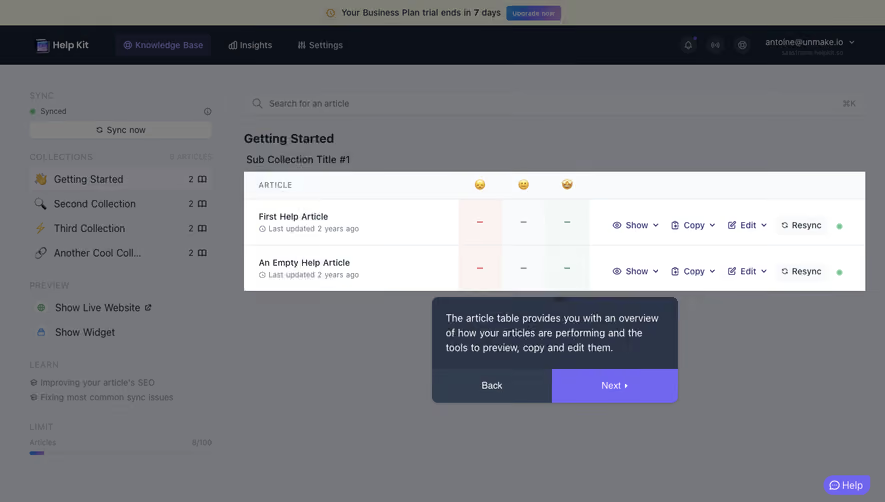
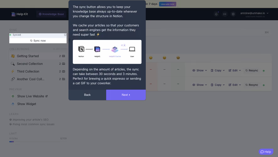
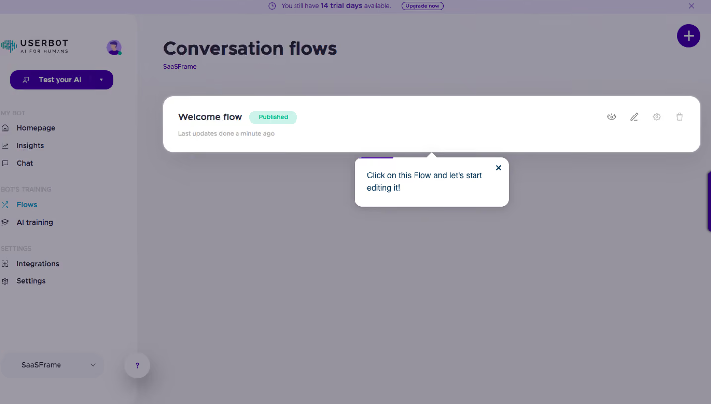
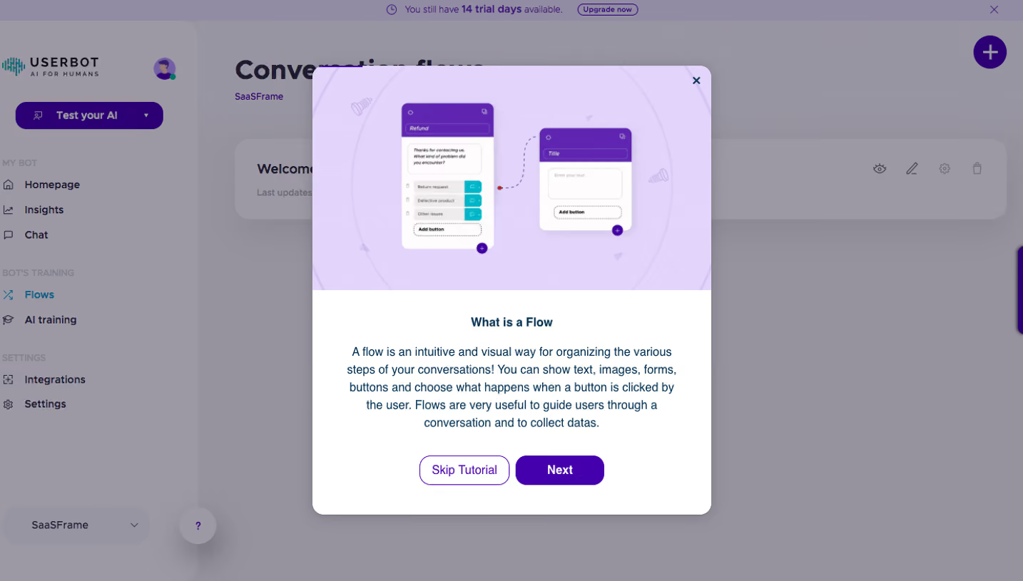
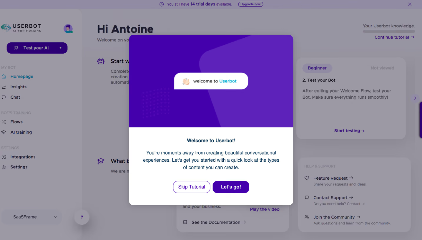
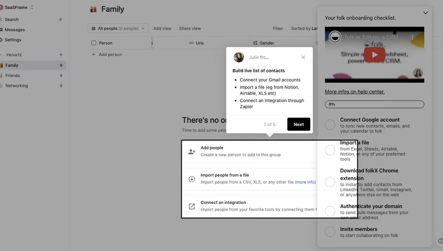
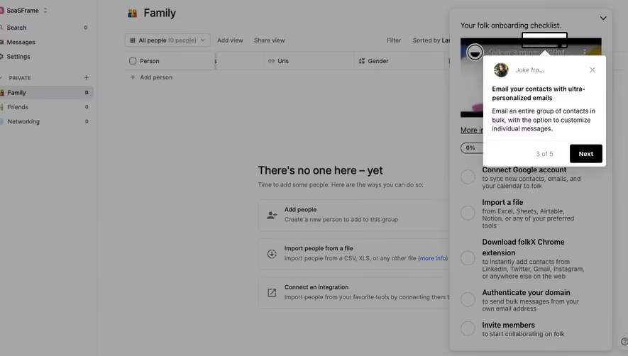
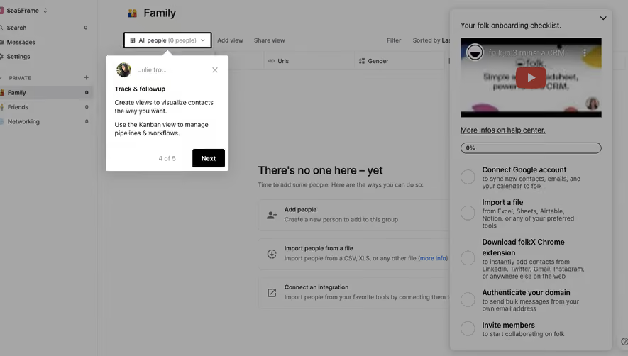
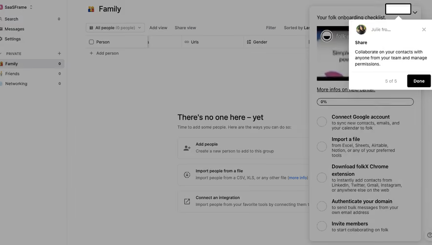
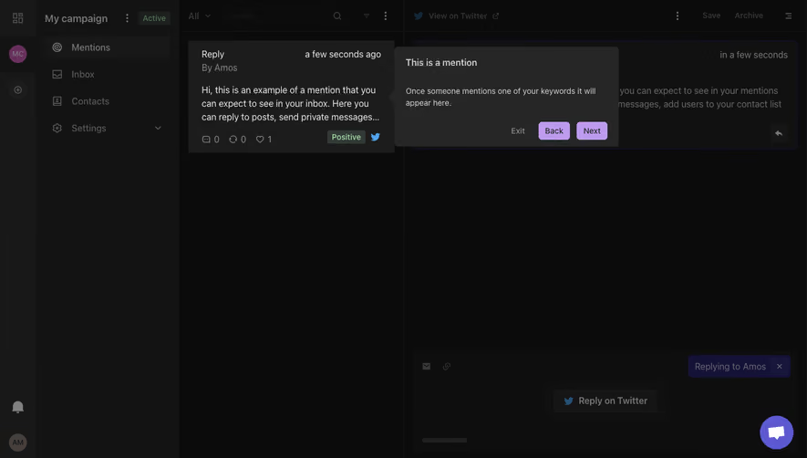
The SaaSFrame references show an opening invitation, a highlighted dashboard section, and a contextual help prompt. They illustrate different stages of guidance. Completing a tour is not the same as accomplishing work, so its value must be evaluated beyond the final tooltip.
Choose a task the tour can support
Start with what the user needs to do. A tour that labels every navigation item can teach vocabulary while leaving the person unsure where to begin. A focused sequence can explain the controls needed for a first report or presentation.
Decide whether the information is necessary now. Guidance about an advanced setting may be better placed when users encounter that setting. Do not interrupt the first session with every feature the product team wants to promote.
Use the user onboarding guide for the wider path to value. A tour is one possible aid within that path, not the whole activation model.
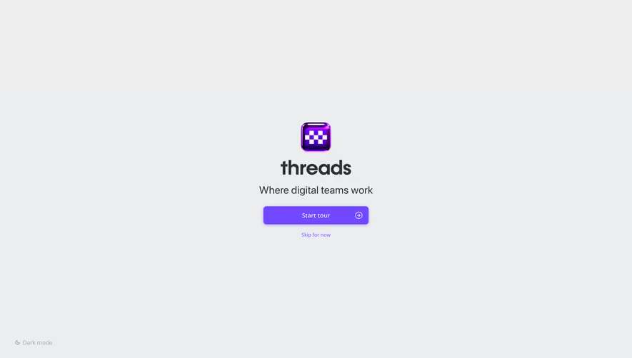
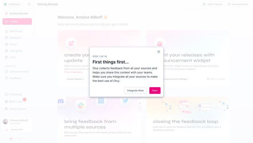
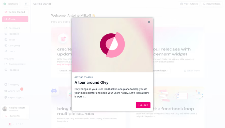
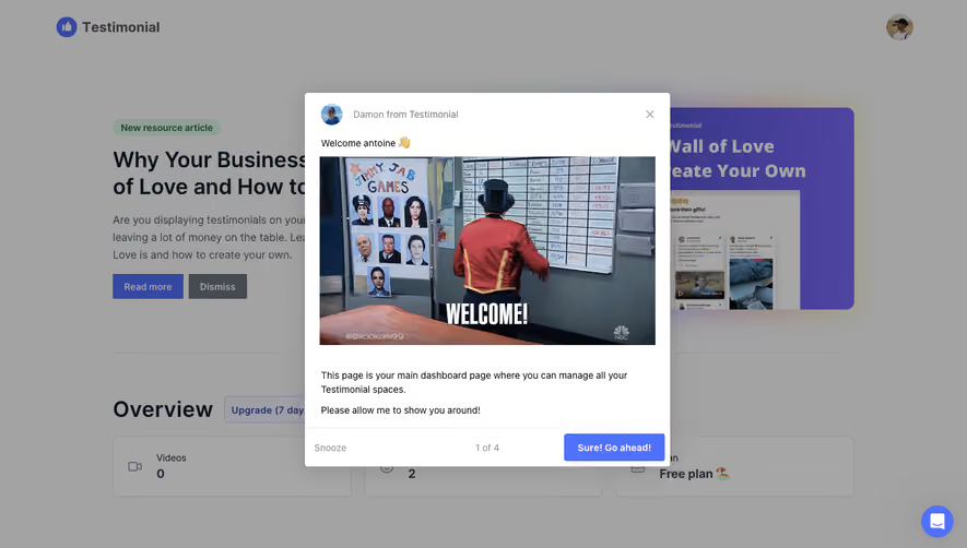
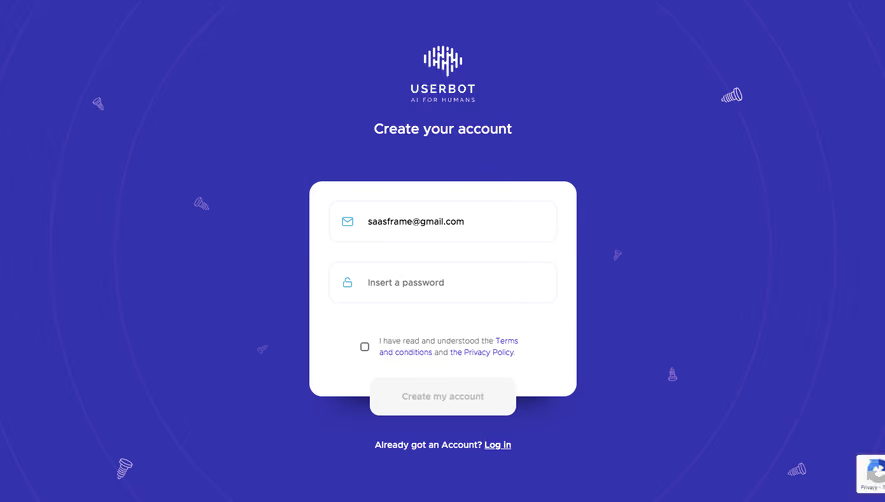
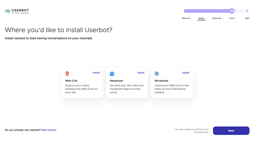
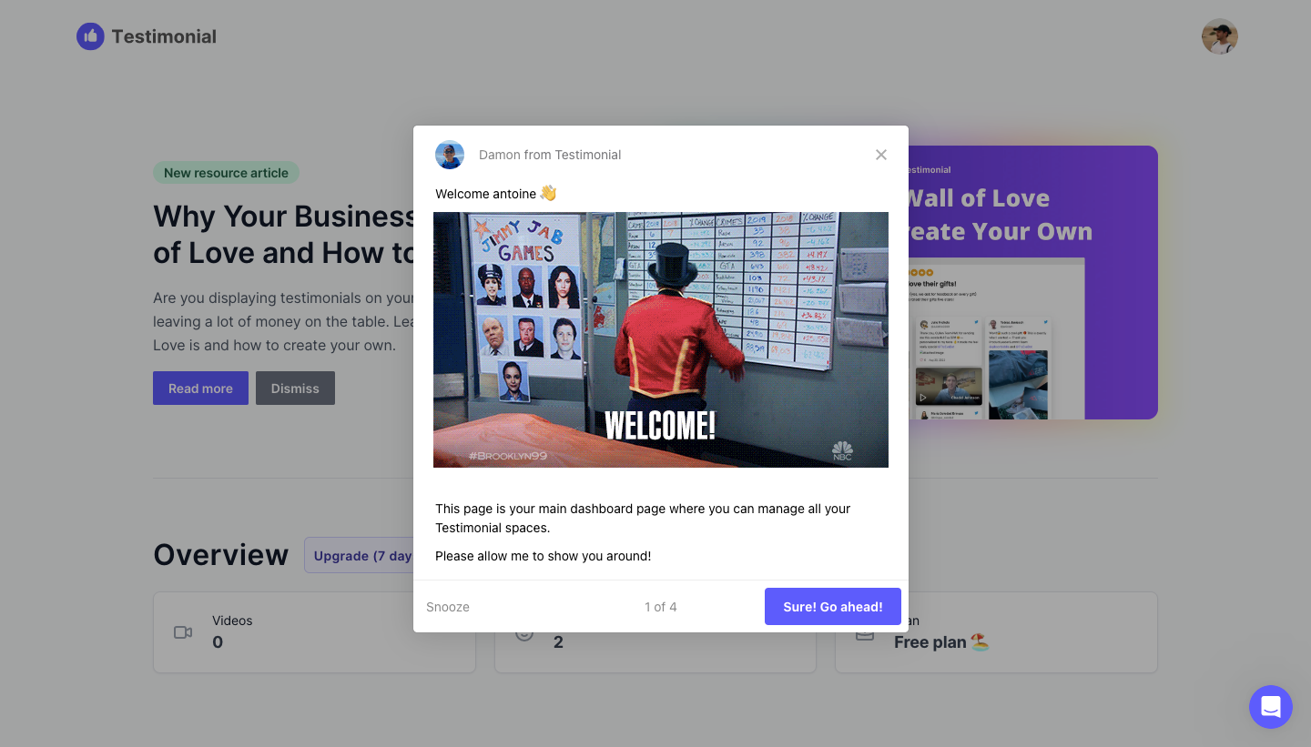
The Testimonial.to opening capture explains that the current page is a dashboard for managing testimonial spaces and asks to show the user around. It includes a progress count, a start action, and a snooze route.
This establishes what the sequence will cover before advancing. The user is not immediately forced through several unexplained overlays. The invitation also provides a way to defer attention.
When adapting the structure, keep the opening concise. Large media can add personality but compete with the actual task. Tell people what the tour helps them understand and preserve a usable route to the product.
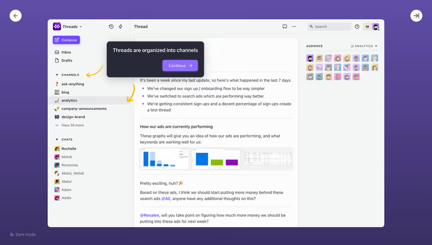
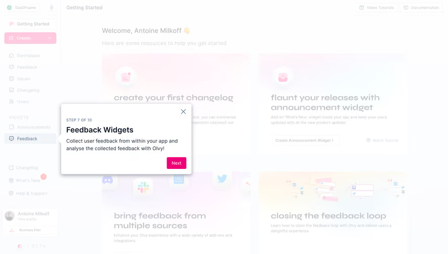
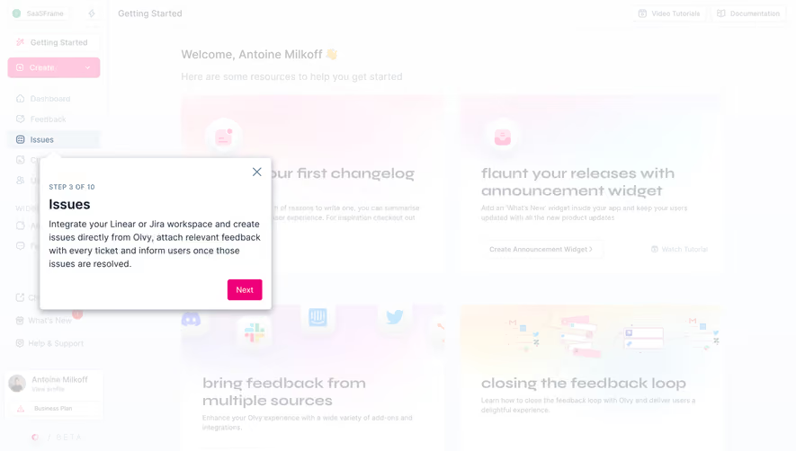
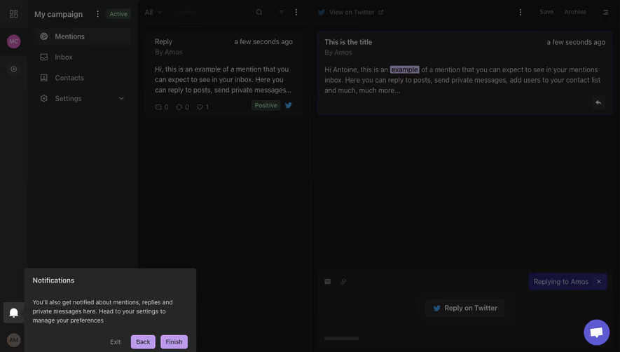
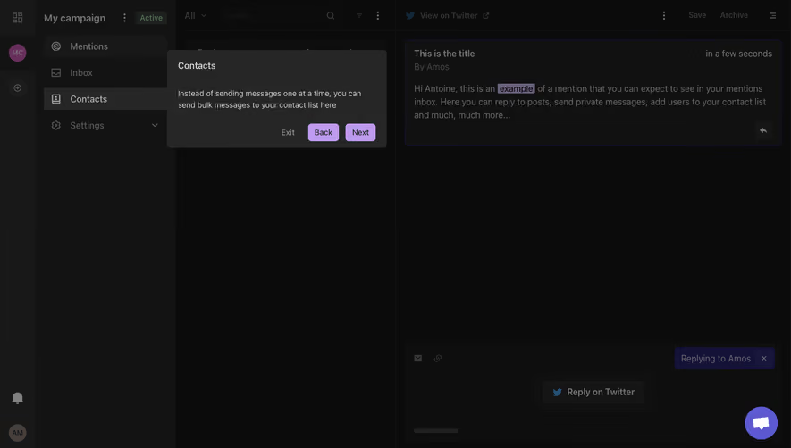
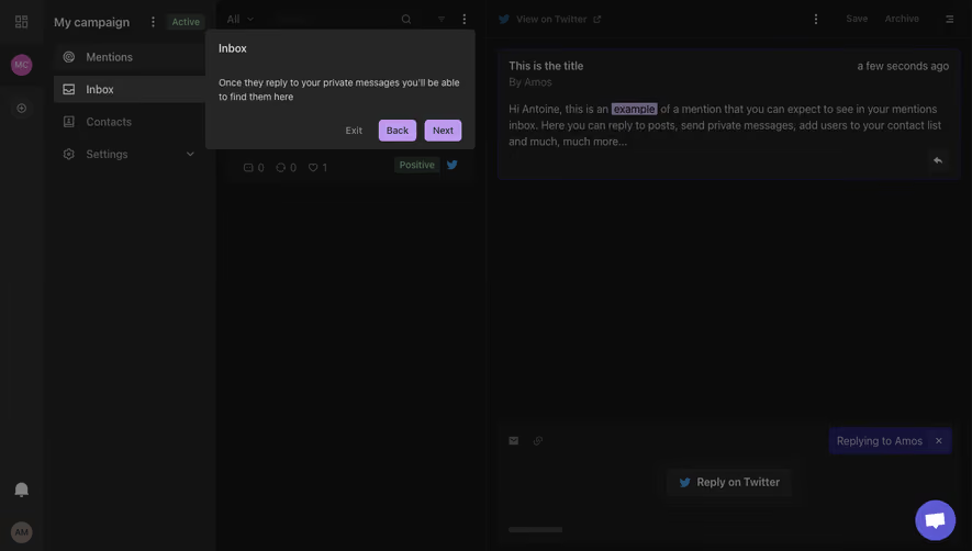
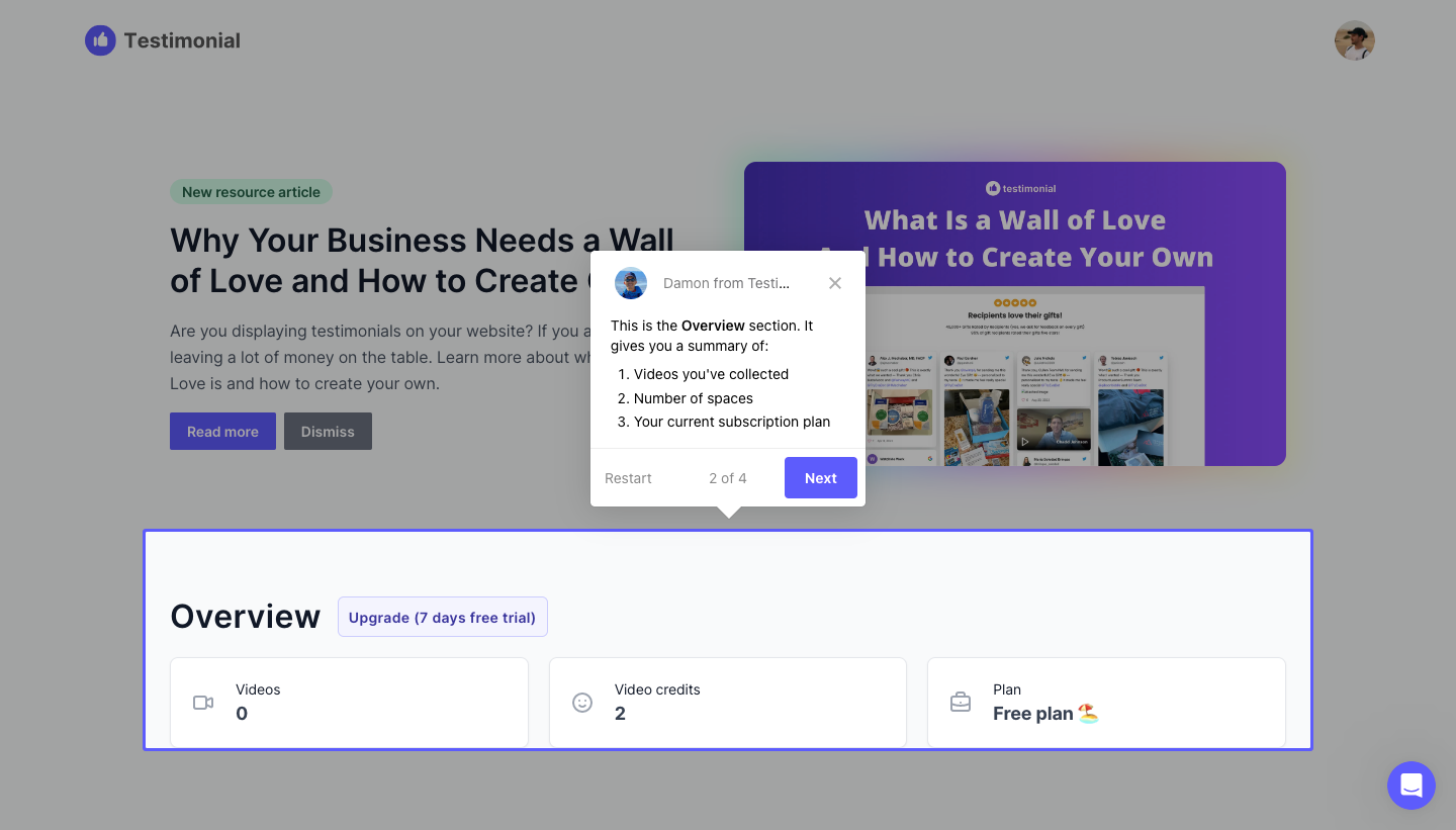
The Testimonial.to overview capture highlights a dashboard section and explains the summaries it contains. The tooltip displays a step count and provides next and restart controls.
The connection between target and explanation makes the information easier to place. Users can inspect the actual region while reading its purpose. This works only if the target remains visible and corresponds to the current account state.
Avoid describing controls that do not exist for the viewer's role or plan. If a target is absent, adapt or omit the step rather than positioning a tooltip against empty space.
Explain purpose rather than repeat labels
A tooltip that says Reports beside a Reports button adds little. Explain what users can accomplish there or why the control matters to the current task. Keep the content specific enough to guide an action.
Use one main idea per step. Several instructions inside one overlay increase the memory burden, especially if the user cannot interact with the target until the tour ends.
Where practical, let users perform the action being explained. Learning through a real object can be more useful than reading a sequence detached from work. Do not mark the step complete solely because the next button was clicked if actual task completion matters.
Make progress reflect the guidance sequence
A step count can help users estimate how much attention remains. It should describe the current tour, not imply completion of all onboarding requirements. If the sequence branches, use progress that remains accurate for the chosen route.
Back and restart controls can support review, but they should preserve product state. Restarting guidance should not recreate objects or repeat a previously completed external action.
Keep navigation labels clear. Next moves through guidance; an action such as Create report changes the product. Those consequences should not be hidden behind identical button text.
Let people dismiss and reopen guidance
A tour should account for users who already know the interface or need to accomplish something immediately. Make dismissal understandable and keep essential product functionality available when the guide is closed.
Deferral and permanent dismissal are different choices. If snoozing means the tour appears later, use a predictable rule and avoid repeating it at every visit. Reopening guidance should be discoverable where practical.
Do not require tour completion for ordinary access unless the product has a real dependency. Educational overlays should not behave like unresolved account errors.
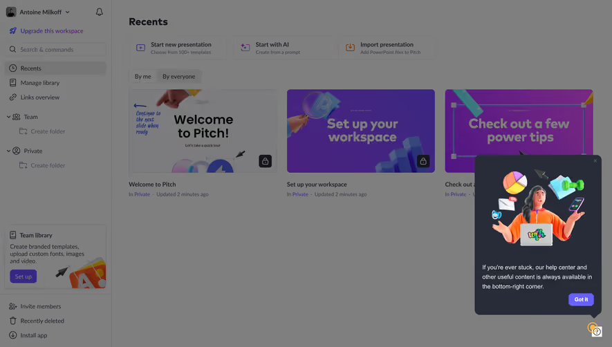
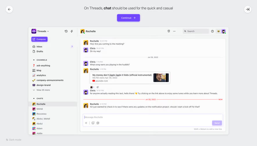
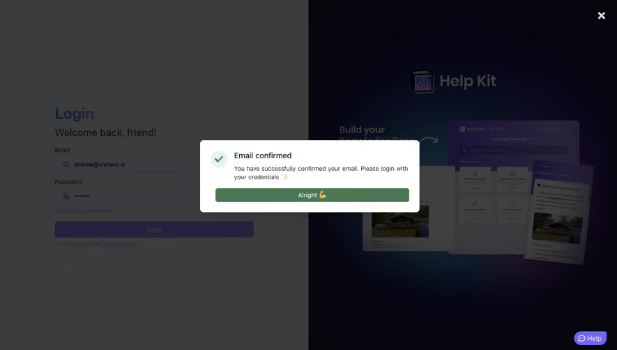
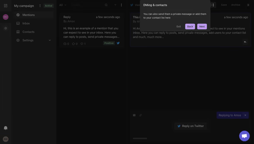
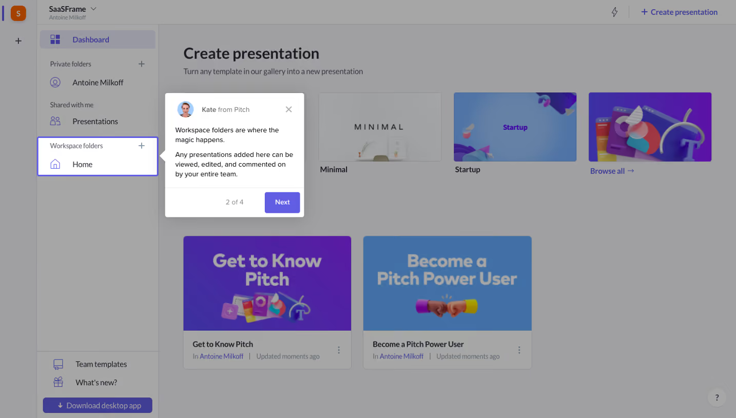
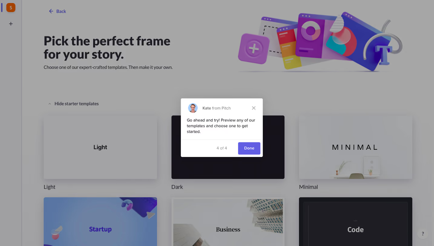
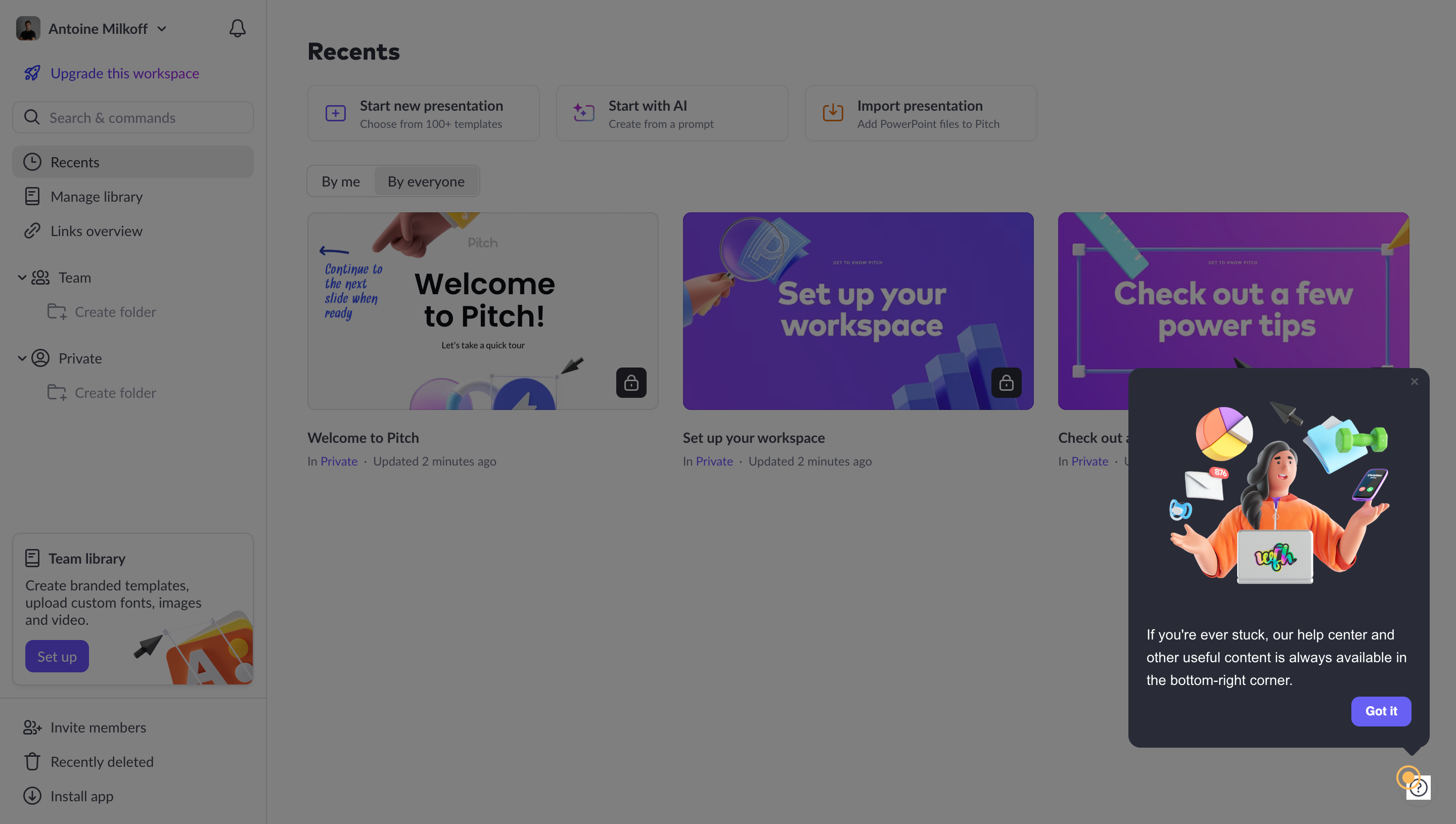
The Pitch capture presents a contextual prompt pointing users toward help resources in the lower-right area. The surrounding screen includes starter presentations and workspace actions.
This provides a durable help route rather than trying to explain every capability in the opening sequence. A product tour can introduce where to find support, then allow users to explore at their own pace.
Keep the help destination useful after the prompt disappears. The control needs a recognizable label or accessible name, and its location should remain usable on smaller screens.
Handle viewport changes and missing targets
Tooltips and highlights need to remain connected when the user scrolls, resizes, or opens another panel. A detached arrow can make the instruction misleading. Decide how the sequence responds to navigation and layout changes.
On small screens, the highlighted target may be outside the current viewport. Bring it into view appropriately or present a different explanation. Do not let the overlay cover the control users are expected to inspect.
If the product state changes during the tour, reassess the next step. A completed setup action can remove the original empty-state target. The guidance should follow confirmed state rather than a fixed screenshot sequence.
Preserve accessible interaction
Provide keyboard access to tour controls and any target the user must operate. Use visible focus and an appropriate reading order. A focus trap must not prevent the task the step asks the person to complete.
Communicate the target and explanation through text, not only a visual spotlight. Essential information should remain understandable without animation or pointer positioning.
At increased zoom, ensure the tooltip content and controls remain reachable. Long instructions should not overflow beyond the visible screen or hide their dismissal route.
Validate learning and repeated use
Ask users to perform the task after the tour and explain where they would return for help. This tests whether the guidance supported understanding rather than only attracted clicks.
Include experienced users, invited members, restricted plans, missing targets, interrupted sequences, and mobile layouts. Measure unnecessary interruption alongside successful learning.
Use tour completion as one signal among others. A high finish rate can reflect useful guidance, but it can also mean people rapidly clicked through to recover access to the product.
Frequently asked questions about product tours
How many steps should a tour contain?
Use the steps needed for one coherent learning task. The relevance and effort of each step matter more than a universal target count.
Should users be able to skip a tour?
Usually yes when the sequence is educational rather than a real prerequisite. Keep the product usable and provide a route to reopen guidance.
Is a completed tour evidence of activation?
No. Activation should correspond to a meaningful product outcome. Observe whether users can accomplish and repeat the task afterward.