Tooltip
4
Provide on-demand help with SaaS Tooltip patterns. Discover how to use hover-triggered hints to explain icons, complex terminology, or hidden features without cluttering the UI.

A tooltip is a short contextual explanation associated with a control, icon, value, or other interface element. It helps users understand something without permanently adding another block of text to the screen. In SaaS products, tooltips often identify unfamiliar icons, clarify a metric, explain a calculated value, or provide a small piece of optional guidance.
The benefit is compactness; the risk is hiding information people need to complete the task. Good tooltip design makes the explanation available through appropriate input methods, readable long enough, and easy to dismiss. This guide analyzes captured examples from Logbook and Café to compare a date explanation with a profile-photo hint. Their visible callouts support layout and wording analysis, but a still image cannot establish whether they appear on hover, focus, or another trigger.
A tooltip works best when the underlying interface remains understandable without opening it. A familiar label can have an optional definition; a calendar date can have an explanation of its relationship to another date. Required instructions, critical consequences, and field errors generally need a more persistent presentation.
Ask whether users must discover the tooltip before they can make a correct decision. If so, the control may need a clearer label or visible supporting text. The pattern should reduce visual density while preserving comprehension, not conceal the product's basic rules.
For icon-only controls, the tooltip can reinforce recognition, but the control still needs an accessible name. A screen reader should not depend on seeing a floating text box to identify the action. Keep the visible hint and the underlying action label consistent.
Distinguish a tooltip from an interactive popover. If the content contains a button, link, or form field that users must operate, it needs an interaction model that permits reaching that content. Calling it a tooltip does not remove the need to manage focus and dismissal correctly.
The captured Logbook Pick a Deadline screen places a calendar in a centered dialog. March 2023 is visible, with different treatments on the 13th and 22nd. A dark callout below the 22nd explains that the date is seven business days after the estimated deadline. A Confirm button remains at the bottom of the dialog.
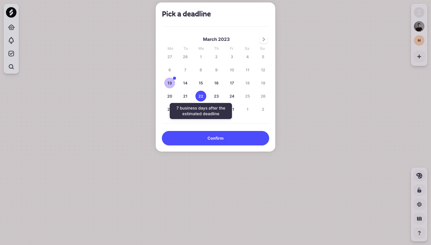
The explanation adds information that the calendar's color states cannot express by themselves. It relates a candidate date to an estimate using a business-day interval. This is a useful distinction for calculated values: the tooltip should explain what the value means, not simply display the same value at a larger size.
The screenshot does not establish how the estimate is calculated, which holiday calendar applies, or what triggers the callout. Do not infer those rules from the visible interval. In an implementation, define the calculation and expose enough context for users to evaluate it when it affects their commitment.
The callout overlaps part of the calendar below the highlighted date. That illustrates a placement tradeoff: proximity helps users connect the explanation to its target, while overlap can hide adjacent options. Let users dismiss the explanation without forcing a different date selection.
The separate Confirm action also matters. Exploring a date and reading its explanation should be distinguishable from committing the deadline. Keep the explanation available during comparison, and make the final selected date understandable after the popup disappears.
The captured Café Profile Setup screen shows an avatar placeholder with a small edit control at its lower right. A white callout points toward that area and explains that teammates might not recognize the user without a picture. Name, position, office, and team fields remain visible around it, with Back and Next at the bottom.
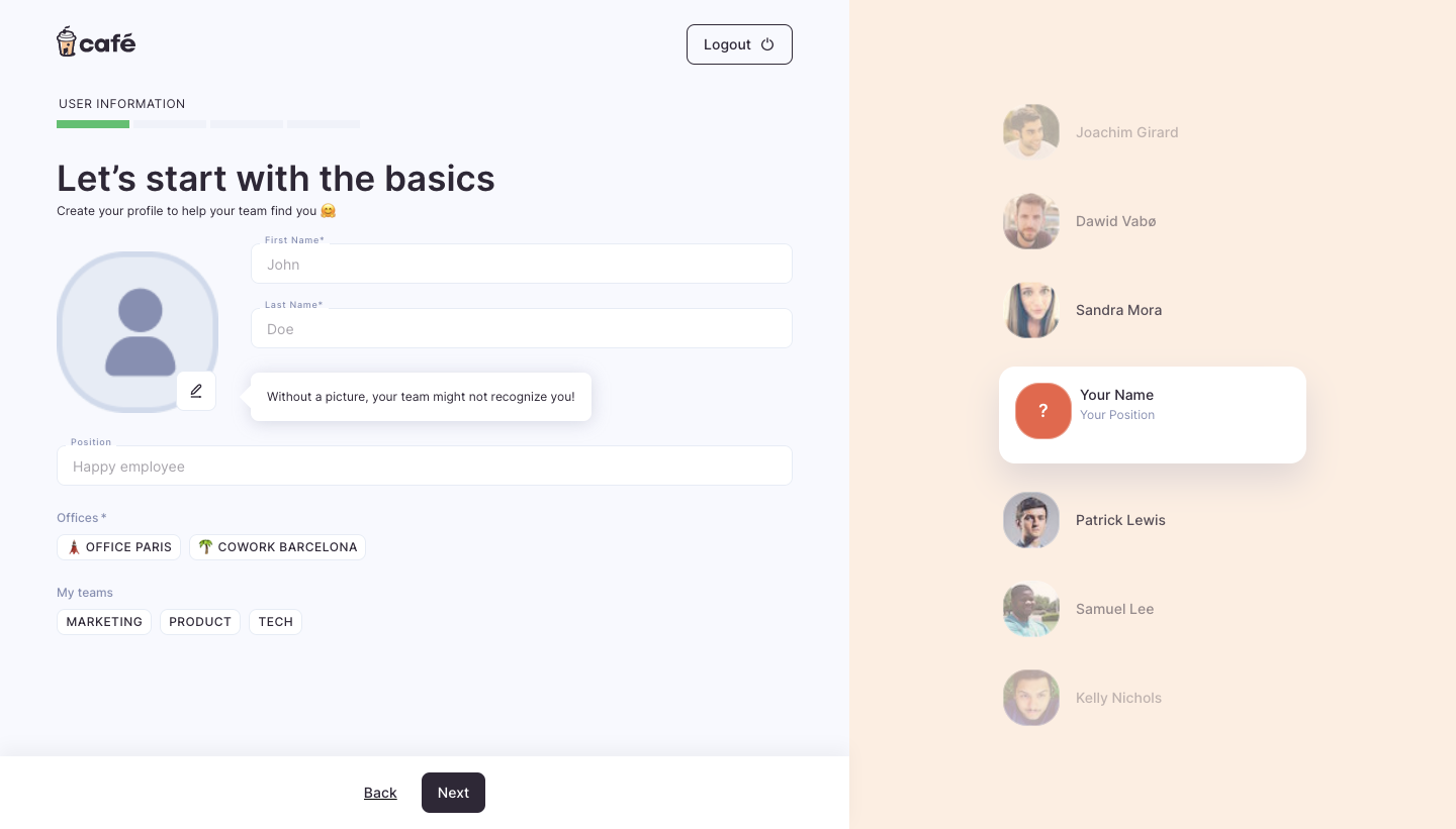
The wording gives a reason for the action rather than merely saying upload a picture. It connects the photo to recognition within a team directory, which is also represented visually on the right of the screen. This makes the guidance specific to the onboarding task.
However, motivation and requirement are different messages. The capture does not establish whether a photo is required. If it is optional, the interface should let users continue without presenting the omission as an error. If required, that rule should be visible without needing to discover a transient hint.
The pointer helps associate the callout with the avatar control. Its broad width also uses substantial space beside the form. On a narrow layout, the same sentence may wrap into a larger overlay. Adapt placement and width so the hint does not obscure the name fields or become detached from its target.
This is a contextual hint visible in a screenshot, not proof of a standards-compliant tooltip implementation. Inspect the actual trigger, keyboard availability, and dismissal behavior before borrowing the interaction wholesale.
Begin with the question users have at that element. What does this icon do? Why is this date different? What does this metric include? A concise answer is more useful than a generic help message that makes users search elsewhere for the real explanation.
For an icon, an action label may be sufficient. For a calculated metric, explain its scope or unit. For a configuration control, explain the consequence that is not obvious from the label. Do not turn every tooltip into a miniature documentation article.
Avoid repeating the visible label without adding meaning. A tooltip on a Revenue label that says Revenue does little. A useful explanation might define the relevant time period or included transactions, provided those rules are accurate for the product.
Keep terminology consistent with the surrounding interface. If the tooltip introduces an unfamiliar internal name, it may increase uncertainty. Long explanations should move into persistent supporting text, a disclosure, or documentation, with an appropriate interaction for any link.
Place the explanation close enough to identify its subject while preserving the target's visibility. A pointer can reinforce the relationship, but the position and wording should remain understandable if the pointer is subtle or absent.
Dense toolbars and data tables require particular care. A tooltip that appears between two neighboring icons can be misattributed. Tie the overlay to the active target and update it predictably as users move through controls.
Do not cover the target's label, selected state, or essential comparison data unnecessarily. Logbook's date callout makes the interval clear, but overlapping dates still need a route back to unobstructed inspection. Placement is part of the task, not just a decorative preference.
If the tooltip follows a moving element, such as a chart point, keep it stable enough to read. Frequent repositioning can make a short explanation difficult to consume. Consider a fixed detail area when the user needs to compare many values.
Hover alone excludes users who operate the interface without a mouse. A focusable control should expose relevant help through keyboard focus where appropriate, and the explanation should not steal focus merely to become visible.
On touch screens, there may be no reliable hover state. If the information matters, provide a visible help trigger, inline text, or another suitable route. Avoid making the first tap show a hint and the second tap perform a consequential action unless the interaction is clearly designed and tested.
For noninteractive labels or chart regions, decide how users can reach the explanation without creating an excessive sequence of tiny focus targets. A chart description or persistent selected-point details may be more practical than hundreds of separate tooltips.
Disabled controls require special consideration because some implementations cannot receive focus. Explain the reason they are unavailable in a reachable location. Users should not need to hover over a muted button to discover a prerequisite or permission restriction.
W3C's explanation of content on hover or focus discusses making applicable additional content dismissible, hoverable, and persistent. In practice, avoid content that vanishes while users move toward it or that covers information they cannot uncover without changing focus.
Allow enough time to read without an arbitrary short timeout. Users may magnify the screen or move a larger pointer away from the text. The overlay should not disappear simply because reading takes longer than expected.
Provide dismissal without forcing users to activate the target or navigate elsewhere. After dismissal, avoid immediately reopening the same tooltip while the user is still trying to inspect the obscured content. Define when it becomes eligible to appear again.
The W3C tooltip pattern page, currently marked as work in progress, describes focus remaining on the trigger, dismissal with Escape, and a descriptive relationship to the tooltip. It also distinguishes tooltips from content containing focusable controls. Use that distinction when selecting the interaction model.
A tooltip is not a substitute for a field label. Users need to identify the field while entering and reviewing values. If the label disappears after typing and only returns on hover, the form becomes harder to understand.
Validation messages should tell users what needs correction and remain associated with the affected field. Do not hide the only explanation inside a tooltip on a tiny error icon. The correction path should work without precision pointing.
Likewise, important permission, billing, or deletion consequences deserve a presentation users can inspect before committing. Supplementary definitions can appear in a tooltip, but the decisive rule should not rely on accidental discovery.
Café's photo hint is suited to optional encouragement if the workflow remains understandable without it. Logbook's interval explanation is suited to contextual clarification if the selected deadline and required calculation rules remain available elsewhere when necessary. Evaluate the information's role before choosing its visual treatment.
Test tooltips near every viewport edge. They should adjust placement without extending offscreen, clipping against a parent container, or pointing to the wrong element. Long localized strings may need more height than the original English text.
At increased zoom, the user sees less of the surrounding screen. Keep the target and explanation close enough to follow while leaving a way to dismiss the overlay. A placement that looks spacious on a desktop screenshot can become obstructive under magnification.
Use readable text, sufficient contrast, and sensible line lengths. A small tooltip is not permission to use tiny text. Avoid truncating the very explanation users opened the tooltip to read.
For tooltips inside a Modal, test stacking and dismissal together. Closing a hint should not unexpectedly close the underlying dialog. Ensure the popup remains associated with its trigger even when the dialog scrolls.
Tooltips can improve a dense interface, but widespread reliance on them may reveal unclear icons or terminology. If users repeatedly open the same hint, consider improving the visible label or providing persistent context rather than adding more hidden explanations.
Review whether the tooltip actually answers the uncertainty. A long pause after opening can mean the explanation is difficult, not that the user is engaged. Observe whether users proceed correctly and can explain the action's meaning afterward.
Test the interface with tooltips unavailable. This exposes which information has become essential despite being hidden. The underlying task should remain usable, with alternative access to information that is necessary for completion.
Use a tooltip for short supplementary information that does not need to remain visible during the task. Choose inline help for required instructions, important consequences, or explanations users must consult repeatedly while entering information.
If users need to focus and operate content inside the popup, choose an interaction pattern that supports that behavior, such as an appropriate nonmodal dialog or disclosure. A conventional tooltip does not receive focus.
Unfamiliar icon controls benefit from an understandable label, but a tooltip does not replace their accessible name. Consider a visible text label when the action is important or difficult to recognize.
Provide help through an intentional touch interaction or a persistent alternative. Do not depend on desktop hover behavior being available. Check that opening help does not accidentally perform the underlying action.
Logbook uses a contextual callout to explain a deadline's relationship to an estimate. Café places a photo-related hint beside an avatar edit control. Both demonstrate visible association and wording; neither screenshot proves keyboard behavior or the trigger mechanism.
Explore these captures for how they connect a short explanation to a specific decision. The strongest tooltip removes uncertainty while keeping the main task understandable, accessible, and easy to continue.