Design with AI
Generate a new design based on this screen using your own content.
# Design from Reference: Zencal Welcome Email
Create an original, high-fidelity visual design inspired by the reference. Prioritize composition, typography, colors, spacing, and component styling over technical implementation.
## Reference
- **Product:** Zencal
- **Category:** Welcome Email
- **Screenshot:** https://cdn.prod.website-files.com/5e9dc792e1210c5325f7ebbc/6acb6a5103442b22fb62ac1d_6acb696eecc5bd4d930a14d9_cms-c01eac6ab792cb66e9b27d1e.webp
Analyze the screenshot first. If inaccessible, request it rather than guessing.
## Content
{{content.instructions}}
{{content.data}}
Preserve essential messaging and factual accuracy. Adapt structure and copy length for visual balance; never invent product claims.
## Visual Design
### Overall aesthetic
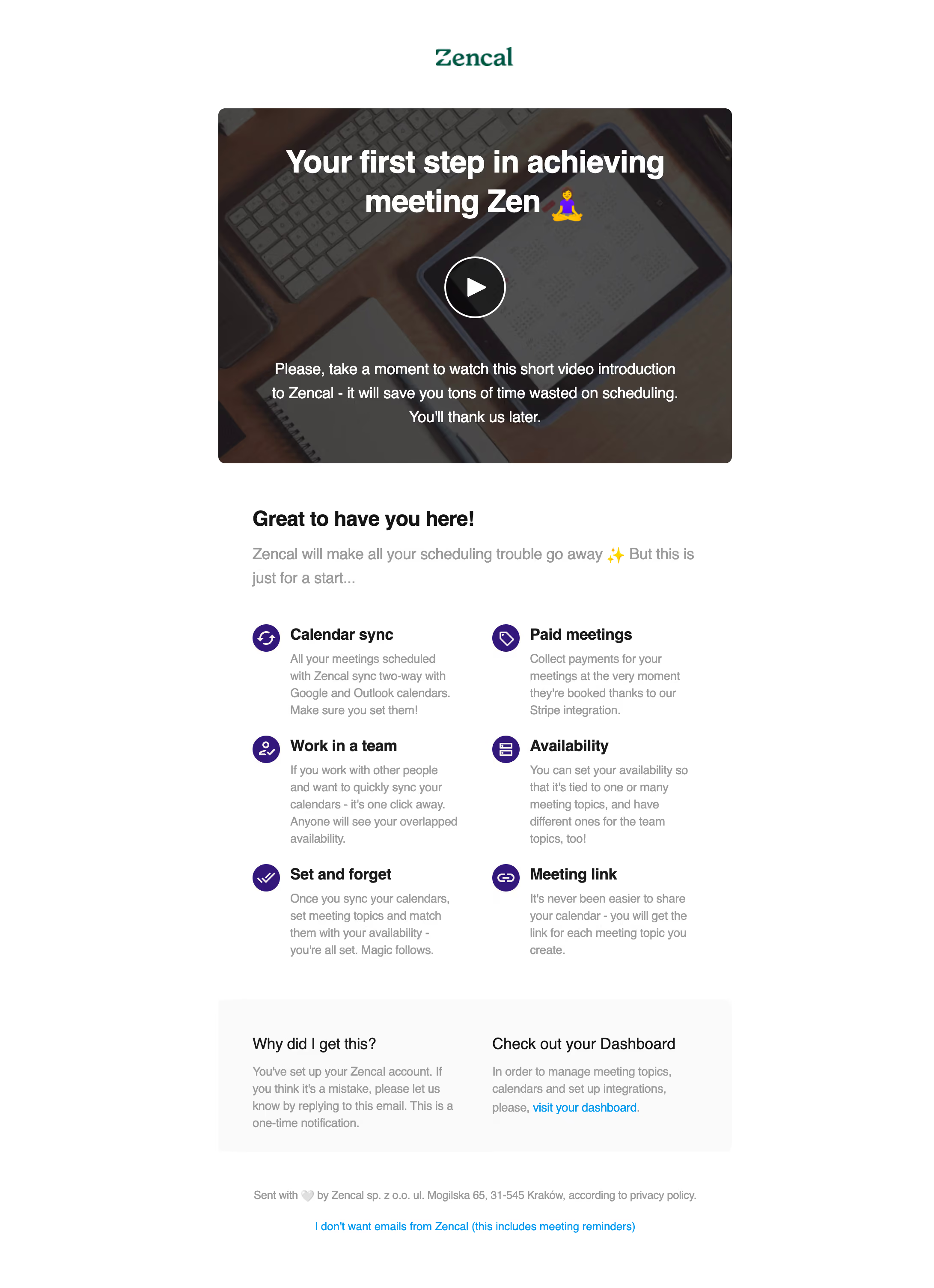
- **Style:** White welcome email with a large video-introduction image and a structured feature overview.
- **Character:** Dark headings, gray body copy, purple circular icons, and green wordmark.
### Page composition
- **Canvas:** 2182 × 3008 image px; CSS estimates assume an unverified 2× capture.
- **Column:** Approximately 1200 image px / 600 CSS px wide.
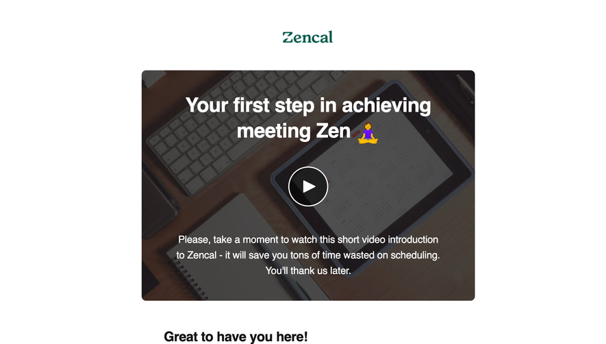
- **Header:** Centered wordmark above a large rounded video poster.
- **Hero poster:** Approximately 1200 × 830 image px, darkened desk photograph with white headline, play symbol, and supporting copy.
- **Body:** Welcome heading, introductory sentence, then six features in a two-column grid.
- **Footer:** Pale panel with notification explanation and dashboard link, followed by small legal text and unsubscribe.
### Information hierarchy
- **Primary:** Video-poster headline and central play control.
- **Secondary:** Welcome heading introduces the feature grid.
- **Feature hierarchy:** Purple icon and bold title precede muted paragraph.
- **Utility:** Dashboard and unsubscribe links use bright blue, remaining subordinate.
### Typography
- **Family:** Arial-like sans serif for content; serif-style branded wordmark; exact families unverified.
- **Hero title:** Approximately 40 CSS px, bold, line-height 46px under assumed 2×.
- **Welcome heading:** Approximately 26px, bold.
- **Feature titles:** Approximately 20px, bold.
- **Intro:** Approximately 18–20px with 28px line-height.
- **Feature copy:** Approximately 14–16px with 20–22px line-height.
- **Footer:** Approximately 12–14px.
- **Precision:** Font metrics and 2× scale are estimates.
### Colors & surfaces
- **Canvas:** #FFFFFF.
- **Footer panel:** #FAFAFA.
- **Muted body text:** Approximately #9B9B9B.
- **Primary headings:** Near-black.
- **Photo overlay:** Darkened photographic shades include #464543, #454442, and #444341.
- **Accent:** Deep purple feature icons and green wordmark; exact flat tokens unverified.
- **Links:** Bright blue.
- **Precision:** Dominant sampled dark shades belong to photography, not general UI surfaces.
### Components
- **Video poster:** Rounded corners around 8 CSS px under assumed 2×.
- **Play control:** Large white outlined circle with white triangle.
- **Feature icons:** Approximately 32 CSS px diameter, purple with white line glyphs.
- **Feature grid:** Two columns with icon beside text and three rows.
- **Footer information:** Two side-by-side text groups on a very light-gray rounded panel.
- **Links:** Inline dashboard and centered unsubscribe; no separate large CTA button visible.
### Visual rhythm
- **Alignment:** Poster and footer panel share width; body text is inset within that width.
- **Spacing:** Broad gap after poster, then compact title/paragraph grouping for each feature.
- **Grid:** Equal columns and repeated icon positions create a predictable rhythm.
- **Contrast:** Photo hero is dense while the body remains airy and white.
### Responsive
- **Observed:** Single desktop email capture.
- **Recommendation:** Use a fluid email column, scale the poster, and stack feature/footer columns on narrow screens.
- **Readability:** Keep body copy legible rather than shrinking the complete email.
- **Video:** Use a linked poster if the destination cannot embed video.
### Adaptation guidance
- **Preserve:** Welcome framing, video introduction, six-feature overview pattern, and quiet utility footer.
- **Content:** Match the number of features to supplied material.
- **Brand:** Substitute actual wordmark and icons consistently.
- **Claims:** Do not transfer scheduling/payment capabilities into unrelated products.
Use this context to reproduce the reference's visual language: layout, typography, colors, spacing, borders, radii, and distinctive elements. The screenshot takes priority if descriptions conflict.
## Direction
{{preferences.fidelityInstructions}}
## Output
{{output.instructions}}
Deliver a polished, cohesive design with precise alignment, hierarchy, and spacing. Produce the requested visual artifact, not just a description. If unsupported, explain the limitation.