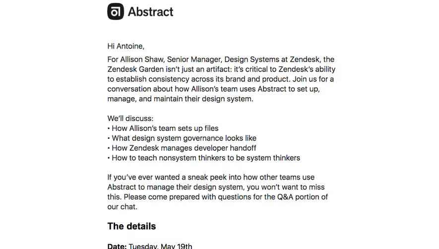
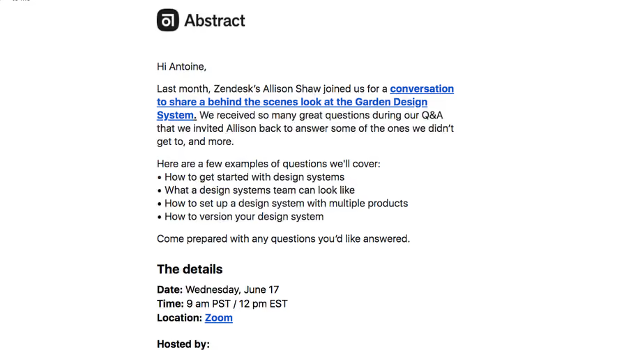
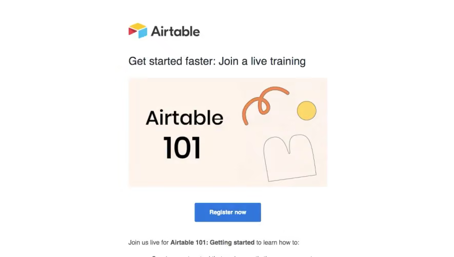
Design with AI
Generate a new design based on this screen using your own content.
# Design from Reference: Zapier Webinars Emails
Create an original, high-fidelity visual design inspired by the reference. Prioritize composition, typography, colors, spacing, and component styling over technical implementation.
## Reference
- **Product:** Zapier
- **Category:** Webinars Emails
- **Screenshot:** https://cdn.prod.website-files.com/5e9dc792e1210c5325f7ebbc/62ecad7d51782c26533fcc53_1659677538128-5eb3d796ca30b354d257ac81_screencapture-mail-google-mail-u-0-2020-05-07-11_39_35.webp
Analyze the screenshot first. If inaccessible, request it rather than guessing.
## Content
{{content.instructions}}
{{content.data}}
Preserve essential messaging and factual accuracy. Adapt structure and copy length for visual balance; never invent product claims.
## Visual Design
### Overall aesthetic
- **Character:** Bold webinar email with a white centered column, pale-gray outer gutters, orange gradient headline and bright blue registration actions.
- **Evidence and scale:** Screenshot measures 1311 × 1999 image pixels. Sizes describe image pixels; email CSS scale and font identities are unverified.
### Page composition
- **Frame:** White column approximately 750px wide centered within gray gutters, with a thin coral outline visible around its edges.
- **Hero:** Dotted coral ornament, centered brand, small event pill, large three-line headline, event-time line and blue registration button.
- **Body:** Left-aligned greeting and explanation lead into a bold blue event link, three-item agenda list and a short closing line.
- **Repeated conversion:** Second centered registration button appears before a recording-availability note.
- **Footer:** Gray circular social icons, hiring link, company/address text, unsubscribe/contact links and a gray brand/tagline finish the email.
### Information hierarchy
- **Headline:** Heavy orange-gradient display text dominates the top, making the event subject the first focal point.
- **Registration:** Identical blue buttons repeat above and below the explanatory content.
- **Agenda:** Three bullets provide a compact scan of the webinar's promised topics.
- **Footer:** Smaller gray elements and separated links reduce utility content's prominence.
### Typography
- **Hero title:** Approximately 56px captured size, heavy sans-serif with 68px leading.
- **Event line:** Around 26px regular; body copy around 20px with 30px leading.
- **Buttons:** Approximately 20px bold white labels.
- **Footer:** Around 16px for legal/address/utility text; the small event pill is around 15px bold. Exact families and computed weights remain unverified.
### Colors & surfaces
- **Measured foundation:** White #FFFFFF and outer gray #F2F2F2 dominate.
- **Measured action:** Blue #146BF6 is prominent in buttons and event/utility links.
- **Measured warm accent:** Coral #CE5044 appears in brand/border/decorative pixels; headline transitions through orange/yellow/coral tones.
- **Text:** Black body copy contrasts with gray address/social/footer elements; no heavy card treatment surrounds individual paragraphs.
### Components
- **Event pill:** Small light-gray rounded capsule with dark bold label.
- **Registration buttons:** Approximately 204 × 64px captured size, blue fill, 12px radius and centered white label.
- **Agenda list:** Three standard round bullets with hanging indents and multi-line copy.
- **Top ornament:** Three rows of evenly spaced small coral dots span much of the column width.
- **Footer icons:** Small gray circles with white social/feed symbols, centered in a short row.
- **Brand close:** Gray wordmark and brief tagline sit below utility links with ample surrounding whitespace.
### Visual rhythm
- **Hero spacing:** Distinct vertical gaps separate ornament, logo, event label, title, time and button.
- **Reading inset:** Body text uses approximately 40px side padding within the white column.
- **Conversion rhythm:** Registration appears before detailed reading and repeats after the agenda.
- **Footer separation:** Large blank intervals detach social and legal content from the invitation.
### Responsive
- **Observed limit:** One tall email rendering is visible; mobile wrapping and email-client behavior are unobserved.
- **Recommended sizing:** Use a fluid capped column, reduce hero type on phones and retain comfortable side padding.
- **Recommended actions:** Keep registration buttons easily tappable and allow time-zone text to wrap.
- **Recommended content:** Preserve agenda bullets and real text, scaling decoration independently of copy.
### Adaptation guidance
- **Preserve the sequence:** Event subject/time/action first, then rationale and agenda, followed by repeated registration.
- **Use color deliberately:** Warm brand/display treatment and a contrasting blue CTA provide clear hierarchy.
- **Implementation:** Use email-safe buttons, accessible links and meaningful text structure. Event date, agenda and performance claims are historical captured copy and require separate verification.
Use this context to reproduce the reference's visual language: layout, typography, colors, spacing, borders, radii, and distinctive elements. The screenshot takes priority if descriptions conflict.
## Direction
{{preferences.fidelityInstructions}}
## Output
{{output.instructions}}
Deliver a polished, cohesive design with precise alignment, hierarchy, and spacing. Produce the requested visual artifact, not just a description. If unsupported, explain the limitation.