Generate a new design based on this screen using your own content.
Thank you! Your submission has been received!
Oops! Something went wrong while submitting the form.
# Design from Reference: WorkOS Pricing Page
Create an original, high-fidelity visual design inspired by the reference. Prioritize composition, typography, colors, spacing, and component styling over technical implementation.
## Reference
- **Product:** WorkOS
- **Category:** Pricing Page
- **Screenshot:** https://cdn.prod.website-files.com/5e9dc792e1210c5325f7ebbc/6acb6addbf2e69a0c03b6a74_6acb6a0eddc9482c9278543b_cms-7ef5b0207a3d2f8df11e36b3.webp
Analyze the screenshot first. If inaccessible, request it rather than guessing.
## Content
{{content.instructions}}
{{content.data}}
Preserve essential messaging and factual accuracy. Adapt structure and copy length for visual balance; never invent product claims.
## Visual Design
Use this context to reproduce the reference's visual language: layout, typography, colors, spacing, borders, radii, and distinctive elements. The screenshot takes priority if descriptions conflict.
## Direction
{{preferences.fidelityInstructions}}
## Output
{{output.instructions}}
Deliver a polished, cohesive design with precise alignment, hierarchy, and spacing. Produce the requested visual artifact, not just a description. If unsupported, explain the limitation.
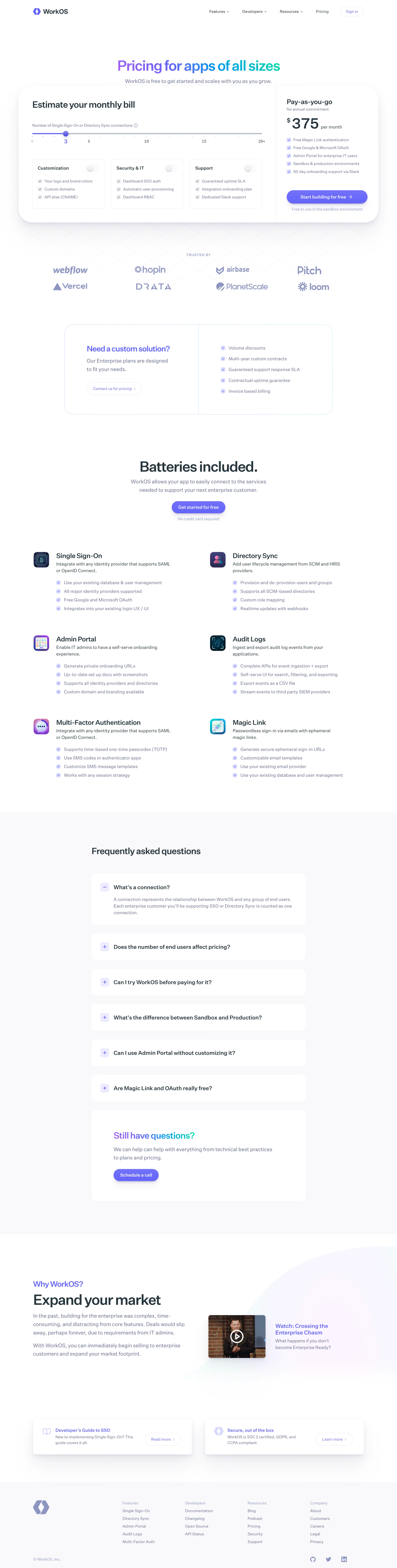
WorkOS’s pricing page embodies a crisp, ultra-modern aesthetic with a professional tone, balancing approachability and enterprise gravitas. The minimalist design leans on generous white space, subdued gradients, and sharp edges, creating a visual clarity that avoids clutter while reflecting technological sophistication.
Layout and Structure
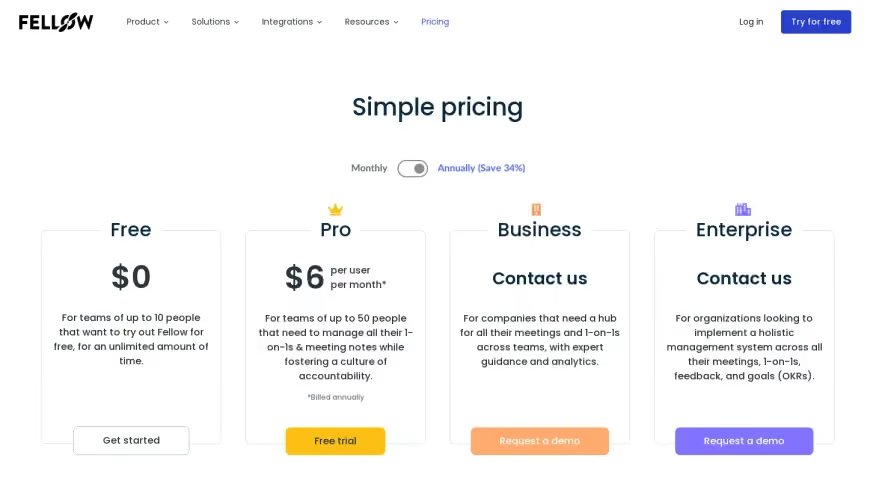
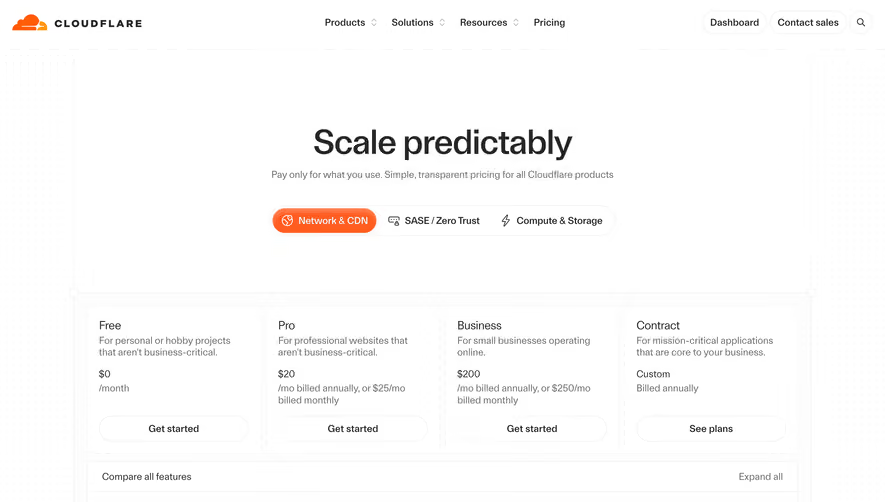
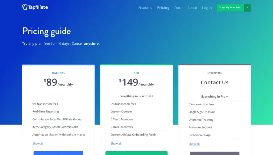
This page flows logically from a succinct hero section—with an instant overview of the free tier—directly to meticulously organized pricing tables. Features are presented in a modular card layout, making comparisons seamless. Absent is the usual carousel of testimonials, replaced by compact footnotes and a support prompt that subtly reassures users at the right moment. The page winds down with a utility-rich footer, quietly inviting deeper exploration without distraction.
Visual Elements
Flat icons and crisp vector illustrations replace photography or video, emphasizing simplicity and software-centric clarity. Subtle micro-animations, like hover effects and button highlights, add interactivity without overwhelming motion. The overall restraint in visuals ensures that content and pricing options remain the focal point.
Color Palette and Typography
A cool, trust-evoking palette of white, soft grays, and blunted blues establish a calm foundation. Judicious pops of deep blue and electric cyan cue action and guide focus. Typography is set with a geometric sans-serif (like Inter or similar), leveraging varied weights and ample line-spacing for hierarchy and legibility.
User Experience Patterns
Navigation remains persistent but minimal, supporting frictionless exploration. Primary CTAs are instantly recognizable thanks to bold color use and concise copy. Collapsible comparison details and clear “Contact Sales” triggers streamline decision-making for different user personas. Responsive layout ensures seamless mobile usability.
Unique or Notable Design Choices
A standout feature is clarity—there’s no upselling noise or distracting banners. “Get Started Free” is prioritized, embracing product-led growth. Contextual tooltips and inline feature clarifications deftly handle complex technical information, making the experience trustworthy and unintimidating.