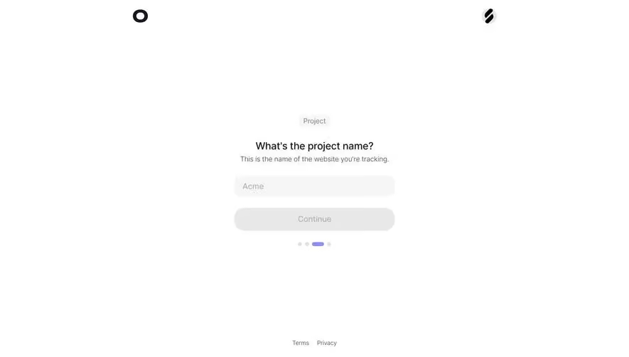
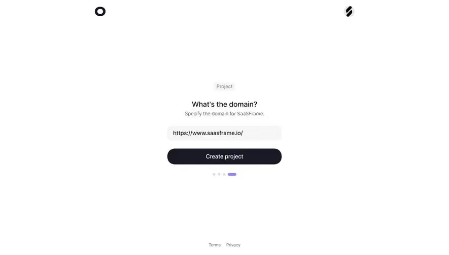
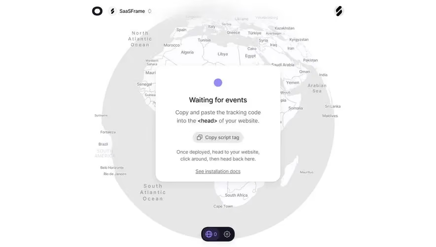
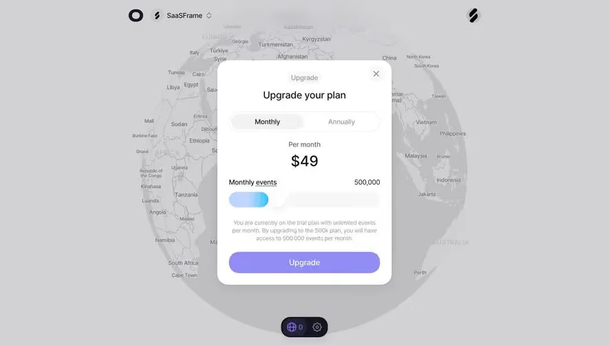
Generate a new design based on this screen using your own content.
Thank you! Your submission has been received!
Oops! Something went wrong while submitting the form.
# Design from Reference: Visitors Signup Code
Create an original, high-fidelity visual design inspired by the reference. Prioritize composition, typography, colors, spacing, and component styling over technical implementation.
## Reference
- **Product:** Visitors
- **Category:** Verification
- **Screenshot:** https://cdn.prod.website-files.com/5e9dc792e1210c5325f7ebbc/697b75af2fb494e1c952dfc3_o9CgztDAFAGMyGzTqBEd4gNX2RJE4i5n2lE-8c6dbYQ.avif
Analyze the screenshot first. If inaccessible, request it rather than guessing.
## Content
{{content.instructions}}
{{content.data}}
Preserve essential messaging and factual accuracy. Adapt structure and copy length for visual balance; never invent product claims.
## Visual Design
Use this context to reproduce the reference's visual language: layout, typography, colors, spacing, borders, radii, and distinctive elements. The screenshot takes priority if descriptions conflict.
## Direction
{{preferences.fidelityInstructions}}
## Output
{{output.instructions}}
Deliver a polished, cohesive design with precise alignment, hierarchy, and spacing. Produce the requested visual artifact, not just a description. If unsupported, explain the limitation.
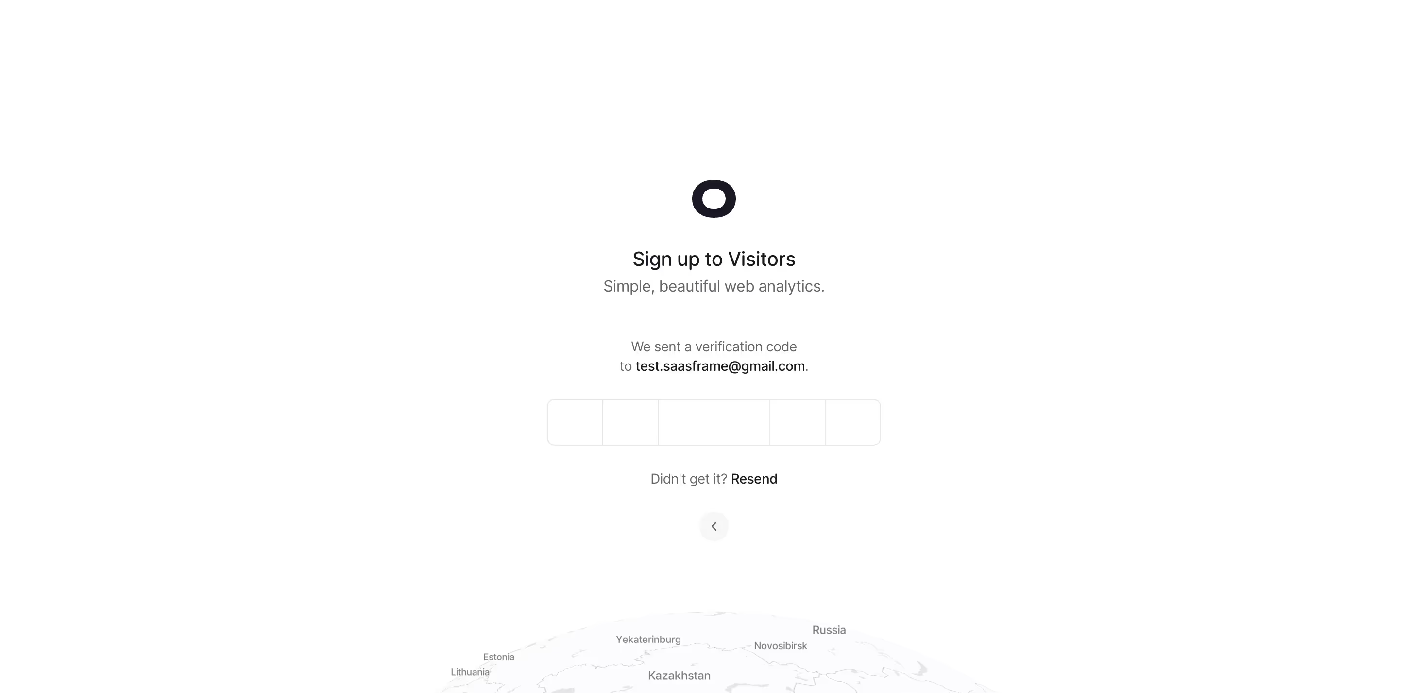
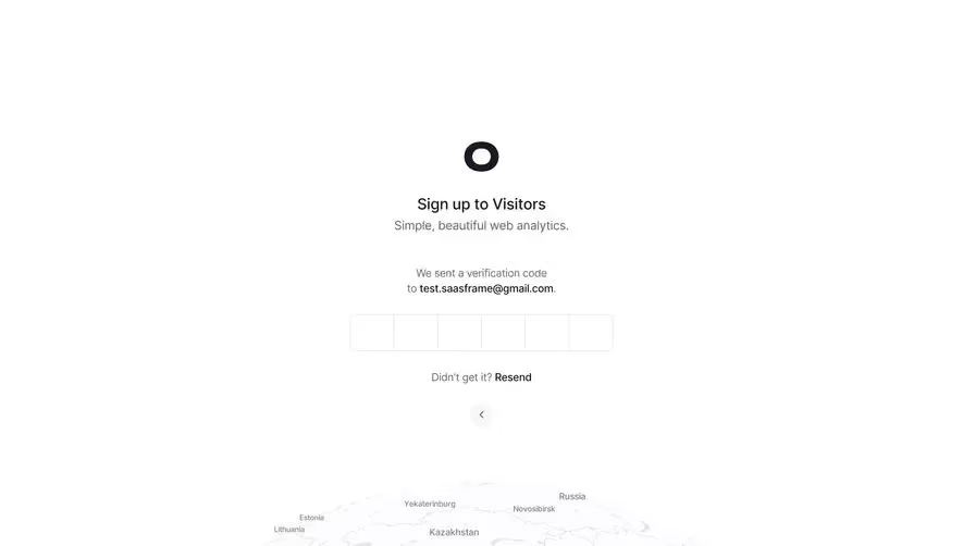
This is one of those screens that just feels calm. Visitors, a web analytics tool, keeps their email verification step dead simple. Six input boxes for the code, a clear message about where the code was sent, and a "Resend" link. That's it. No clutter, no anxiety.
Layout That Breathes
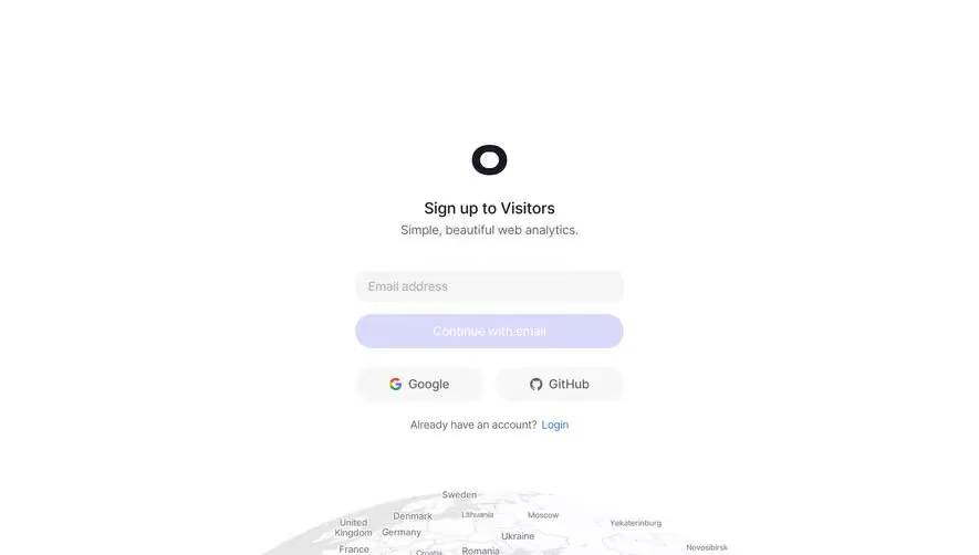
Everything is centered and stacked vertically with generous whitespace. The logo sits up top, followed by the heading, subtext, the verification inputs, and the resend option. There's a subtle back arrow below for navigation. The whole thing reads top to bottom in about two seconds. You know exactly what to do.
Typography and Palette
The type is clean and modern. "Sign up to Visitors" is bold and confident while the supporting text stays light gray and understated. The color palette is basically black, white, and gray. Nothing competing for attention.
The Map Detail
What makes this distinct is that faded globe illustration peeking in at the bottom. It reinforces the analytics theme without being distracting. Smart contextual touch that adds personality to an otherwise minimal screen.