Design with AI
Generate a new design based on this screen using your own content.
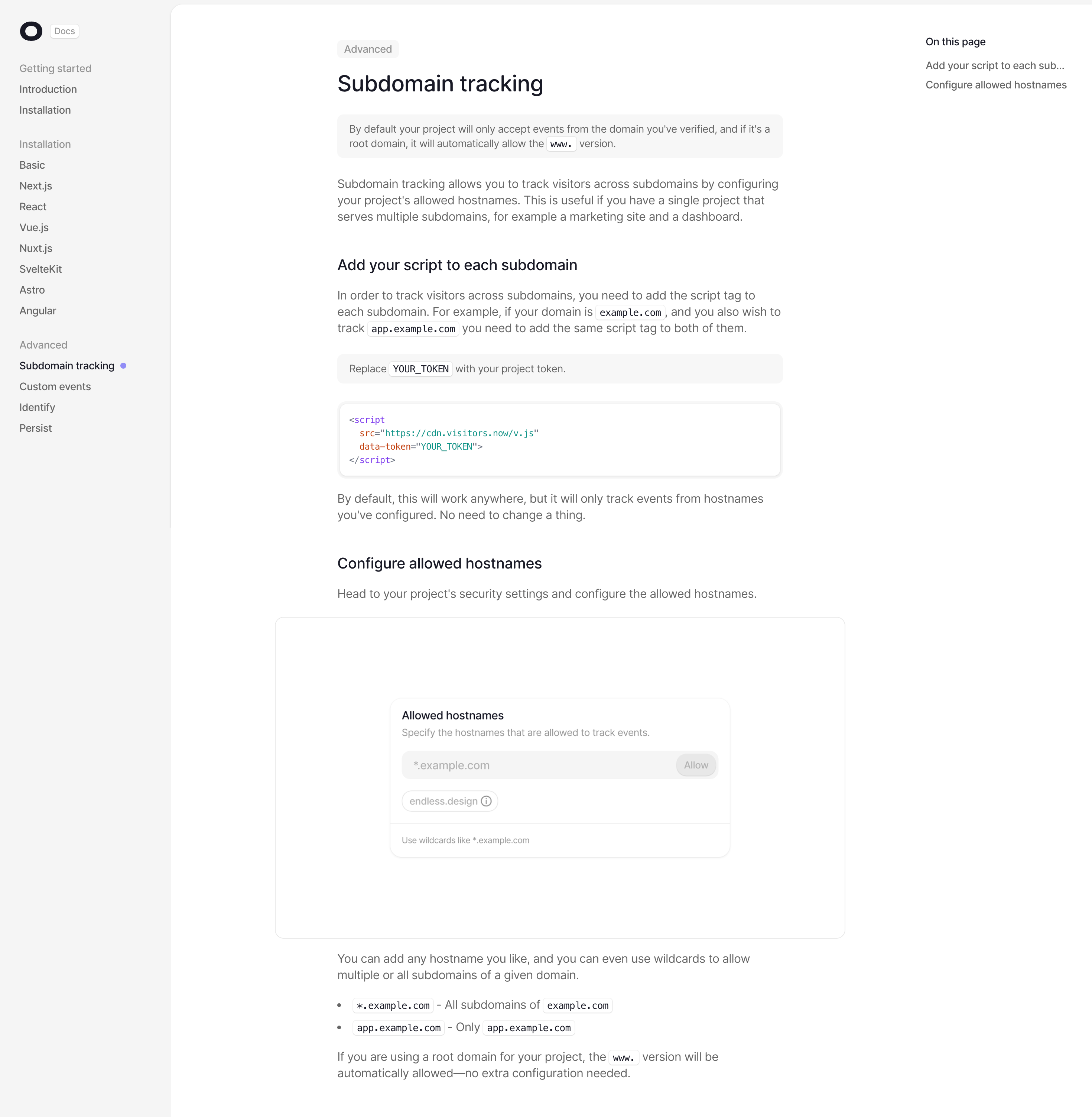
# Design from Reference: Visitors Documentation
Create an original, high-fidelity visual design inspired by the reference. Prioritize composition, typography, colors, spacing, and component styling over technical implementation.
## Reference
- **Product:** Visitors
- **Category:** Documentation
- **Screenshot:** https://cdn.prod.website-files.com/5e9dc792e1210c5325f7ebbc/6acad3aec2028efdec71b09d_6acad15fc5142fbf8922d233_cms-44de9cac6567d11773df344b.webp
Analyze the screenshot first. If inaccessible, request it rather than guessing.
## Content
{{content.instructions}}
{{content.data}}
Preserve essential messaging and factual accuracy. Adapt structure and copy length for visual balance; never invent product claims.
## Visual Design
### Overall aesthetic
- **Character:** Minimal technical documentation with a three-column reading layout and subdued code/callout surfaces.
### Page composition
- **Canvas:** 2940 × 3006 screenshot px; CSS estimates assume approximately 2× capture.
- **Structure:** Pale left documentation navigation, narrow central Subdomain tracking article and small right On this page list. Article contains note, prose, two subheads, script block, large settings image and bullets.
### Information hierarchy
- **Priority:** Advanced tag and main heading establish context; subheads divide setup and hostname configuration. Right rail mirrors article sections.
### Typography
- **Family:** Neutral sans serif with monospace inline/script code; exact fonts unverified.
- **Scale:** Estimated CSS title 32 px, subheads 20 px, body 16 px, sidebar 14 px and code 12–13 px.
### Colors & surfaces
- **Sampled palette:** White #FFFFFF, sidebar #F5F5F5, callouts #F7F7F7, gray text #666666, headings #181925 and borders #E8E8E8.
### Components
- **Code:** White rounded outlined block with soft shadow and purple/orange/teal syntax tokens.
- **Callouts:** Pale-gray rounded rectangles with concise technical notes; inline code uses small outlined light tokens.
- **Navigation:** Group labels, simple text links and a small violet active-item dot; large lightly outlined screenshot frame.
### Visual rhythm
- **Spacing:** Approximately 40–56 CSS px between sections and large main-column margins; muted surfaces maintain reading focus.
### Responsive
- **Observed:** Desktop only.
- **Adaptation:** Collapse sidebar/contents rails, keep code horizontally scrollable and avoid shrinking documentation images beyond readability.
### Adaptation guidance
- **Preserve:** Quiet reading hierarchy and clear code/prose distinction.
- **Replace:** Use accurate target-product instructions and placeholders; never reuse project tokens or domain details.
Use this context to reproduce the reference's visual language: layout, typography, colors, spacing, borders, radii, and distinctive elements. The screenshot takes priority if descriptions conflict.
## Direction
{{preferences.fidelityInstructions}}
## Output
{{output.instructions}}
Deliver a polished, cohesive design with precise alignment, hierarchy, and spacing. Produce the requested visual artifact, not just a description. If unsupported, explain the limitation.