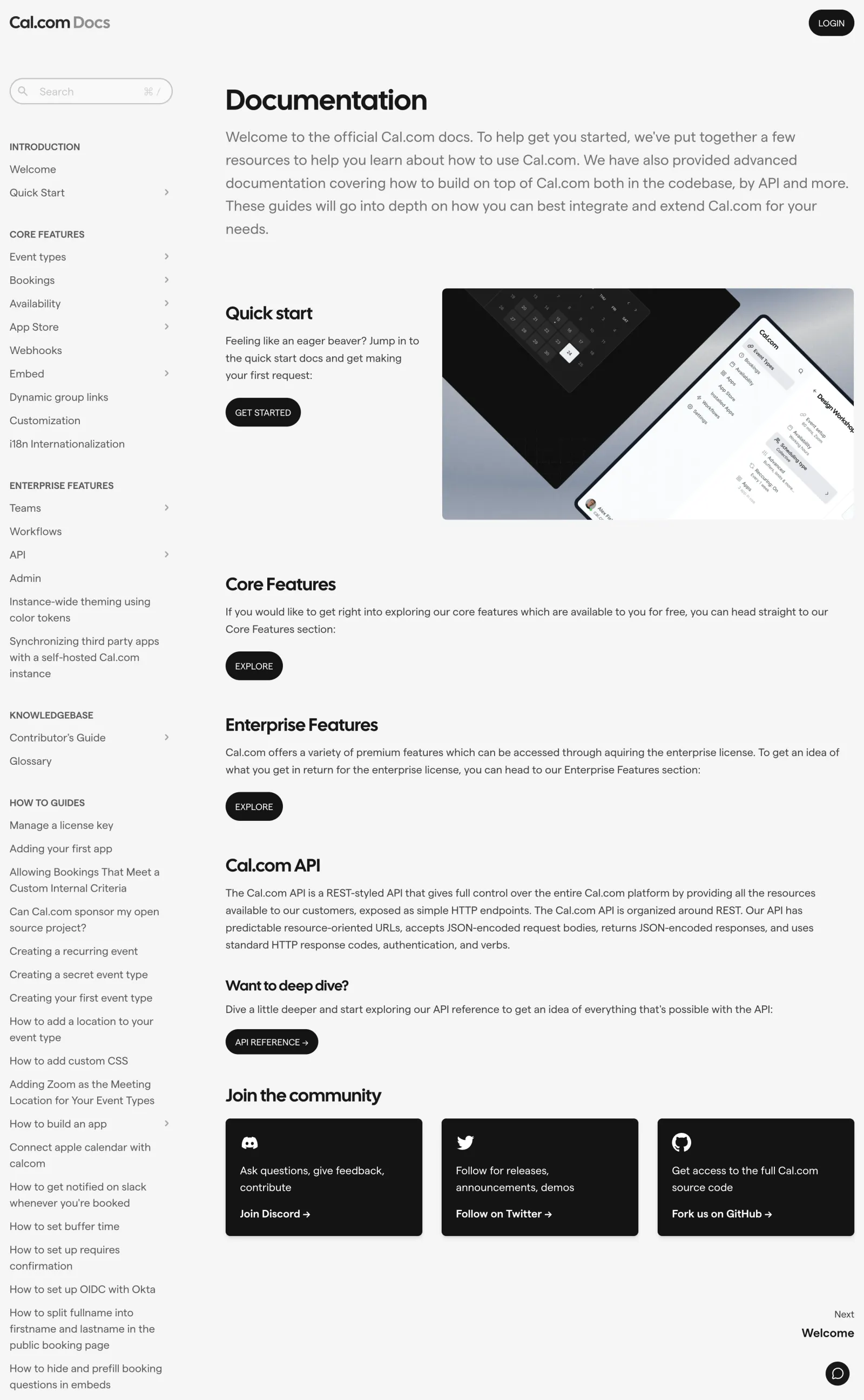
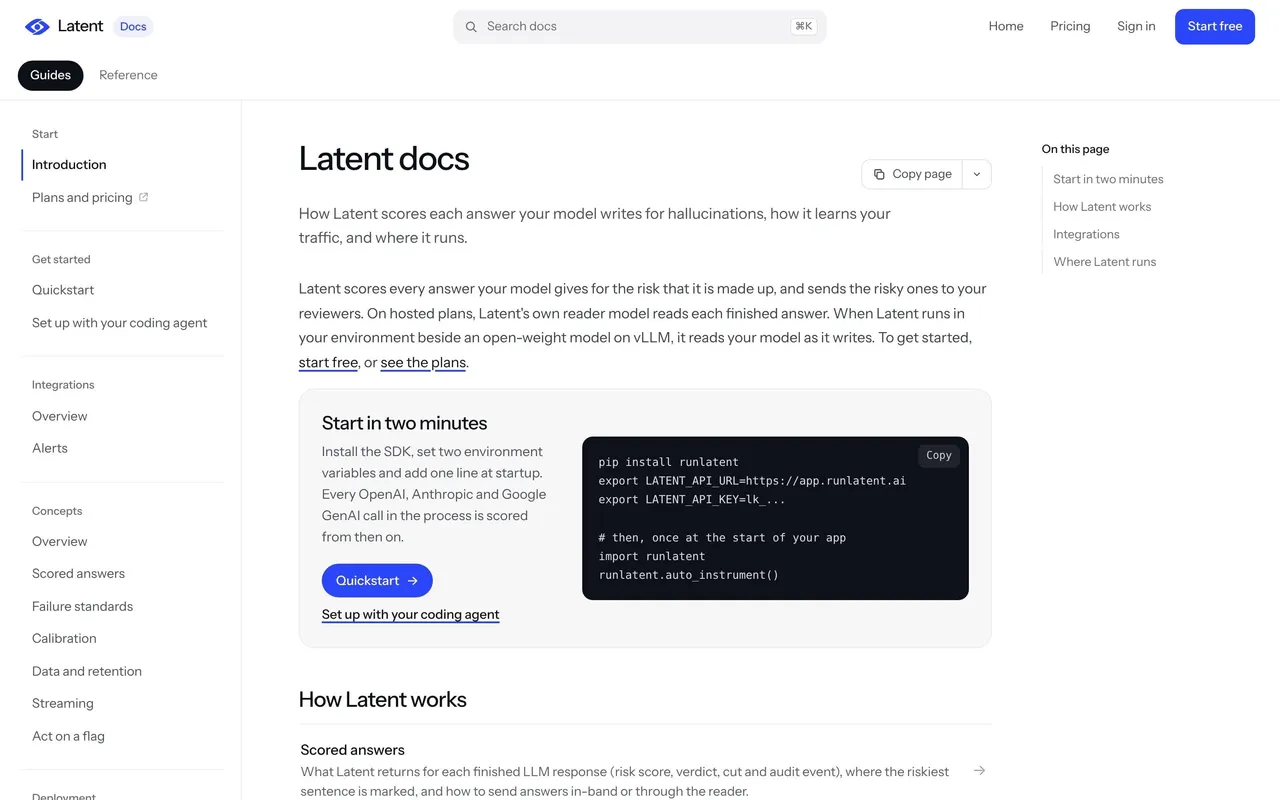
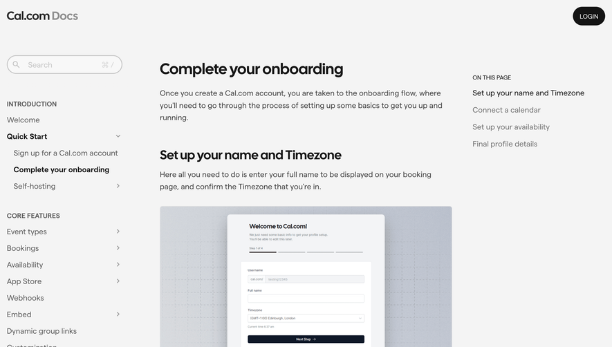
Cal.com’s docs page exudes a crisp, minimalist modernism, balancing whitespace with structured content blocks. The aesthetic clues professionalism with a hint of warmth—visual restraint is paired with thoughtfully placed graphics that feel approachable, not clinical.
Layout and Structure
The page adopts a classic three-column documentation layout: a clean sidebar for navigation, a central content area for reading, and an unobtrusive secondary panel for quick links or actions. The hierarchy is clear and legible, with section headings set apart by deliberate spacing. There’s an ever-present, slim sticky header that reinforces site-wide navigation without eating up precious vertical space.
Visual Elements
Visual cohesion comes from precise iconography: simple line-icons echo the brand’s understated style. Micro-animations, such as active link highlights and subtle fading transitions, add vibrancy without distraction. There’s a strategic absence of heavy illustration or photography, allowing the focus to stay on legibility and function.
Color Palette and Typography
The palette uses deep charcoal, gentle gradients, and accent blues—a foundation that’s easy on the eyes for extended documentation reading. Typography is a blend of geometric sans-serifs for headings and highly legible body text, creating evident hierarchy and scan-ability.
User Experience Patterns & Unique Choices
Navigation is instantly accessible: persistent, collapsible, and predictable, with smart breadcrumb trails. CTAs are quietly present, prioritizing information flow over aggressive conversion. Standout features include dark mode toggle, live search, and sticky in-page anchors for segmented content. The overall tone fosters trust, calm focus, and a sense of technical sophistication—ideal for SaaS teams needing reliable, inspiring UX patterns.
 SaaSFrame