Generate a new design based on this screen using your own content.
Thank you! Your submission has been received!
Oops! Something went wrong while submitting the form.
# Design from Reference: Visitors Contact Page
Create an original, high-fidelity visual design inspired by the reference. Prioritize composition, typography, colors, spacing, and component styling over technical implementation.
## Reference
- **Product:** Visitors
- **Category:** Contact Page
- **Screenshot:** https://cdn.prod.website-files.com/5e9dc792e1210c5325f7ebbc/6acbcc49e13ab9df8f05320e_6acad15e5a5fdf4c302fa2b6_cms-85d48311acbe43652e2e9ee6.webp
Analyze the screenshot first. If inaccessible, request it rather than guessing.
## Content
{{content.instructions}}
{{content.data}}
Preserve essential messaging and factual accuracy. Adapt structure and copy length for visual balance; never invent product claims.
## Visual Design
Use this context to reproduce the reference's visual language: layout, typography, colors, spacing, borders, radii, and distinctive elements. The screenshot takes priority if descriptions conflict.
## Direction
{{preferences.fidelityInstructions}}
## Output
{{output.instructions}}
Deliver a polished, cohesive design with precise alignment, hierarchy, and spacing. Produce the requested visual artifact, not just a description. If unsupported, explain the limitation.
Clean Contact Page That Actually Respects Your Time
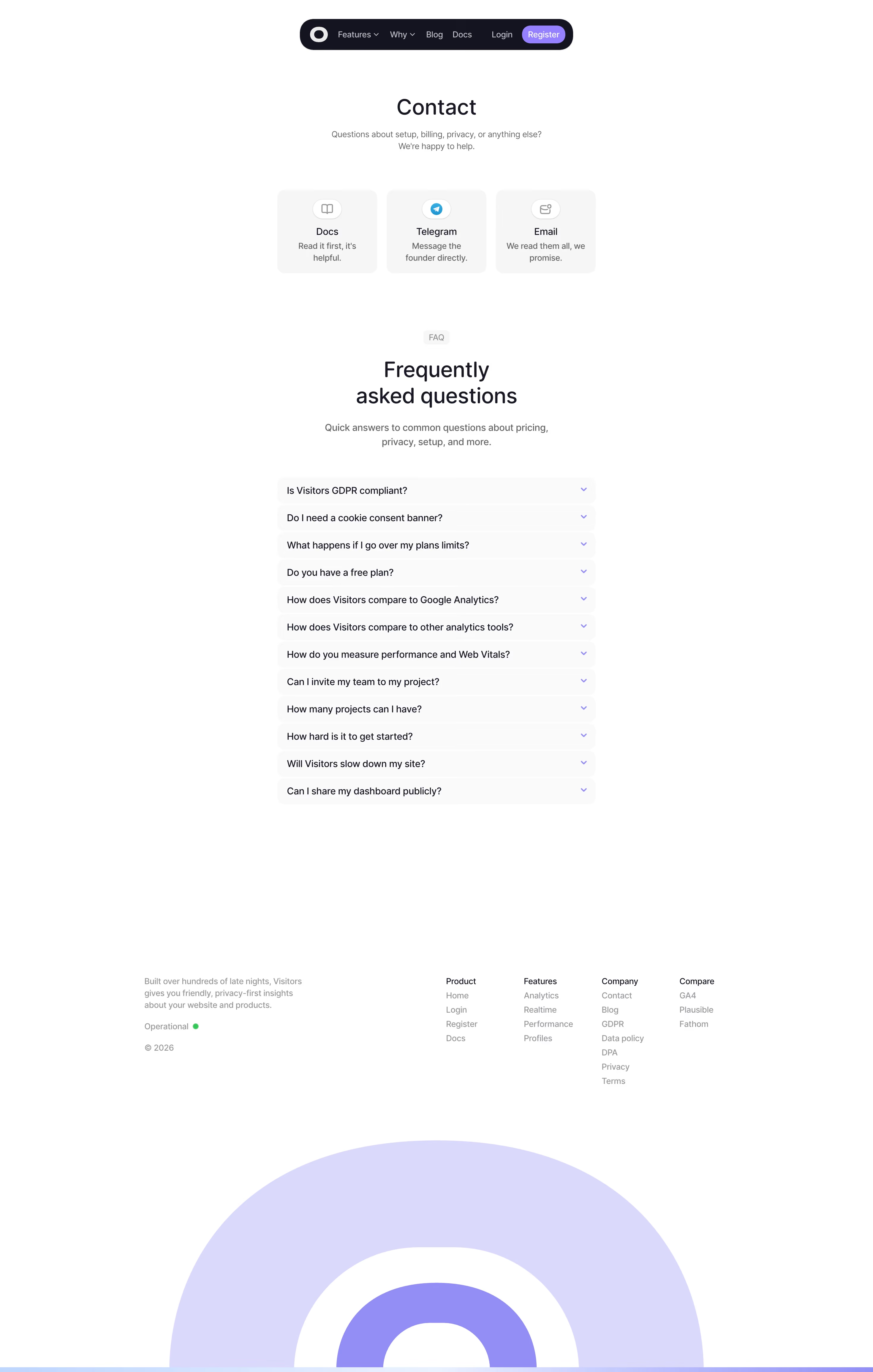
First thing you notice is how dead simple the contact options are. Three cards. Docs, Telegram, Email. No fluff. The Telegram option with "Message the founder directly" is a bold move that builds instant trust. That tiny blue Telegram icon pops against the otherwise monochrome palette.
FAQ Section That Does the Heavy Lifting
The accordion-style FAQ below is smart placement. Thirteen questions stacked tight with consistent spacing. It's doing the work of a support team. The section label "FAQ" sits above in muted gray, paired with a larger serif-style heading that feels warm without being decorative. Good hierarchy throughout.
Footer With Purpose
The footer is surprisingly dense in a good way. Four organized columns, an operational status indicator with a green dot, and links to GDPR and DPA pages. Shows they care about compliance without making it the whole personality.
What Makes It Stand Out
That massive concentric circle graphic bleeding off the bottom is unexpected. It adds visual weight and personality to what could have been a forgettable page. The dark pill navigation up top with the purple Register button anchors everything confidently.