
Thank you! Your submission has been received!
Oops! Something went wrong while submitting the form.
Get SaaSFrame Pro
Monthly
$18
Quarterly
$48
Yearly
$180
Upgrade to access this feature
Browse all screens & flows
Filter and search screens & flows
Access Figma files
Access mobile versions
Bookmark screens & flows
Join now


Teachable Affiliate Page

Teachable
Share what you know.
Designed by
No items found.

Bookmark
Bookmark

Design with AI
Thank you! Your submission has been received!
Oops! Something went wrong while submitting the form.
# Design from Reference: Teachable Affiliate Page
Create an original, high-fidelity visual design inspired by the reference. Prioritize composition, typography, colors, spacing, and component styling over technical implementation.
## Reference
- **Product:** Teachable
- **Category:** Affiliate Page
- **Screenshot:** https://cdn.prod.website-files.com/5e9dc792e1210c5325f7ebbc/62ec9c6417fa63d93480d422_1659620722020-screenshot-device-742f5edd96c6864f6455e733e69984ef-1659599250898.webp
Analyze the screenshot first. If inaccessible, request it rather than guessing.
## Content
{{content.instructions}}
{{content.data}}
Preserve essential messaging and factual accuracy. Adapt structure and copy length for visual balance; never invent product claims.
## Visual Design
### Overall aesthetic
- **Character:** An editorial affiliate page combines large serif headlines, warm off-white surfaces and vivid mint-green conversion areas.
- **Tone:** Full-width lifestyle photography and a substantial portrait testimonial create a personal partner-program presentation.
### Page composition
- **Capture:** The source is 1440 × 4923 image pixels, inspected throughout. Measurements approximate image pixels; CSS scale is unverified.
- **Hero:** White navigation overlays a full-width photograph. A large mint rectangle overlaps the lower-left image with headline, copy and signup action.
- **Benefits:** A centered section title introduces six text benefits in a three-column, two-row grid.
- **Testimonial:** A deep-green band pairs a large centered quotation on the left with a tall portrait on the right.
- **Questions:** Three fully visible question/answer blocks sit below a centered FAQ heading.
- **Closing:** A full-width mint signup band precedes a charcoal footer with brand copy, three link groups and social/legal row.
### Information hierarchy
- **Opening:** The large hero statement and contrasting mint block establish the program before benefits.
- **Benefits:** Serif titles introduce each capability above regular sans-serif explanation.
- **Testimonial:** Large pale serif text dominates its dark section, with small attribution below.
- **Conversion:** Compact dark signup buttons recur in the opening and final mint panel.
### Typography
- **Families:** High-contrast serif headlines pair with clean sans-serif copy, with occasional mixed-family emphasis. Exact identities are unverified.
- **Hero:** Approximately 72 pixels with generous leading across three lines.
- **Major sections:** Large centered headings are around 64–68 pixels; benefit and FAQ questions around 32 pixels in serif.
- **Body:** Approximately 20 pixels with 35–36-pixel leading.
- **Quotation:** Around 40 pixels with 54-pixel leading; navigation and footer links approximately 16 pixels.
### Colors & surfaces
- **Measured base:** Warm off-white #F9FAF5 dominates the benefits and FAQ regions.
- **Measured mint:** #21CD9C supplies the hero overlay and closing signup band.
- **Measured green:** Deep #1A4942 anchors testimonial background and much of the green text palette.
- **Measured footer:** Charcoal #222222 supports footer and dark buttons.
- **Nearby tones:** #F8FBF5 and #F9FAF7 appear in soft surface variations.
### Components
- **Hero block:** An approximately 600-pixel-wide mint rectangle uses broad padding and square corners, overlapping the photo boundary.
- **Signup buttons:** Dark compact rectangles around 52 pixels high have small radii and white labels.
- **Benefit grid:** Six unboxed text groups share column alignment with large horizontal gutters.
- **Testimonial split:** Two broad columns balance quotation and portrait, with a small introductory label and fine rule above the quote.
- **FAQ:** Questions and answers are all expanded as ordinary text; no accordion indicators are visible.
- **Footer:** Three link columns sit beside a wide brand-description area; outlined circular social icons align along the bottom.
### Visual rhythm
- **Margins:** Most sections use approximately 60-pixel outer insets, with narrower FAQ reading width.
- **Whitespace:** Benefits and FAQ groups receive substantial vertical spacing, avoiding dense commercial lists.
- **Color blocks:** Photo, off-white, deep green, off-white, mint and charcoal establish a clear sequence.
- **Reading cadence:** Large serif statements alternate with shorter sans-serif explanatory paragraphs.
### Responsive
- **Observed state:** Only desktop is shown; mobile behavior is unverified.
- **Recommended flow:** Stack benefit columns and testimonial, and move the hero block into normal flow when overlap becomes cramped.
- **Recommended type:** Scale large headings fluidly and remove forced desktop line breaks.
- **Recommended footer:** Stack link groups and wrap social controls with comfortable spacing.
### Adaptation guidance
- **Preserve the palette:** Keep mint, deep green, warm white and charcoal as the core visual system.
- **Retain editorial contrast:** Pair serif statements with readable sans-serif explanations.
- **Content fidelity:** Treat commission, income and support claims as captured content, not independently verified current terms.
- **Accessibility:** Maintain text contrast over the hero image, meaningful portrait alternatives and descriptive signup links.
Use this context to reproduce the reference's visual language: layout, typography, colors, spacing, borders, radii, and distinctive elements. The screenshot takes priority if descriptions conflict.
## Direction
{{preferences.fidelityInstructions}}
## Output
{{output.instructions}}
Deliver a polished, cohesive design with precise alignment, hierarchy, and spacing. Produce the requested visual artifact, not just a description. If unsupported, explain the limitation.


Category
Patterns
No items found.


Added on
June 19, 2020
Similar screens
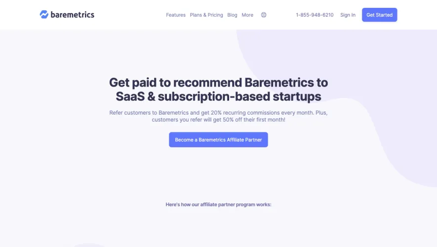


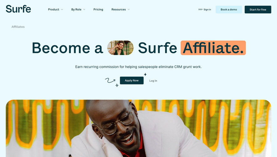

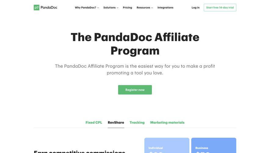

Upgrade to SaaSFrame Pro now to see similar examples.
Monthly
$18 /month
Billed $18 monthly
Browse all screens & flows
Filter and search screens & flows
Search text in screenshots
Access Figma files
Access mobile versions
Join now
Quarterly
$16 /month
Billed $48 quarterly
Browse all screens & flows
Filter and search screens & flows
Search text in screenshots
Access Figma files
Access mobile versions
Join now
Yearly
$15 /month
Billed $180 yearly
Browse all screens & flows
Filter and search screens & flows
Search text in screenshots
Access Figma files
Access mobile versions
Join now