Prompt 604 words Copy
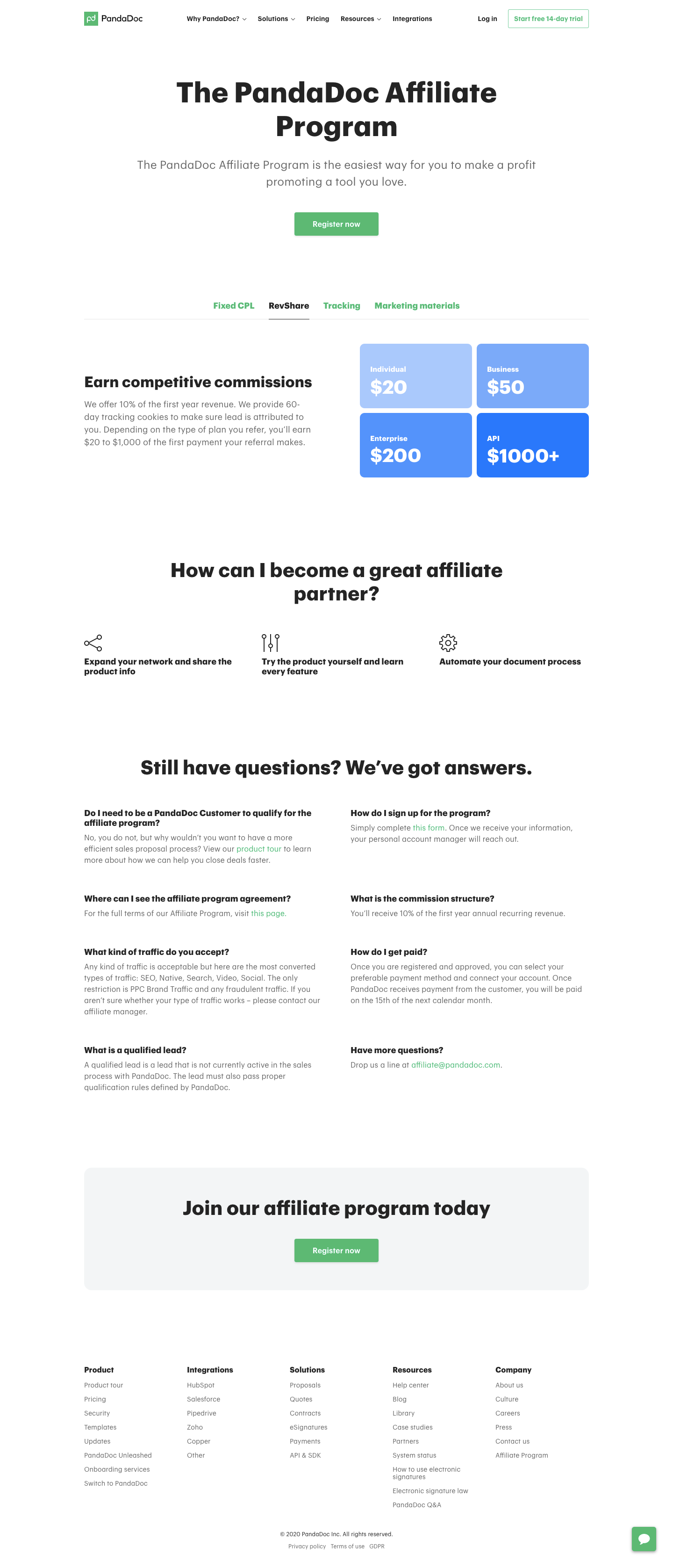
# Design from Reference: PandaDoc Affiliate Page

Create an original, high-fidelity visual design inspired by the reference. Prioritize composition, typography, colors, spacing, and component styling over technical implementation.

## Reference

- **Product:** PandaDoc
- **Category:** Affiliate Page
- **Screenshot:** attached to this message (also available at https://media.saasframe.io/o/041e998eba2f094a7227.webp)

Analyze the attached screenshot first. If no image is attached, open the screenshot link; if neither is accessible, ask for it rather than guessing.

## Visual Design Context

### Overall aesthetic

- **Character:** Straightforward affiliate marketing page with heavy black headings, green actions and blue commission tiles.

### Page composition

- **Capture:** 1440 × 3353 screenshot pixels; estimated CSS scale approximately 1×.
- **Structure:** Navigation, centered hero/register CTA, four-tab benefits, split commission explanation/2×2 amounts, three partner tips, two-column FAQ, pale final CTA and five-column footer.

### Information hierarchy

- **Priority:** Affiliate proposition and Register now lead; commission visual supports details, followed by practical guidance and common questions.

### Typography

- **Family:** Heavy rounded sans-serif headings and regular sans-serif body; exact family unverified.
- **Estimated CSS sizes:** Hero 60px, section headings 44px, amount tiles 40px, body 18px and navigation 14px.

### Colors & surfaces

- **Measured palette:** White #FFFFFF, pale panel #F3F5F6, dark #242424 and tile blues #AAC9FC/#7BAAF9/#5493FB.
- **Accents:** Green registration buttons, tabs and inline links.

### Components

- **Elements:** Tab underline, four amount tiles, outline icons, open FAQ pairs and rounded closing banner.
- **Estimated geometry:** Content 1080px wide, 8px tile radius, 16px closing radius, 48px buttons and 32px column gaps.

### Visual rhythm

- **Spacing:** Large white intervals isolate the main sections; FAQ is relatively dense but remains unboxed.

### Responsive

- **Suggested adaptation:** Stack benefit columns and FAQ pairs; wrap tabs and footer groups. Mobile behavior is unverified.

### Adaptation guidance

- **Transfer:** Preserve clear program/action hierarchy and visual commission comparison. Replace all financial terms with actual program details.

## Content

**Instructions:**

Generate realistic example content that fits the selected design reference.

Create appropriate headlines, descriptions, labels, buttons, and supporting copy based on the type of interface being designed.

If a product or business description is provided, use it to guide the content.

Otherwise, invent a plausible fictional SaaS product appropriate for the reference.

Keep the content concise, coherent, and visually balanced.

Do not present fictional statistics, customer names, or testimonials as verified facts.

## Design Direction

**Instructions:**

Use the reference screenshot as the main source of visual inspiration rather than a strict layout template.

Preserve its most distinctive design characteristics, such as typography, visual rhythm, color relationships, component treatments, and overall aesthetic.

Feel free to modify section arrangements, proportions, spacing, and individual components to better suit my content.

Introduce original design decisions where they improve usability, composition, or brand consistency.

The result should clearly reflect the reference's visual language without looking like a direct reproduction.

Follow the visual identity of the reference design.

Use its typography, color palette, component styling, and overall aesthetic as the primary design direction.

Do not introduce an unrelated visual identity.

## Output

**Instructions:**

Generate a high-fidelity visual mockup of the requested interface.

Present the design as a polished, realistic website or product UI screenshot.

Prioritize visual composition, typography, spacing, colors, alignment, and component details.

Use the available image-generation or visual-design capabilities.

Do not replace the mockup with source code, a written design specification, or a textual description.

If direct visual generation is unavailable, clearly explain the limitation.

## Constraints

- Use the actual screenshot as the primary visual reference.
- Preserve essential messaging and factual accuracy.
- Prioritize visual quality and consistency.
- Do not invent unsupported product claims.
- Adapt structure and copy length for visual balance.
Reference image Attach it to your message: assistants can’t open image links. Open in ChatGPT ↗ Open in Claude ↗
Build it in Lovable ↗ v0 ↗ Figma Make ↗
Opening a tool copies the screenshot so you can paste it with your prompt.
 SaaSFrame