Overall Style and Aesthetic
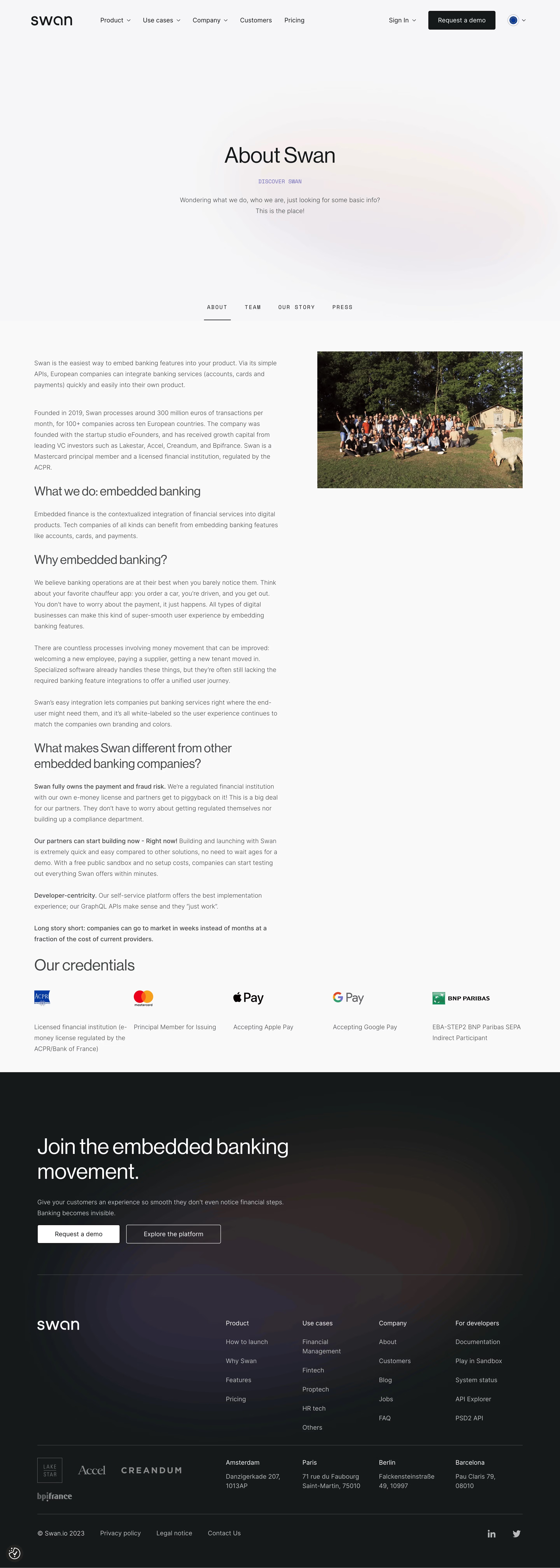
Swan’s pricing page radiates a polished minimalism, fusing a clean, contemporary design with subtle pops of brand color. The look feels confident, professional, and forward-thinking—geared toward modern fintech clients but approachable for a broader SaaS audience. Spacious white backgrounds, crisp lines, and gentle gradients keep the interface light and visually inviting. Layout and Structure
The page follows a logical, user-first hierarchy: a concise hero section at the top sets the context and orients users. Core pricing tiers are presented clearly, side by side, followed by a compact “Enterprise” option and an at-a-glance pricing comparison table. Scrolling reveals supporting details: features breakdown, FAQs, and an informative, utility-packed footer. Visual Elements
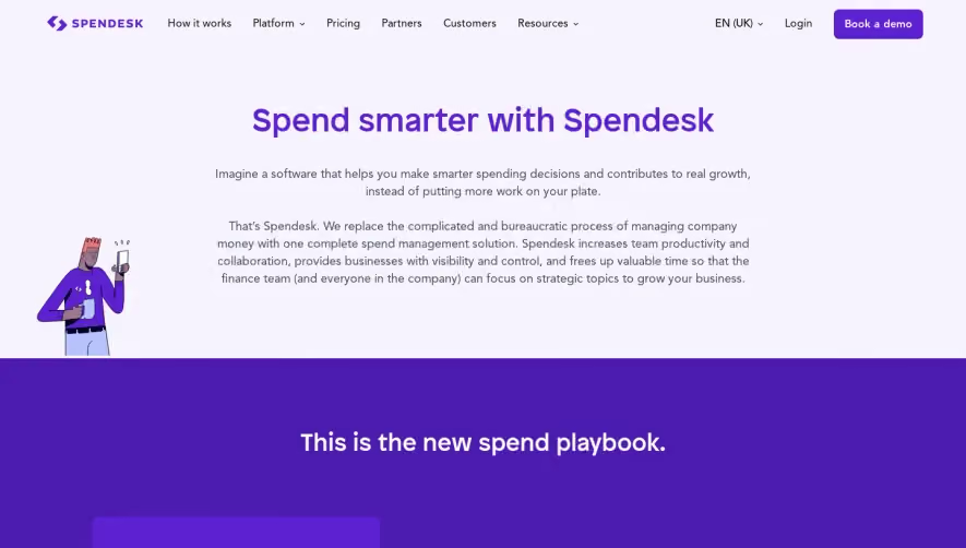
Rather than stock photos, Swan relies on bespoke vector illustrations and clean, geometric icons. These visuals enliven the page without overwhelming it, reinforcing product functionality and benefits. Micro-interactions, like subtle hover states and expandable FAQ answers, lend a touch of animation that feels purposeful, not flashy. Color Palette and Typography
The palette is understated yet memorable: crisp whites, deep navy and black, complemented by bands of vibrant signature blue for CTAs and highlights. Typography is sans-serif, modern, and spacious—likely utilizing a geometric or grotesque style. Ample weight and size differences establish clear hierarchy, guiding the eye smoothly from headings to body copy. User Experience Patterns
Navigation is fixed and always accessible—users can hop between sections without losing their place. CTAs (“Contact Us” and “Start Now”) are visually prominent and repeated thoughtfully. Forms are concise, undemanding, and mobile-friendly. The entire flow emphasizes clarity and reduces friction. Unique or Notable Design Choices
Standout elements include the elegantly sticky pricing header, the interactive toggle for monthly/annual billing, and the custom-built comparison table, which demystifies plan differences at a glance. The page maintains a reassuring, expert tone—striking a balance between fintech seriousness and SaaS warmth.