Overall Style and Aesthetic
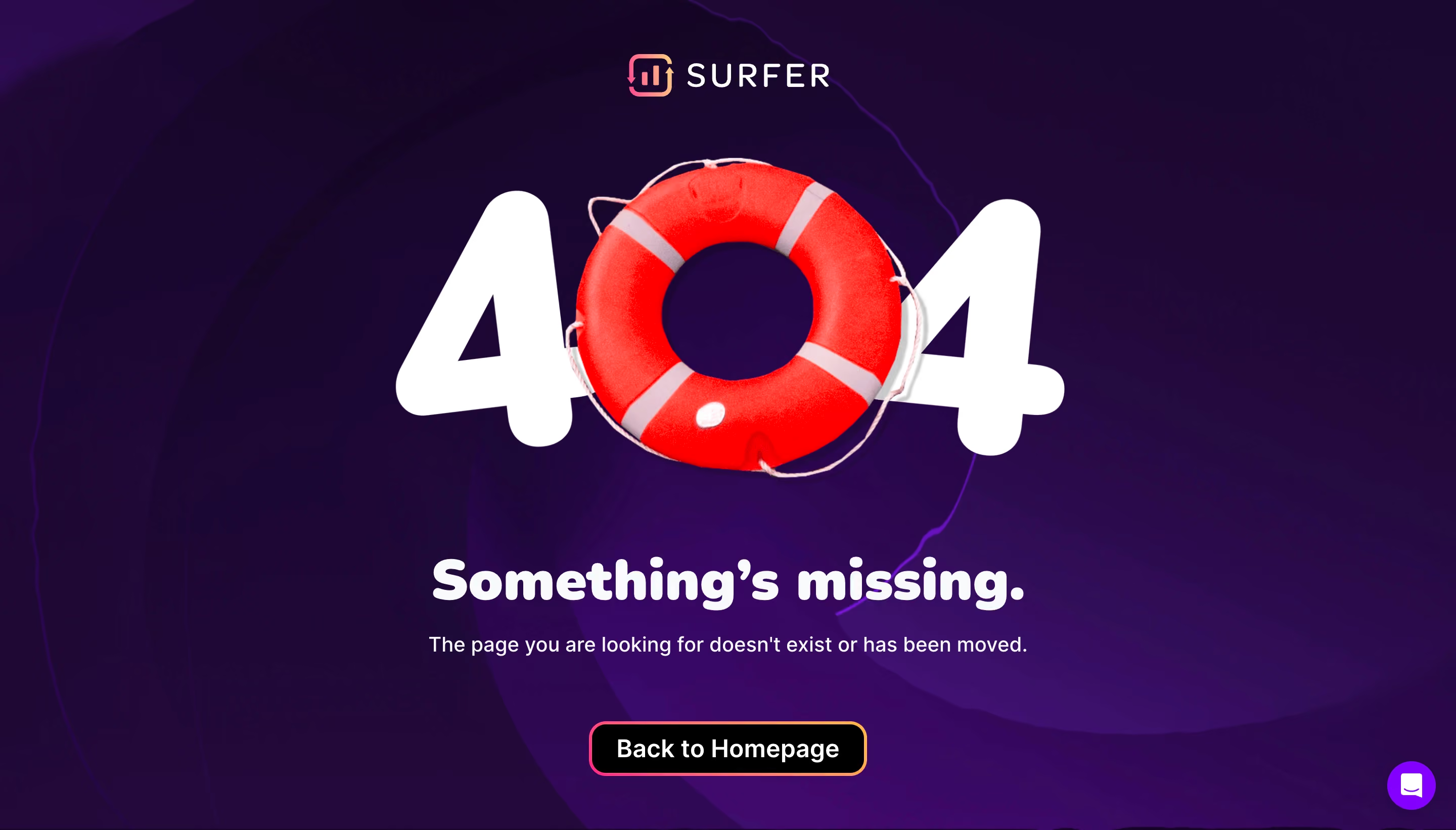
SurferSEO’s 404 page delivers a playful, modern aesthetic that balances professionalism with a dash of personality. The design leverages ample whitespace, ensuring the layout feels open and inviting rather than cluttered. Whimsical illustrations, subtle gradients, and tasteful use of brand colors create a friendly yet polished first impression, even on an error page. Layout and Structure
The page features a single-column, centered layout, instantly drawing the visitor’s eye to the core message. The illustration occupies the primary visual focus, followed by clear messaging and a prominent call-to-action (CTA) button. The absence of superfluous sections (features, pricing, testimonials) maintains focus, suited to the context of a 404 experience, while a slim footer ensures brand consistency and offers navigation back to the main site. Visual Elements
A standout hand-drawn style illustration creates an approachable and memorable visual impact. This artwork, depicting a lost explorer with a quirky “404” sign, injects humanity and character, transforming a potential frustration point into a friendly touchpoint. Gentle animations bring the scene to life without overwhelming the senses. Color Palette and Typography
Vibrant purples, playful oranges, and soothing gradients echo SurferSEO’s branding, working harmoniously with soft background tones. Bold, geometric sans-serif typography establishes a clear hierarchy, with the “404” headline grabbing attention and supporting text guiding next steps. The font choice enhances readability and reinforces the modern, digital-native vibe. User Experience Patterns and Standout Choices
A conspicuous CTA—“Back to homepage”—anchors the user’s path forward, minimizing frustration and confusion. Familiar navigation appears in the header, helping users reorient seamlessly. Notably, the illustration and page humor turn a dead end into a delightful brand moment—showcasing that even errors can build trust and engagement through thoughtful, user-centric design.