Design with AI
Generate a new design based on this screen using your own content.
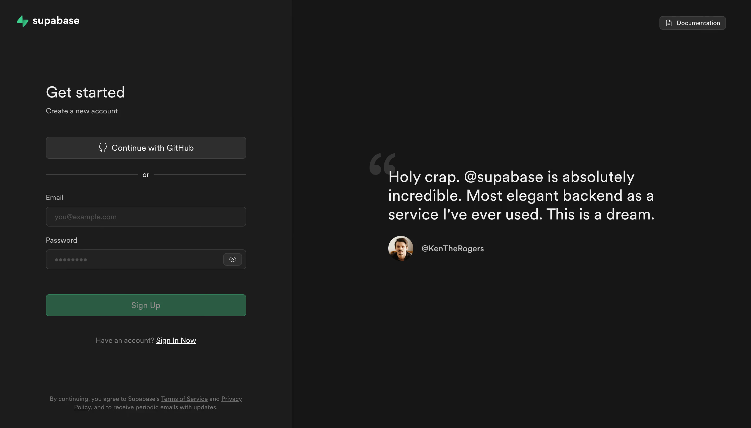
# Design from Reference: Supabase Signup
Create an original, high-fidelity visual design inspired by the reference. Prioritize composition, typography, colors, spacing, and component styling over technical implementation.
## Reference
- **Product:** Supabase
- **Category:** Signup
- **Screenshot:** https://cdn.prod.website-files.com/5e9dc792e1210c5325f7ebbc/6acadcbe8c9a73ab05f13365_6acadc2500b891bde5292c68_cms-ab19dc7502f75b3a22eff70a.webp
Analyze the screenshot first. If inaccessible, request it rather than guessing.
## Content
{{content.instructions}}
{{content.data}}
Preserve essential messaging and factual accuracy. Adapt structure and copy length for visual balance; never invent product claims.
## Visual Design
### Overall aesthetic
- **Style:** Dark split-screen signup page with a compact form on the left and large testimonial on the right.
- **Accent:** Green branding and signup action sit within an otherwise charcoal/gray palette.
### Page composition
- **Canvas:** Source 2880 × 1642 pixels; geometry uses the 1400 × 798 inspection view. Approximate 2× source-to-CSS capture is plausible but unverified.
- **Split:** Left form region is roughly 545px wide, separated by a fine vertical boundary from a larger darker testimonial region.
- **Form column:** Approximately 373px wide, beginning near x85. Brand sits top left, title around y160, social signup around y255 and fields beneath.
- **Testimonial:** Large quotation near x723, y317, with oversized quote mark behind/above and avatar attribution below.
- **Utilities:** Small documentation button sits upper right; legal consent text sits near the bottom of the left panel.
### Information hierarchy
- **Task:** Get started heading and Create a new account subtitle lead the form.
- **Routes:** Continue with GitHub precedes a horizontal or divider, followed by email and password fields.
- **Action:** A full-width green Sign Up button follows the fields; existing-account sign-in link appears below.
- **Proof:** Large testimonial copy and compact avatar/handle attribution balance the form.
- **Legal:** Small muted consent copy contains underlined terms/privacy links.
### Typography
- **Form heading:** Approximately 30px medium sans serif with around 36px line height.
- **Testimonial:** Approximately 30px medium, around 35px line height, broken into three broad lines.
- **Controls:** Social button and primary action around 16px; labels/subtitle around 14px.
- **Small text:** Legal copy around 12px/16px; attribution around 16px medium. Exact family is unverified.
### Colors & surfaces
- **Measured darks:** #161616 right canvas, #1C1C1C left panel, #222222 inputs and #2E2E2E raised social control.
- **Measured accent:** #155C42 dark green signup surface.
- **Measured foreground/boundaries:** #EDEDED light text and #3E3E3E outlines; #151515 appears among nearby dark tones.
- **Contrast:** Secondary copy is medium gray, while the brand icon provides a brighter green highlight.
### Components
- **Social button:** Approximately 373 × 41px, charcoal fill, thin lighter border, 6px radius and centered GitHub icon/text.
- **Fields:** Approximately 373 × 37px, dark fill, thin gray border and 5px radius, with external labels.
- **Password control:** Masked dots and a compact eye icon button at the right end.
- **Signup button:** Approximately 373 × 41px, green fill and small rounded corners. Its muted label appears subdued; actual disabled semantics are not verified.
- **Testimonial attribution:** Approximately 47px circular avatar alongside a handle.
- **Documentation:** Small outlined dark button with file icon.
- **States:** No error, focus, password-revealed, authorization or success state is visible.
### Visual rhythm
- **Form spacing:** Around 39px separates subtitle from social button; divider and fields follow in a compact vertical sequence.
- **Field cadence:** Labels sit about 10px above inputs; roughly 20px separates field groups.
- **Action gap:** Around 47px follows password before signup, and around 38px follows signup before sign-in prompt.
- **Balance:** Testimonial is vertically centered in the wider right region; legal copy anchors the left panel near its bottom.
### Responsive
- **Observed scope:** Desktop only; mobile behavior is unverified.
- **Recommended split:** Prioritize the form and move testimonial below or omit it at narrow widths.
- **Recommended fields:** Keep fluid width and comfortable minimum control height.
- **Recommended legal:** Allow consent text to wrap naturally without being pinned over form content.
### Adaptation guidance
- **Preserve:** Clear social/email alternatives, external labels, restrained green accent and secondary sign-in route.
- **Interaction:** Define password visibility, validation, submission loading and authorization feedback explicitly.
- **Content:** Use supplied testimonial text/attribution and legal links; do not invent endorsements.
- **Accessibility:** Label the eye control, retain visible focus and ensure muted text/buttons meet readable contrast requirements.
Use this context to reproduce the reference's visual language: layout, typography, colors, spacing, borders, radii, and distinctive elements. The screenshot takes priority if descriptions conflict.
## Direction
{{preferences.fidelityInstructions}}
## Output
{{output.instructions}}
Deliver a polished, cohesive design with precise alignment, hierarchy, and spacing. Produce the requested visual artifact, not just a description. If unsupported, explain the limitation.