
Thank you! Your submission has been received!
Oops! Something went wrong while submitting the form.
Get SaaSFrame Pro
Monthly
$18
Quarterly
$48
Yearly
$180
Upgrade to access this feature
Browse all screens & flows
Filter and search screens & flows
Access Figma files
Access mobile versions
Bookmark screens & flows
Join now

Steep Landing Page

Steep
Modern analytics platform
Designed by
No items found.

Bookmark
Bookmark

Design with AI
Thank you! Your submission has been received!
Oops! Something went wrong while submitting the form.
# Design from Reference: Steep Landing Page
Create an original, high-fidelity visual design inspired by the reference. Prioritize composition, typography, colors, spacing, and component styling over technical implementation.
## Reference
- **Product:** Steep
- **Category:** Landing Page
- **Screenshot:** https://cdn.prod.website-files.com/5e9dc792e1210c5325f7ebbc/6acad56f86f1bee9c3650771_6acad4985a5fdf4c3030e3d7_cms-59f58ef7310d912bcc047d33.webp
Analyze the screenshot first. If inaccessible, request it rather than guessing.
## Content
{{content.instructions}}
{{content.data}}
Preserve essential messaging and factual accuracy. Adapt structure and copy length for visual balance; never invent product claims.
## Visual Design
### Overall aesthetic
- **Character:** A long editorial analytics landing page combines large serif headlines, quiet sans-serif product copy and hand-drawn illustrations.
- **Personality:** Sketchy charts, plants, cursors and collaborator bubbles soften detailed product screenshots; pastel surfaces keep the page calm and approachable.
- **Contrast:** Mostly white and pale gray sections are interrupted by mint feature areas and one large near-black integration callout.
### Page composition
- **Capture scale:** The original is 2880 × 25444 pixels and has been inspected throughout. A 2× capture is plausible but unverified; dimensions below estimate CSS pixels at half source resolution.
- **Navigation and hero:** A wide navigation row centers the Steep logo between links and account actions. A large pale rounded hero centers headline, subtitle and two buttons above overlapping desktop/mobile product views.
- **Introductory cards:** Two outlined cards introduce a short video and semantic-layer integration.
- **Metrics system:** A mint panel centers a large headline above a metric-directory screenshot, flanked by drawn plants; two outlined supporting cards follow.
- **Analysis chapter:** A full-width drawn chart with comment bubbles leads to a centered headline. A pale split panel pairs an Explore menu with a chart screenshot, followed by two supporting cards and a testimonial strip.
- **Reports chapter:** A drawn report composition introduces collaboration copy. A pale split Reports panel shows a dashboard, followed by two supporting cards and another testimonial.
- **Closing chapters:** A pie-chart illustration introduces an eight-item feature mosaic; a dark integration callout follows. A door illustration, final paired CTAs and four-column footer close the page.
### Information hierarchy
- **Chapter structure:** Repeated oversized centered serif headings divide metrics, analysis, reporting and broader capabilities into distinct chapters.
- **Product proof:** Large screenshots show real interface density beneath high-level marketing claims; smaller UI fragments explain individual capabilities.
- **Supporting hierarchy:** Two-up cards alternate screenshot fragments and drawings, using a smaller serif title and muted explanatory paragraph.
- **Conversion:** Get started and Request a demo recur at the opening and close, while integration and video actions remain secondary.
### Typography
- **Families:** Display text uses a high-contrast serif with italic emphasis; navigation, body and UI examples use sans-serif. Exact font identities are unverified.
- **Display roles:** The hero is approximately 72 pixels with compact leading; chapter headings are around 60–64 pixels, often two lines with a key word italicized.
- **Card roles:** Supporting card titles are about 36 pixels in serif; compact mosaic titles are around 20 pixels in bold sans serif.
- **Reading roles:** Main subtitles use approximately 24 pixels with 32-pixel leading; card descriptions are around 18 pixels with 24–26-pixel leading.
- **Testimonials:** Large centered italic serif quotations use approximately 38–40 pixels, with smaller gray sans-serif attribution beneath.
- **Utilities:** Navigation and buttons are roughly 16 pixels; product screenshot labels remain much smaller and should be treated as image content.
### Colors & surfaces
- **Measured base:** White #FFFFFF dominates; near-black #191919 provides strong typography and the dark integration panel.
- **Measured pale surfaces:** #F7F7F8 and #FAFAFB appear in neutral panels; mint #E6F4EB supports the metrics chapter and visualization tile.
- **Measured warm surface:** Pale cream #F7F5E2 supports the mobile-app feature tile.
- **Accent relationships:** Blue, green and coral chart series remain inside product imagery; peach typography/buttons contrast against the dark integration panel.
- **Boundaries:** Light-gray outlines distinguish white cards without heavy shadows; soft shadows are mainly reserved for floating product windows.
### Components
- **Buttons:** Black primary and white outlined secondary controls are approximately 48 pixels high with 8–10-pixel radii, generous horizontal padding and occasional right arrows.
- **Hero showcase:** A large rounded desktop window is overlapped by a phone and comment bubble; the surrounding pale panel clips the composition at its lower edge.
- **Product panels:** Wide pale rounded surfaces pair a roughly 300-pixel text/menu column with a much wider screenshot; active vertical menu items use darker text and a short black rule.
- **Supporting cards:** Two equal outlined cards have approximately 16-pixel radii, spacious illustration areas and centered title/copy beneath.
- **Feature mosaic:** A large mobile-app tile occupies the left half beside four compact capability tiles; the lower row combines Joins, Custom SQL and a double-width Visualizations tile.
- **Testimonials:** Full-width pale rounded strips center quotation and attribution with broad internal padding.
- **Dark callout:** A near-black rounded rectangle centers two integration marks, peach serif heading, short copy and a peach action button.
- **Footer:** A fine divider introduces brand/location/social details and three link groups with uppercase gray labels.
### Visual rhythm
- **Outer spacing:** Major panels sit approximately 40 pixels from the viewport edge; narrower content groups use larger internal margins.
- **Grid rhythm:** Roughly 16–20-pixel gutters separate cards and mosaic tiles; consistent radii tie differently sized surfaces together.
- **Chapter pauses:** Extensive white space surrounds drawn chapter illustrations and centered headlines, creating slow transitions between dense UI demonstrations.
- **Image/copy cadence:** Large proof panels alternate with paired cards and full-width quotations, avoiding a continuous wall of screenshots.
### Responsive
- **Observed state:** The page is captured at desktop width. Phone imagery is a product mockup and does not verify the website's mobile layout.
- **Recommended grids:** Stack two-up cards and split product panels, then reorganize the feature mosaic into a single or two-column flow.
- **Recommended typography:** Scale large serif headings fluidly and preserve italic emphasis without forcing desktop line breaks.
- **Recommended imagery:** Keep screenshots proportional, provide zoomable detail or alternative explanatory text and prevent overlapping phone/comment artwork from obscuring critical content.
### Adaptation guidance
- **Preserve the pairing:** Retain the contrast between editorial serif storytelling and precise sans-serif product evidence.
- **Reuse illustration language:** Use fine imperfect outlines, small pastel collaborator circles and restrained grainy color fills consistently.
- **Maintain chapter completeness:** Preserve metrics, analysis, reports, capabilities, integration and conversion sections with their distinct layouts.
- **Implementation estimates:** Start with 40-pixel outer gutters, 16-pixel card radii, 60–72-pixel display type and 18–24-pixel body hierarchy, then tune against the source pixels.
- **Content resilience:** Keep text outside fixed-height screenshots, allow card titles to wrap and ensure all CTA labels remain visible at smaller widths.
Use this context to reproduce the reference's visual language: layout, typography, colors, spacing, borders, radii, and distinctive elements. The screenshot takes priority if descriptions conflict.
## Direction
{{preferences.fidelityInstructions}}
## Output
{{output.instructions}}
Deliver a polished, cohesive design with precise alignment, hierarchy, and spacing. Produce the requested visual artifact, not just a description. If unsupported, explain the limitation.


Category
Patterns
No items found.
Tech Stack
No items found.
Added on
January 4, 2024
Similar screens
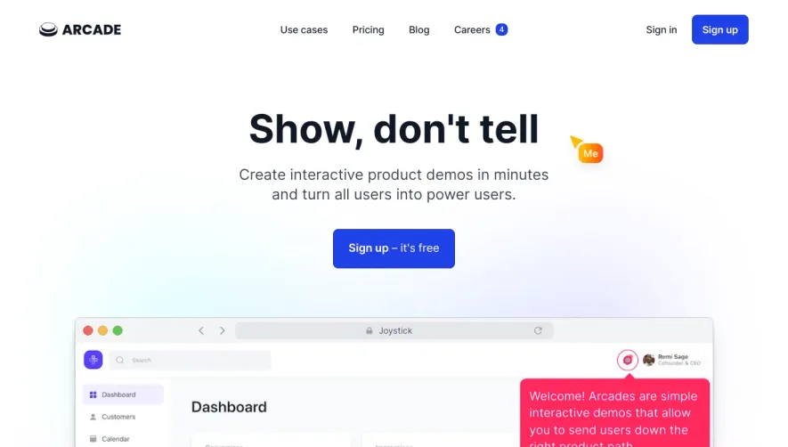



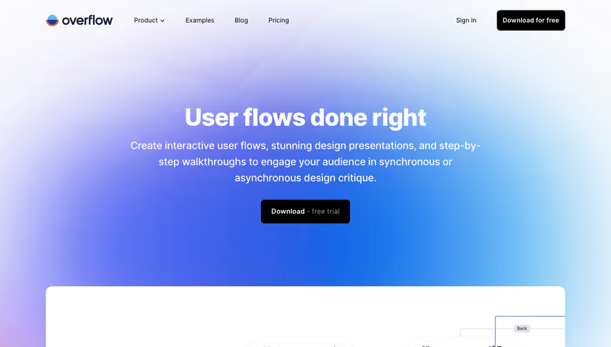

Upgrade to SaaSFrame Pro now to see similar examples.
Monthly
$18 /month
Billed $18 monthly
Browse all screens & flows
Filter and search screens & flows
Search text in screenshots
Access Figma files
Access mobile versions
Join now
Quarterly
$16 /month
Billed $48 quarterly
Browse all screens & flows
Filter and search screens & flows
Search text in screenshots
Access Figma files
Access mobile versions
Join now
Yearly
$15 /month
Billed $180 yearly
Browse all screens & flows
Filter and search screens & flows
Search text in screenshots
Access Figma files
Access mobile versions
Join now