Overall Style and Aesthetic
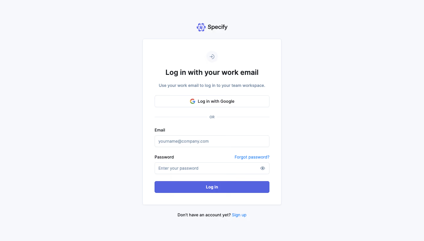
Specify’s login page embraces a sophisticated minimalist approach, blending modern professionalism with a touch of playful personality. The spacious layout is clean and uncluttered, guiding attention without distractions. Gentle color gradients and soft shadows add visual depth, while rounded corners and subtle micro-interactions lend a welcoming, approachable vibe. Layout and Structure
The page centers its content with a vertically aligned form, immediately focusing users’ attention on the login action. There’s no traditional hero section; instead, the brand’s logo sits proudly above the form, reinforcing identity. The footer is discreet and simple, containing essential links. The overall architecture is laser-focused, removing all excess elements to foster effortless user flow. Visual Elements
The standout visual is the charming, animated mascot illustration to the left of the form, delivering brand personality and a human touch without overwhelming the interface. Minimalist icons accompany input fields for clarity, while gentle motion in the mascot illustration draws the eye and enlivens the page without disrupting the login process. Color Palette and Typography
The design relies on a crisp white background contrasted with deep blues and subtle purple highlights, evoking trust and modernity. Primary CTA buttons feature a vibrant blue that stands out, encouraging engagement. Typography is clean and geometric, using a bold sans-serif for headings and a lighter weight for form instructions, ensuring hierarchy and readability. User Experience Patterns & Unique Choices
Navigation is almost invisible—there’s no distraction from logging in. The form is straightforward, offering clear calls to action and links to sign up or reset the password. Notably, the delightful mascot illustration adds memorability and warmth, making a typically bland SaaS page feel distinctive, friendly, and on-brand. The overall impression is both trustworthy and inviting, making for a seamless and engaging experience.