Overall Style and Aesthetic
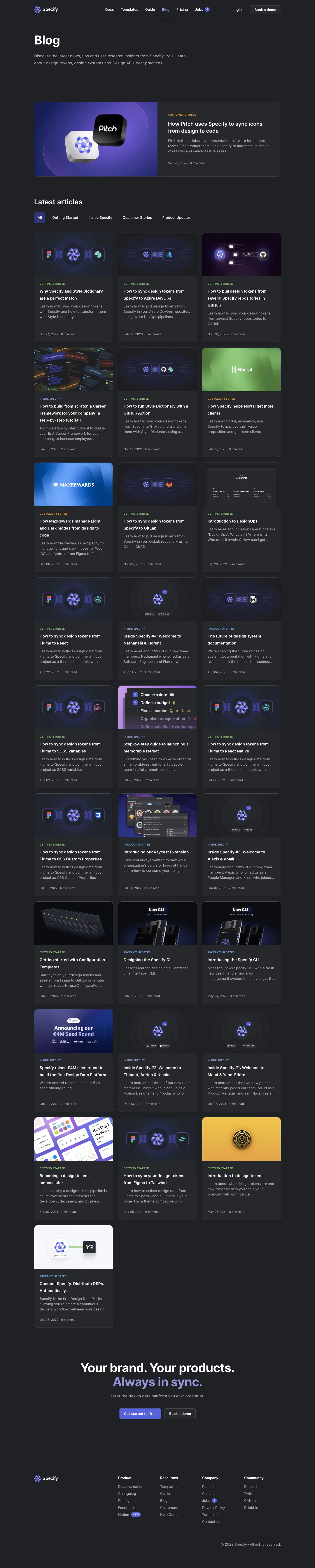
Specify’s blog radiates a modern, minimalist sophistication, blending a professional tone with subtle playfulness. Clean lines and ample white space create a sense of calm and clarity, allowing content to shine while exuding trustworthiness and innovation. The restrained use of color and balanced visuals conveys a tech-forward, confident identity—perfect for design-focused SaaS audiences seeking inspiration. Layout and Structure
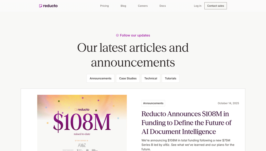
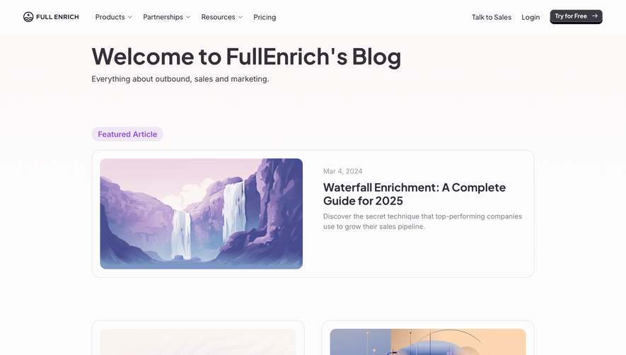
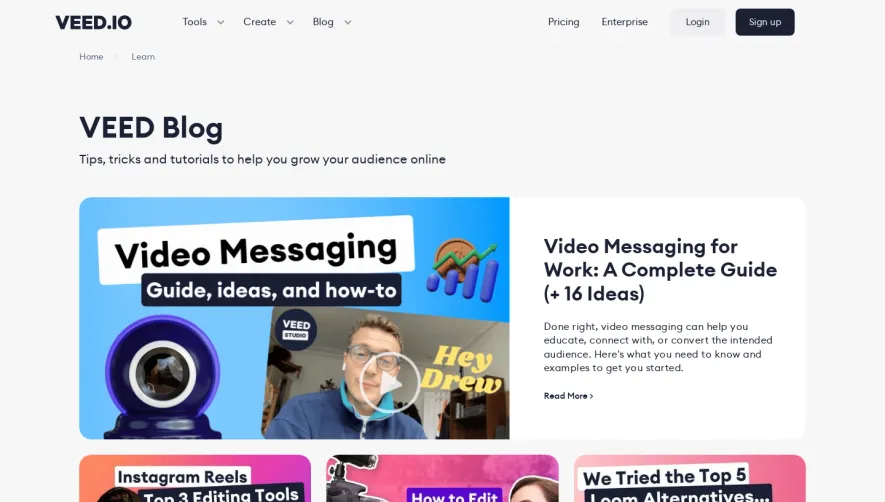
The page opens with a compact, understated header—logo left, navigation right—immediately inviting exploration. Content is organized in a clear card-based grid, each post preview featuring an image, title, excerpt, and tags, inviting scanning and interaction. There’s no clutter: pagination is simple, and the sticky navigation ensures users never feel lost. The footer is concise but functional, reinforced with brand colors and subtle links. Visual Elements
Every blog card features thoughtfully-composed illustrations or design-centric imagery rather than stock photos, aligning with the brand’s creative focus. Minimalist icons and SVG elements add a tailored, cohesive flair. There’s a gentle interplay of shadows, hover effects, and micro-animations, lending depth and interactivity without overwhelming the experience. Color Palette and Typography
Specify’s palette is anchored by clean whites, accented with deep indigos, purples, and soft gradients, projecting creativity and trust. Typography pairs geometric sans-serif fonts for headings with highly legible body text, using size and weight variations to establish clear hierarchy. Blog titles stand out, while summaries are easy to skim. User Experience Patterns & Unique Choices
Elegant navigation, intuitive search, and digestible blog summaries define the UX. Cards feature subtle hover states, hinting at interactivity. The absence of flash or popups keeps the reader focused. Unique to Specify is the perfect alignment between brand visuals and content, making every design choice feel intentional and on-brand—serving as a masterclass in SaaS design restraint and polish.