Design with AI
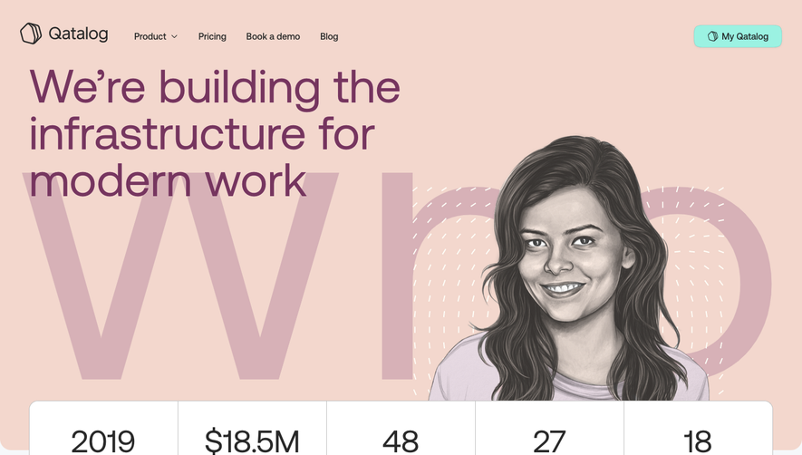
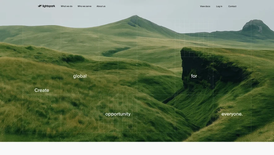
Generate a new design based on this screen using your own content.
# Design from Reference: Speakeasy About Page
Create an original, high-fidelity visual design inspired by the reference. Prioritize composition, typography, colors, spacing, and component styling over technical implementation.
## Reference
- **Product:** Speakeasy
- **Category:** About Page
- **Screenshot:** https://cdn.prod.website-files.com/5e9dc792e1210c5325f7ebbc/6acad411c910b3adf9e48ddc_6acad1b24dc332e891b60922_cms-61497af13da340677c9df91f.webp
Analyze the screenshot first. If inaccessible, request it rather than guessing.
## Content
{{content.instructions}}
{{content.data}}
Preserve essential messaging and factual accuracy. Adapt structure and copy length for visual balance; never invent product claims.
## Visual Design
### Overall aesthetic
- **Character:** Editorial developer-company page with thin elegant serif headings, monospace labels and monochrome ASCII-like artwork.
### Page composition
- **Canvas:** 2880 × 18002 screenshot px; CSS estimates assume 2× capture.
- **Sequence:** Split about hero, mission, four core-value cards, globe illustration, four-column team/friend directories, black careers band, investor logos/directory, three article cards, ring-art CTA and multicolumn footer.
### Information hierarchy
- **Priority:** Large lightweight serif statements contrast with compact directories. Thin rules and small uppercase labels distinguish content groups.
### Typography
- **Family:** High-contrast editorial serif display, geometric sans body and monospace uppercase metadata; exact fonts unverified.
- **Scale:** Estimated CSS hero 56–60 px, section headings 42–48 px, body 16 px, directory names 16 px and roles 11–12 px.
### Colors & surfaces
- **Sampled palette:** Near-white #FAFAFA, white #FFFFFF, black #000000, rules #DBDBDB/#EDEDED and muted text #808080/#545454.
- **Accents:** Very thin multicolor gradient rules and outlines; most imagery stays monochrome.
### Components
- **Artwork:** Character-built hand, globe, stars and ring form recurring motifs.
- **Directories:** Small square portraits, name/role pairs and fine bottom rules; team four columns, individual investors three.
- **Cards/actions:** Outlined 2×2 value grid; black article thumbnails; small outlined pill buttons; black full-width recruitment section.
### Visual rhythm
- **Spacing:** Exceptionally generous approximately 160–240 CSS px between major sections; compact ruled directories provide denser rhythm.
### Responsive
- **Observed:** Desktop only.
- **Adaptation:** Reduce major gaps, collapse directories to one/two columns, preserve serif legibility and simplify ASCII artwork at small sizes.
### Adaptation guidance
- **Preserve:** Editorial serif/monospace contrast, fine grids and restrained character artwork.
- **Replace:** Use approved people/investors and supplied content; do not copy corporate affiliations or article claims.
Use this context to reproduce the reference's visual language: layout, typography, colors, spacing, borders, radii, and distinctive elements. The screenshot takes priority if descriptions conflict.
## Direction
{{preferences.fidelityInstructions}}
## Output
{{output.instructions}}
Deliver a polished, cohesive design with precise alignment, hierarchy, and spacing. Produce the requested visual artifact, not just a description. If unsupported, explain the limitation.