Generate a new design based on this screen using your own content.
Thank you! Your submission has been received!
Oops! Something went wrong while submitting the form.
# Design from Reference: Span Demo Request
Create an original, high-fidelity visual design inspired by the reference. Prioritize composition, typography, colors, spacing, and component styling over technical implementation.
## Reference
- **Product:** Span
- **Category:** Demo Request
- **Screenshot:** https://cdn.prod.website-files.com/5e9dc792e1210c5325f7ebbc/6acad39bc2028efdec71ae8a_6acad11ad5603a17eba4f744_cms-6c30834d53f1d2f2e6e568b1.webp
Analyze the screenshot first. If inaccessible, request it rather than guessing.
## Content
{{content.instructions}}
{{content.data}}
Preserve essential messaging and factual accuracy. Adapt structure and copy length for visual balance; never invent product claims.
## Visual Design
Use this context to reproduce the reference's visual language: layout, typography, colors, spacing, borders, radii, and distinctive elements. The screenshot takes priority if descriptions conflict.
## Direction
{{preferences.fidelityInstructions}}
## Output
{{output.instructions}}
Deliver a polished, cohesive design with precise alignment, hierarchy, and spacing. Produce the requested visual artifact, not just a description. If unsupported, explain the limitation.
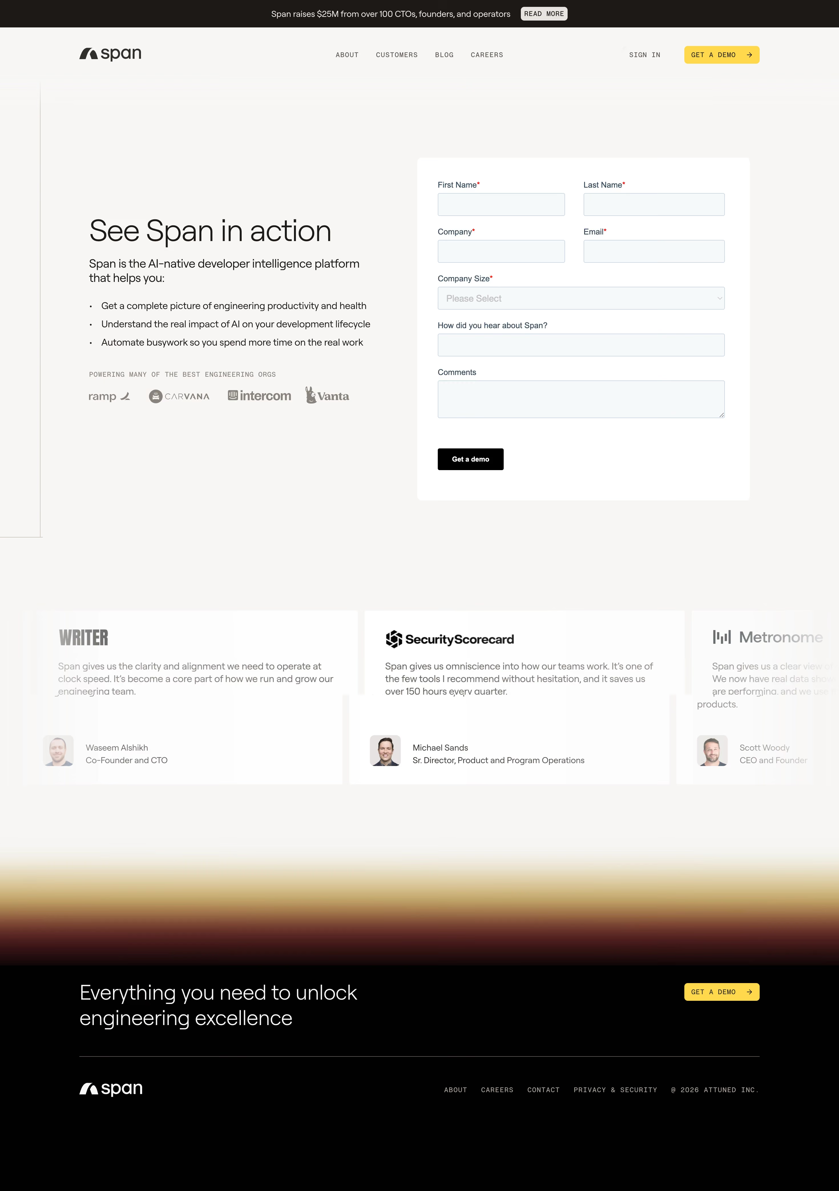
First thing you notice is the split layout. Left side sells, right side converts. Simple. The form fields are clean and well-spaced, never feeling cramped. That warm golden gradient at the bottom adds just enough personality without being distracting.
Typography Does the Heavy Lifting
"See Span in action" in that large serif heading hits different against the sans-serif body copy. The contrast between the two typefaces creates a clear hierarchy that pulls you down through the bullet points naturally. Those bullets are tight and benefit-driven, not fluffy.
Trust Without Trying Too Hard
The logo bar with Ramp, Carvana, Intercom, and Vanta sits quietly below the fold. Then the testimonial cards below go harder with real names, real titles, real photos. Michael Sands from SecurityScorecard dropping "saves us over 150 hours every quarter" is the kind of specificity that actually works.
What Makes It Stand Out
The restrained color palette is doing a lot. Black, white, and that warm amber gradient. The yellow "GET A DEMO" button in the nav and footer pops without screaming. Everything feels intentional and confident.