
Thank you! Your submission has been received!
Oops! Something went wrong while submitting the form.
Get SaaSFrame Pro
Monthly
$18
Quarterly
$48
Yearly
$180
Upgrade to access this feature
Browse all screens & flows
Filter and search screens & flows
Access Figma files
Access mobile versions
Bookmark screens & flows
Join now
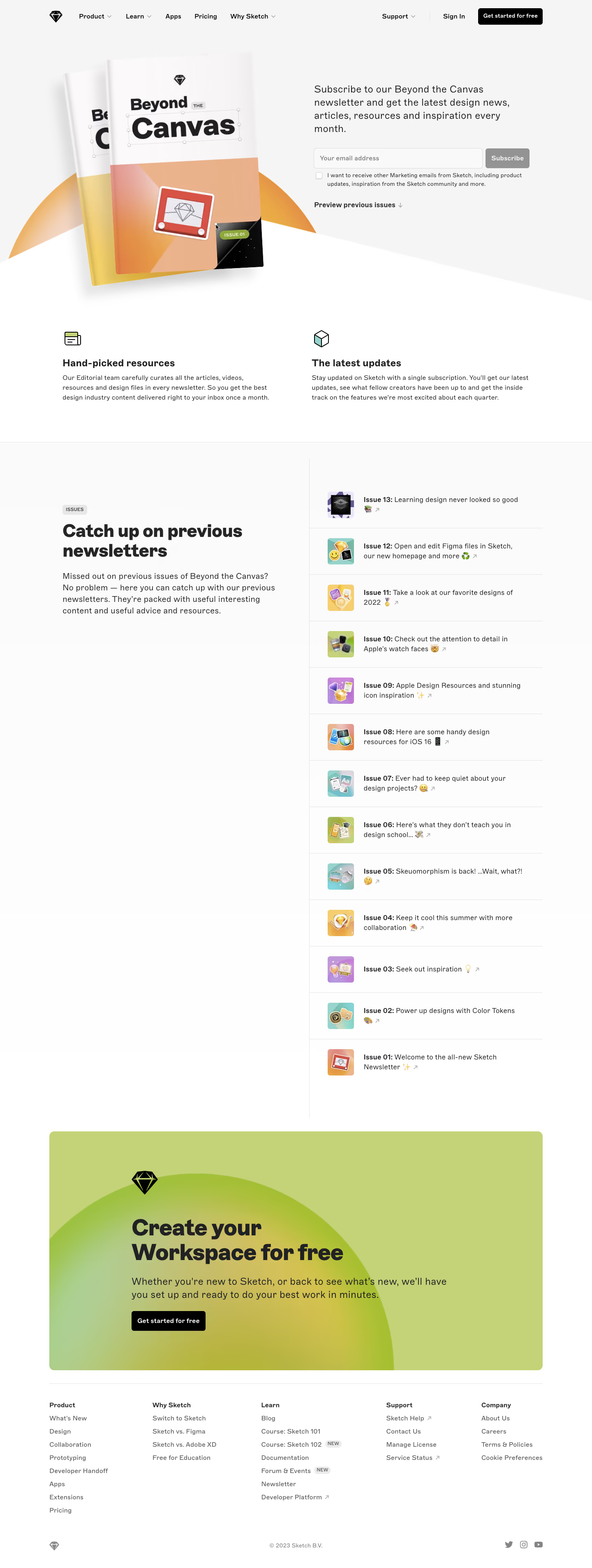

Sketch Newsletter Page

Sketch
Design, collaborate, prototype and handoff
Designed by
No items found.

Bookmark
Bookmark

Design with AI
Thank you! Your submission has been received!
Oops! Something went wrong while submitting the form.
# Design from Reference: Sketch Newsletter Page
Create an original, high-fidelity visual design inspired by the reference. Prioritize composition, typography, colors, spacing, and component styling over technical implementation.
## Reference
- **Product:** Sketch
- **Category:** Newsletter Page
- **Screenshot:** https://cdn.prod.website-files.com/5e9dc792e1210c5325f7ebbc/6acb6dee0e8221f13083663a_6acb6bd8bf2e69a0c03bb66f_cms-45ed0ce51ab5c47386220931.webp
Analyze the screenshot first. If inaccessible, request it rather than guessing.
## Content
{{content.instructions}}
{{content.data}}
Preserve essential messaging and factual accuracy. Adapt structure and copy length for visual balance; never invent product claims.
## Visual Design
### Overall aesthetic
- **Style:** Editorial newsletter landing page with a pale neutral hero, white archive area and a large lime-green closing promotion.
- **Character:** Magazine mockups, colorful issue thumbnails and small illustrated icons express a design-focused identity.
- **Capture:** The image measures 1440 × 3814 pixels. CSS estimates assume approximately 1:1 capture scale; browser scale and font identity are unverified.
### Page composition
- **Header:** A black diamond mark and product links sit left, with support, sign-in and a black start action right.
- **Hero split:** Large overlapping magazine covers occupy the left; newsletter explanation, email form, optional marketing checkbox and archive link occupy the right.
- **Hero boundary:** A broad angled white shape cuts across the pale background beneath the magazine artwork.
- **Benefits:** Two equal columns pair small line illustrations with bold labels and short descriptions.
- **Archive:** A two-column region places introductory copy left and thirteen issue rows right, divided by a vertical rule.
- **Closing promotion:** A wide rounded lime panel contains a black diamond, large heading, explanation and black action over a soft circular gradient.
- **Footer:** Five link columns sit below a thin rule, followed by small brand, copyright and social details.
### Information hierarchy
- **Newsletter identity:** The oversized magazine artwork carries the newsletter name while the right-hand copy explains its monthly value.
- **Signup:** Email entry and Subscribe are the primary hero controls.
- **Optional preference:** A small unchecked checkbox and compact explanation sit beneath the form.
- **Archive route:** A bold preview link points toward the previous-issues section.
- **Archive hierarchy:** Large left heading contrasts with small issue rows; each row emphasizes its issue number before a short description.
- **Secondary conversion:** The workspace-creation panel is visually distinct from newsletter signup.
- **Footer:** Small category labels organize product, comparison, learning, support and company links.
### Typography
- **Family:** A clean sans-serif is visible; exact identity is unverified.
- **Hero explanation:** Approximately 24-pixel CSS size with 32-pixel line height.
- **Benefit headings:** Approximately 24 pixels, bold; descriptions around 16 pixels with 24-pixel line height.
- **Archive heading:** Approximately 40–44 pixels, bold, with tight line spacing.
- **Archive intro:** Approximately 20 pixels with 28-pixel line height.
- **Issue rows:** Approximately 16 pixels with 24-pixel line height; issue labels are bold.
- **Closing heading:** Approximately 54 pixels, bold, across two lines; supporting text around 24 pixels.
- **Footer and controls:** Approximately 14–16 pixels, with very small checkbox copy around 12 pixels.
### Colors & surfaces
- **Measured base:** White #FFFFFF and pale gray #F5F5F5 support the main layout.
- **Measured green:** #C4D378 fills much of the closing promotion.
- **Measured text:** Near-black #212123 supports headings and primary labels.
- **Hero artwork:** Warm orange, peach, yellow and pink magazine surfaces contrast with the neutral background.
- **Archive thumbnails:** Small violet, mint, yellow and orange illustrations provide repeated color accents.
- **Actions:** Black filled buttons carry white text; the empty newsletter form shows a muted-gray Subscribe control.
- **Depth:** Magazine mockups cast soft shadows; most content regions remain flat with hairline rules.
### Components
- **Magazine artwork:** Two overlapping covers with tilted perspective sit over a partial warm semicircle.
- **Email form:** A wide outlined field and compact gray button share one row.
- **Preference control:** A small empty checkbox sits beside multi-line marketing text.
- **Preview link:** Bold text with a small downward arrow sits beneath the signup area.
- **Benefit blocks:** Each uses a small outlined icon, bold title and short paragraph without a card frame.
- **Archive rows:** Thirteen horizontal entries pair roughly 64-pixel square thumbnails with issue number, short text, emoji and external-arrow marks.
- **Archive dividers:** Thin horizontal rules separate rows; a vertical rule distinguishes the right list from left introduction.
- **Promotion card:** Approximately 1200 pixels wide, with 12-pixel corners and an oversized soft green/yellow circular gradient.
- **Footer details:** Small NEW badges annotate selected learning links; external destinations carry diagonal arrows.
- **State scope:** No submitted-email confirmation, selected checkbox or opened issue is shown.
### Visual rhythm
- **Container:** Approximately 120-pixel desktop gutters align benefits, archive and footer.
- **Hero balance:** Large artwork offsets the smaller functional signup group.
- **Archive cadence:** Equal thumbnail size and roughly 110-pixel row spacing create a long consistent list.
- **Whitespace:** The archive introduction remains fixed in the left visual zone while the right list extends far lower in the capture; sticky behavior is unverified.
- **Conversion break:** A generous gap separates archive from the bright closing card.
- **Footer density:** Compact link groups follow the large promotional message.
### Responsive
- **Recommendation — hero:** Stack artwork and signup copy, keeping the form prominent.
- **Recommendation — form:** Stack email and Subscribe when horizontal space is limited.
- **Recommendation — archive:** Move the introduction above the issue list and preserve readable thumbnail/text rows.
- **Recommendation — promotion:** Scale the large heading and crop decorative gradient within the panel.
- **Recommendation — footer:** Wrap columns and retain clear external-link cues. No mobile layout is evidenced.
### Adaptation guidance
- **Preserve newsletter value:** Pair a clear monthly-content explanation with signup and optional preference controls.
- **Keep archive useful:** Maintain issue numbering, thumbnail identity and concise summaries.
- **Separate product conversion:** Keep workspace signup visually distinct from newsletter subscription.
- **Reuse editorial imagery:** Carry magazine and issue-cover motifs rather than generic decorative cards.
- **Define form feedback:** Add validation, consent handling and subscription success states separately.
- **Avoid inferring archive behavior:** The screenshot shows links and layout, not issue-opening or sticky-column interactions.
Use this context to reproduce the reference's visual language: layout, typography, colors, spacing, borders, radii, and distinctive elements. The screenshot takes priority if descriptions conflict.
## Direction
{{preferences.fidelityInstructions}}
## Output
{{output.instructions}}
Deliver a polished, cohesive design with precise alignment, hierarchy, and spacing. Produce the requested visual artifact, not just a description. If unsupported, explain the limitation.


Category
Patterns
No items found.
Tech Stack

Added on
March 16, 2023
Similar screens
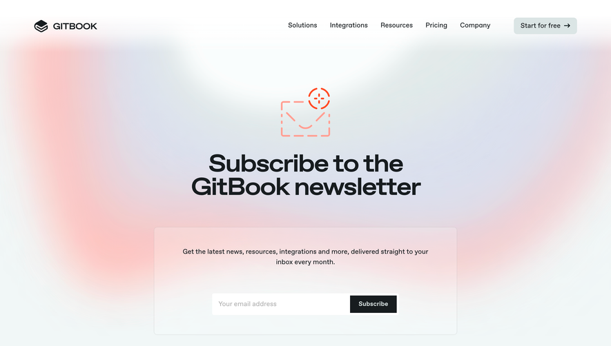


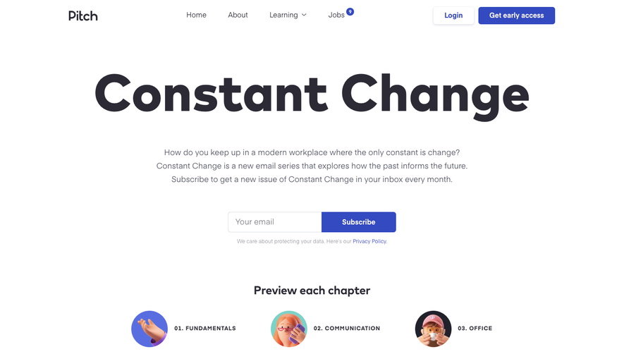

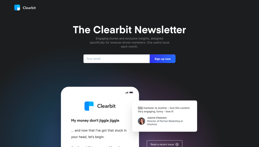

Upgrade to SaaSFrame Pro now to see similar examples.
Monthly
$18 /month
Billed $18 monthly
Browse all screens & flows
Filter and search screens & flows
Search text in screenshots
Access Figma files
Access mobile versions
Join now
Quarterly
$16 /month
Billed $48 quarterly
Browse all screens & flows
Filter and search screens & flows
Search text in screenshots
Access Figma files
Access mobile versions
Join now
Yearly
$15 /month
Billed $180 yearly
Browse all screens & flows
Filter and search screens & flows
Search text in screenshots
Access Figma files
Access mobile versions
Join now