Overall Style and Aesthetic
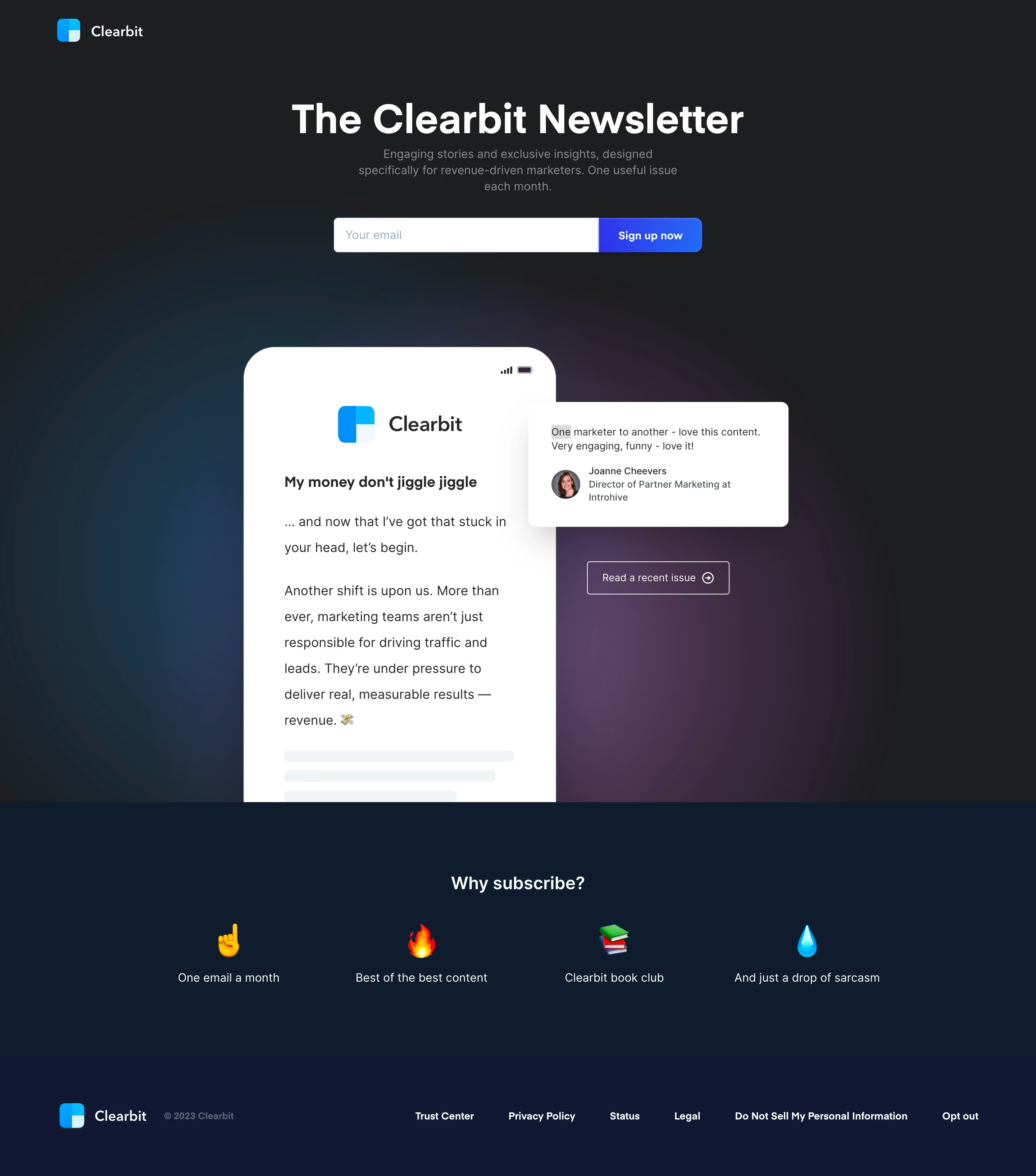
Clearbit’s newsletter landing page exemplifies a polished, modern SaaS aesthetic with a distinct professional edge. The design embraces minimalism, employing ample whitespace and clear visual hierarchy that makes the page feel both airy and focused. Friendly illustrations lend a subtly playful touch, balancing the page’s businesslike tone with welcoming energy. Layout and Structure
The page follows a compact, scroll-light structure, starting with an inviting hero section that immediately articulates the newsletter’s value. There’s a single, focused call-to-action (CTA), keeping user attention on sign-up without distractions. Supporting sections are spare—no crowded features lists—focusing entirely on getting users subscribed fast. The footer anchors the page with concise navigation and corporate credibility. Visual Elements
Clean, purpose-driven vector illustrations punctuate the page, using on-brand chromatic accents to draw the eye without overwhelming. Icons are flat, monochromatic, and universally recognizable, enhancing readability. The absence of photography or video keeps load times fast and attention directed toward the content and form. Color Palette and Typography
Clearbit leans on a streamlined palette dominated by soft whites, muted grays, and distinct blues that evoke trust and clarity. Typographically, crisp sans-serif fonts invade the hierarchy elegantly: bold headlines, supportive subheads, and readable body copy. Button CTAs use contrasting fills to pop against the background, guiding the user journey intuitively. User Experience Patterns and Unique Touches
Navigation is frictionless—a top nav icon returns users to the homepage, while the simple form avoids excess fields, lowering barriers to conversion. Subtle hover states and micro-interactions signal interactivity. Notably, the page’s concise copy and laser-focused layout make conversion feel effortless, underscoring Clearbit’s innovative, user-centric approach.