Overall Style and Aesthetic
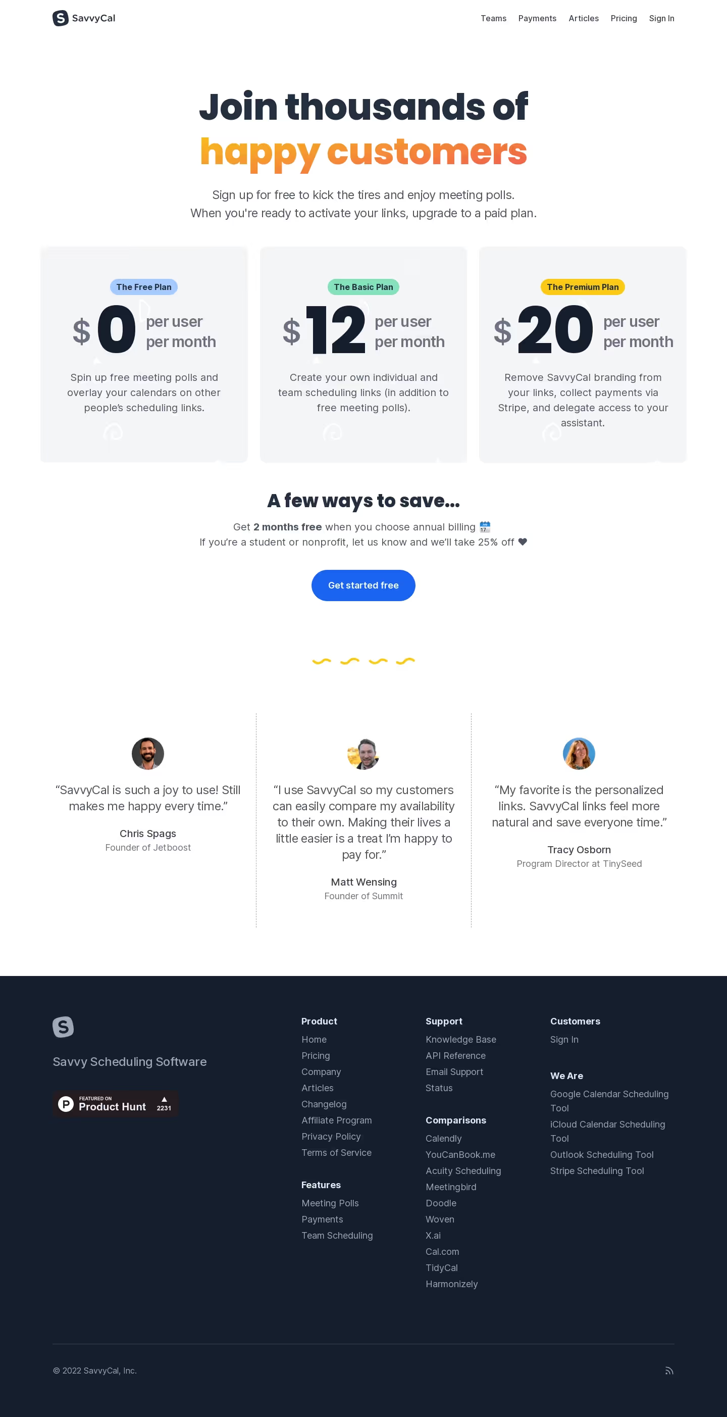
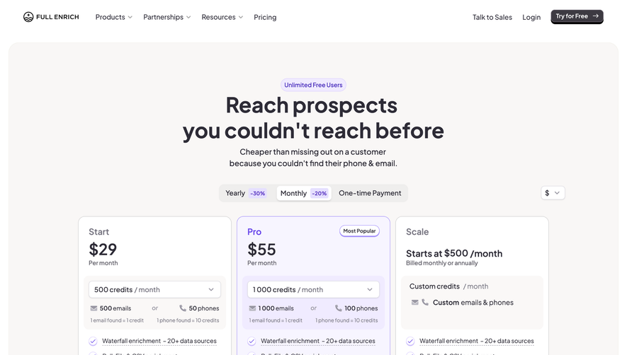
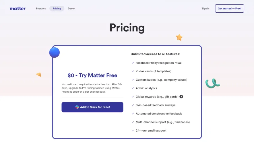
SavvyCal’s pricing page embodies a modern minimalist design, projecting professionalism while retaining a friendly, approachable vibe. Generous white space, precise alignment, and subtle shadow effects create a refreshing, uncluttered interface that feels both premium and inviting—striking a balance between efficiency and warmth. Layout and Structure
The layout follows a clear visual hierarchy, beginning with a concise hero header that communicates value immediately. The pricing plans are front-and-center, presented in a responsive, horizontally arranged card format. Supplementary sections like FAQs, social proof via customer logos, and a secondary FAQ area are neatly stacked, each separated for digestibility. A compact, informative footer rounds out the site, offering quick links without distraction. Visual Elements
Custom illustrations and playful, lightweight icons accentuate key areas, reinforcing the brand’s personality and guiding user focus. Subtle microanimations on plan selection buttons and hover states enhance interactivity without overwhelming the eye, elevating the tactile quality of the page. Color Palette and Typography
A clean, predominantly white background contrasts sharply with rich accent hues: deep purples, sky blues, and energetic pinks, used sparingly for buttons and highlights. Crisp sans-serif typography—with bold weights for headings and lighter text for details—creates an immediate visual hierarchy and ensures legibility. User Experience Patterns
Top navigation remains sticky, ensuring seamless access to key pages. High-contrast CTAs (“Start for free”) are prominent and repeated for maximum conversion. Plan toggles are intuitive, forms are minimal, and scroll rhythm feels natural—making it frictionless for visitors to explore and commit. Unique or Notable Design Choices
The pricing grid features subtle background fills and checkmark icons for features, lending clarity to plan differences. Strategic use of social proof reinforces trust, while FAQs are both visible and collapsible, making information easily discoverable. The tone throughout is empathetic and empowering, welcoming users while emphasizing clarity and ease.