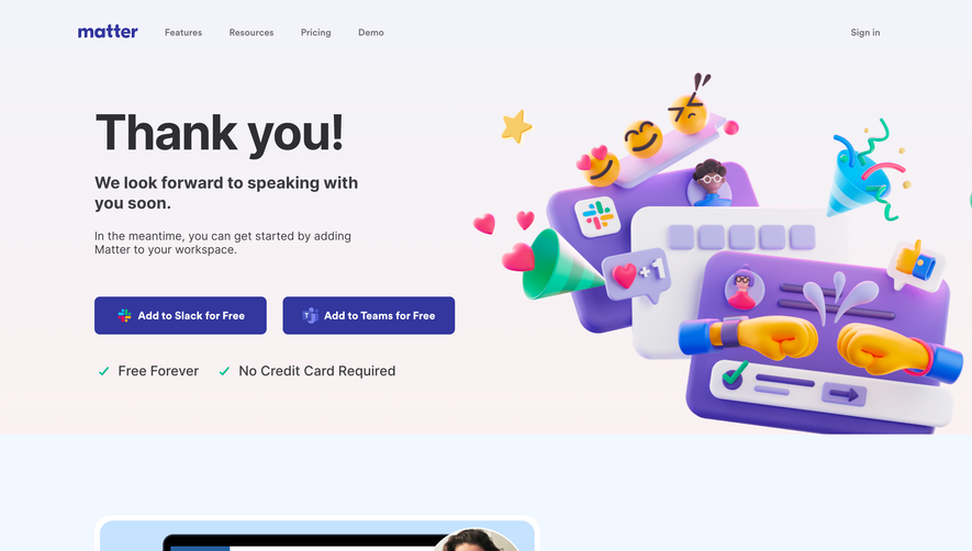
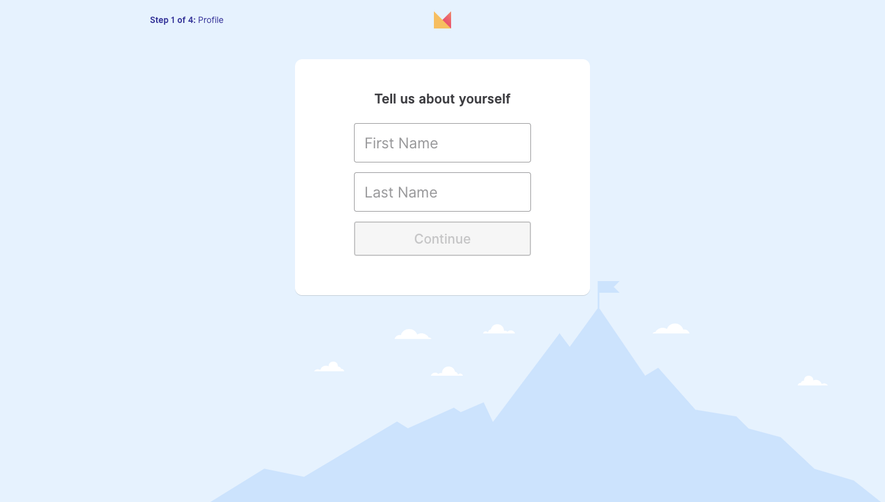
Matter’s pricing page radiates a modern, approachable professionalism with a distinctly minimalist flair. The visual tone is warmly inviting—using generous white space, rounded corners, and friendly illustrations that create a balanced sense of trust and innovation.
Layout and Structure
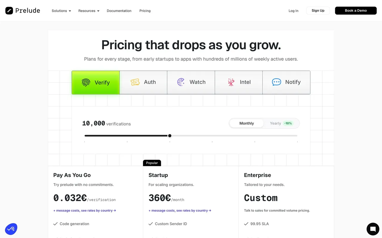
Content flows smoothly in a single-column format, with the core pricing tables centered under a clear, value-proposition header. Subtle sectioning enhances readability: pricing options take center stage, followed by concise plan breakdowns, a scrolling carousel of recognizable customer logos, FAQs, and a reassuring, comprehensive footer.
Visual Elements
Custom illustrations—soft gradients, hand-drawn characters, and light icons—inject personality and highlight key offerings without overpowering crucial information. Micro-animations animate hover states and CTAs, lending a tactile, interactive energy, while color-themed badges and tick marks quickly guide the eye to major features.
Color Palette and Typography
Matter expertly utilizes a palette combining deep indigo, gentle lilac, and bold accent colors (such as mint or coral) that unify the brand and make conversion elements pop. Headings are strong but humanistic sans-serifs, while body text remains highly legible. Font hierarchy is clear: pricing and CTAs dominate, while supplementary details are subtly downplayed.
User Experience Patterns
Top navigation is sticky, ensuring persistent access to essential pages. Prominent CTAs (“Start for Free”) are visually distinct and repeated for emphasis. Interactive toggles (monthly/annual pricing) and streamlined forms reduce friction, while sticky headers and shadow effects deliver satisfying scroll interactions.
Notable Design Choices and Tone
The design’s personality shines through custom illustrations and playful micro-animations, crafting a confident yet friendly user experience. The page’s tone is solution-focused and transparent, persuading users with clarity and warmth while building credibility and delight.
 SaaSFrame