Overall Style and Aesthetic
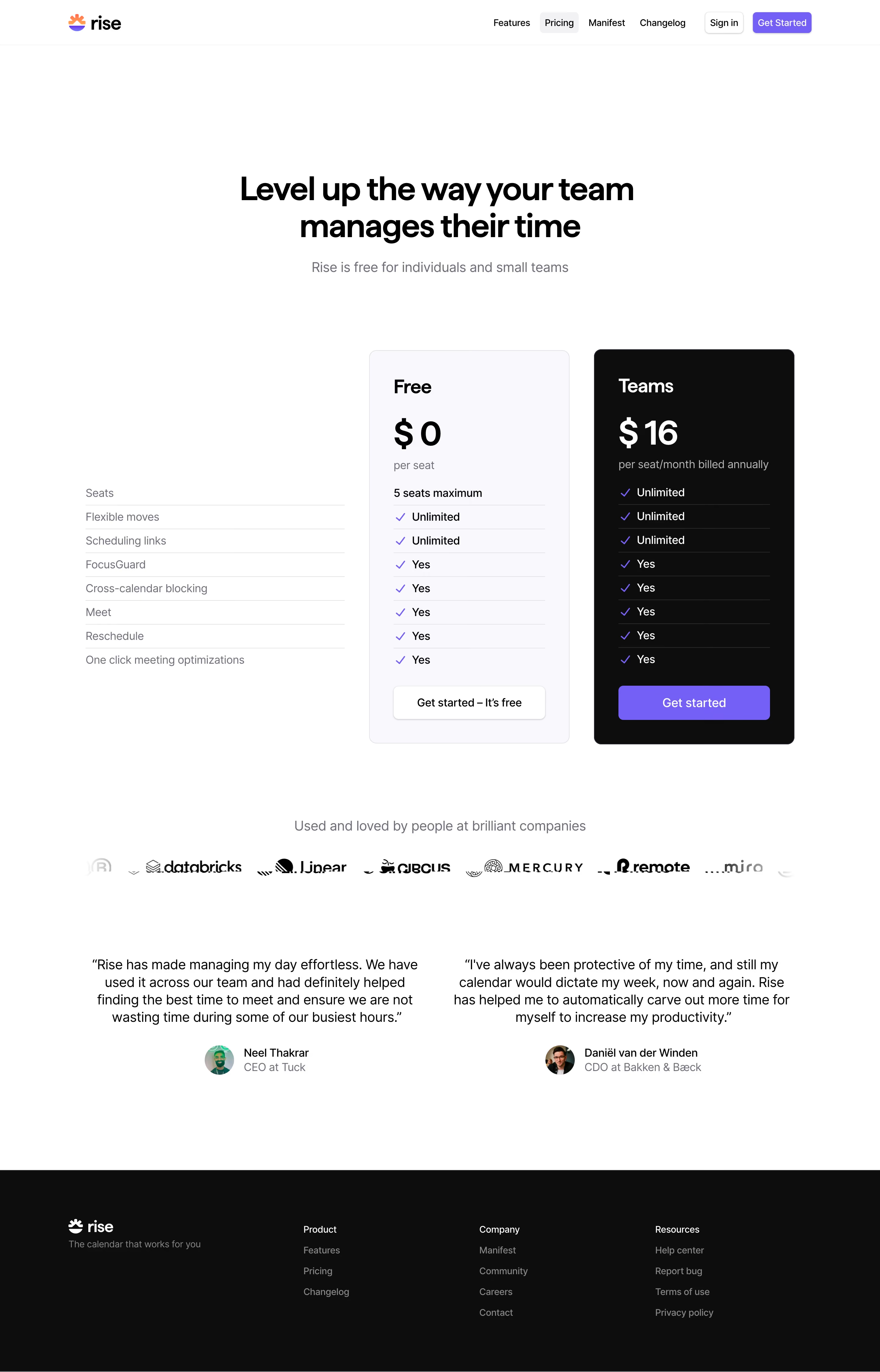
Rise Calendar’s pricing page epitomizes modern minimalism, with a clean, uncluttered layout that puts content and action at the forefront. The page feels fresh and approachable, achieving a perfect blend of professionalism and warmth through subtle color gradients, generous white space, and restrained visual flourishes. Layout and Structure
The structure is highly intuitive: a concise hero section introduces the purpose, immediately followed by well-delineated pricing cards showcasing plan features. The pricing grid is horizontal and visually anchored, enabling easy plan comparison. Supporting sections below clarify additional value propositions, while a compact footer ties off the journey with essential links and understated branding. Visual Elements
Bespoke icons and simple, friendly illustrations inject character without overwhelming. Micro-animations (like hover states and card highlights) guide attention and add interactivity. There’s a clear absence of stock photography, focusing on vector art and crisp iconography that reinforce the SaaS product’s digital-first nature. Color Palette and Typography
The palette features serene blues, moody purples, and soft grays against a white background, creating a trustworthy, calming ambiance. Pared-back accent colors call out primary CTAs. Typography is geometric and sans-serif, emphasizing legibility and hierarchy—plan names are bold and prominent, while descriptive text is lighter to aid scanning. User Experience Patterns
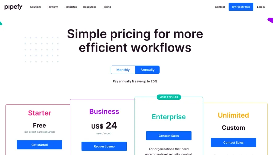
Navigation is frictionless with a sticky top bar and persistent, vibrant CTAs (“Start free,” “Contact sales”). Interactive toggles (e.g., monthly vs annual billing) provide immediate feedback. Clear visual cues, concise copy, and logical progression reduce cognitive load and make the conversion path straightforward. Unique or Notable Design Choices
Animated plan toggles, detailed hover tooltips, and transparent, upfront pricing build trust and orient users instantly. The inclusion of a “most popular” badge above one plan leverages social proof visually. The overall tone is innovative, credible, and user-centric—making complex decisions feel effortless and welcoming.