Overall Style and Aesthetic
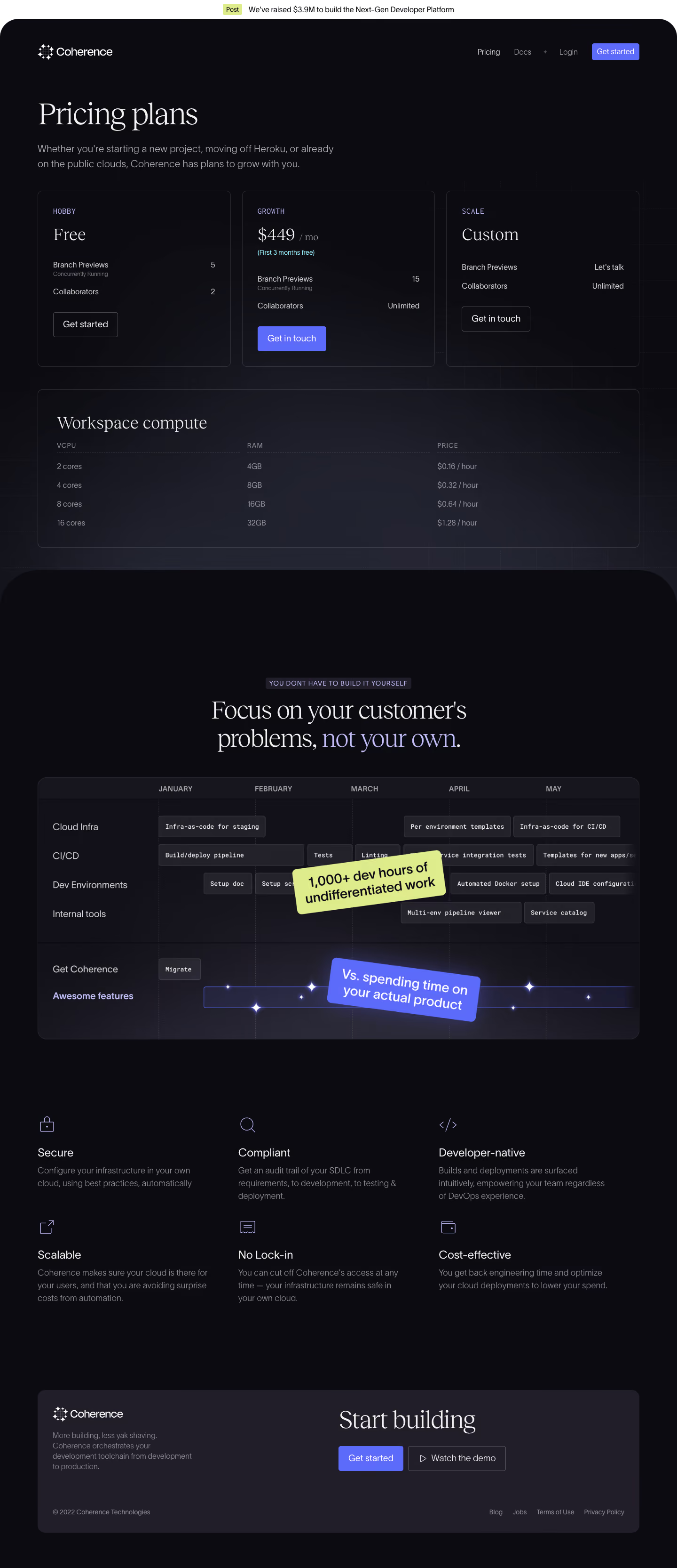
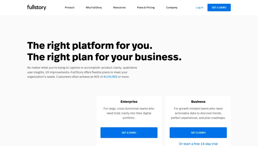
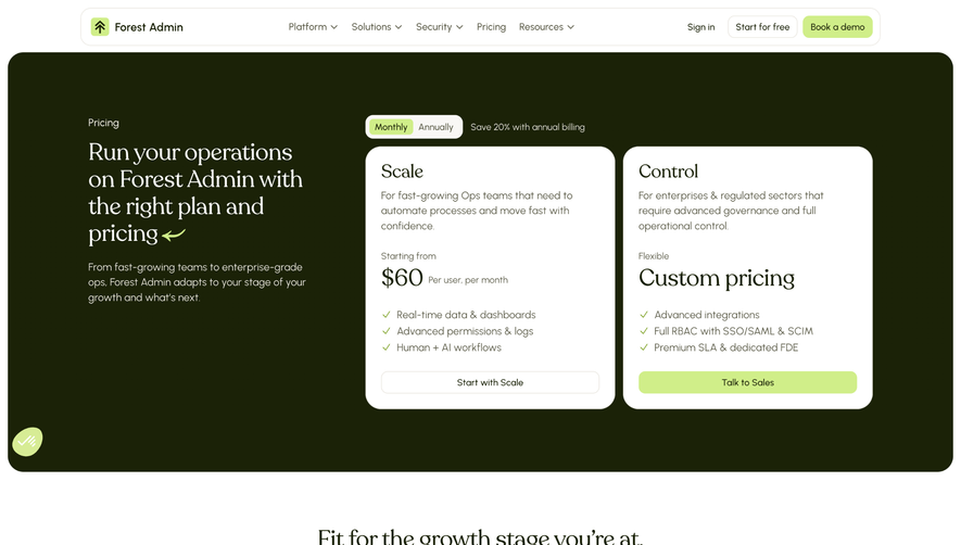
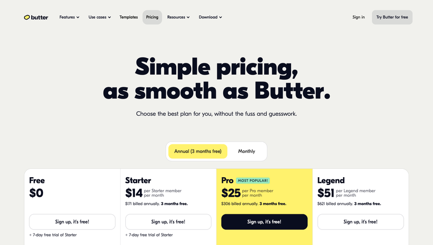
Coherence’s pricing page embraces a modern, minimalist aesthetic infused with personality and clarity. The crisp layout strips away clutter, allowing key content to breathe, while playful bursts of color and friendly illustrations inject warmth and approachability. The overall tone feels professional but inviting, showing confidence without pretension—ideal for SaaS audiences that value clarity and innovation. Layout and Structure
The page flows with distinct, well-separated sections: an immediate, focused hero area introducing the page and pricing philosophy; a prominent pricing grid with clearly tiered options; and informative footnotes clarifying features. Navigation remains sticky at the top for easy access, and logical scrolling rhythms guide users from value proposition to granular plan details, keeping engagement high. Visual Elements
Distinctive, hand-drawn-style illustrations and custom icons punctuate the page, breaking text monotony and aiding comprehension. Subtle micro-animations add dynamism—hover on card details for gentle highlighting and discover small surprise movements that convey polish and attention to detail, without overwhelming the content. Color Palette and Typography
A clean white background is accented by rich purples and vibrant gradient bursts, creating a sense of creativity and momentum. Typography is elegant and modern, emphasizing hierarchy with bold headers and easy-to-read body text, drawing the eye logically down the page. Fonts likely mix a geometric sans-serif for headings with softer, humanistic text. User Experience Patterns
Transparent CTAs in contrasting hues stand out without disrupting flow. Simple, distraction-free navigation and sticky elements enhance accessibility. Subtle hover states and clean pricing toggles keep users engaged. The user journey feels considered—intuitive, informative, and conversion-focused. Unique or Notable Design Choices
Noteworthy is the balance of playfulness and professionalism: whimsical illustrations paired with clear, jargon-free copy. The pricing table’s modular layout avoids overwhelming detail, while footnotes enhance transparency. Overall, the experience feels streamlined, confident, and delightfully user-centric—perfect inspiration for any SaaS product seeking to build trust and foster engagement.