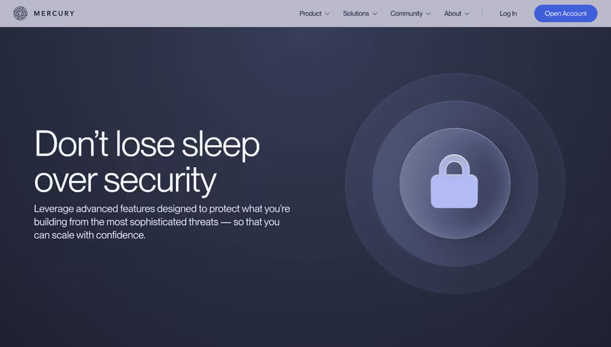
Generate a new design based on this screen using your own content.
Thank you! Your submission has been received!
Oops! Something went wrong while submitting the form.
# Design from Reference: Resend Security Page
Create an original, high-fidelity visual design inspired by the reference. Prioritize composition, typography, colors, spacing, and component styling over technical implementation.
## Reference
- **Product:** Resend
- **Category:** Security Page
- **Screenshot:** https://cdn.prod.website-files.com/5e9dc792e1210c5325f7ebbc/6acad4c81025e911ae5184ee_6acad3ddd8cd56d39f5a7e24_cms-aa554e2efb5ca744a3913307.webp
Analyze the screenshot first. If inaccessible, request it rather than guessing.
## Content
{{content.instructions}}
{{content.data}}
Preserve essential messaging and factual accuracy. Adapt structure and copy length for visual balance; never invent product claims.
## Visual Design
Use this context to reproduce the reference's visual language: layout, typography, colors, spacing, borders, radii, and distinctive elements. The screenshot takes priority if descriptions conflict.
## Direction
{{preferences.fidelityInstructions}}
## Output
{{output.instructions}}
Deliver a polished, cohesive design with precise alignment, hierarchy, and spacing. Produce the requested visual artifact, not just a description. If unsupported, explain the limitation.
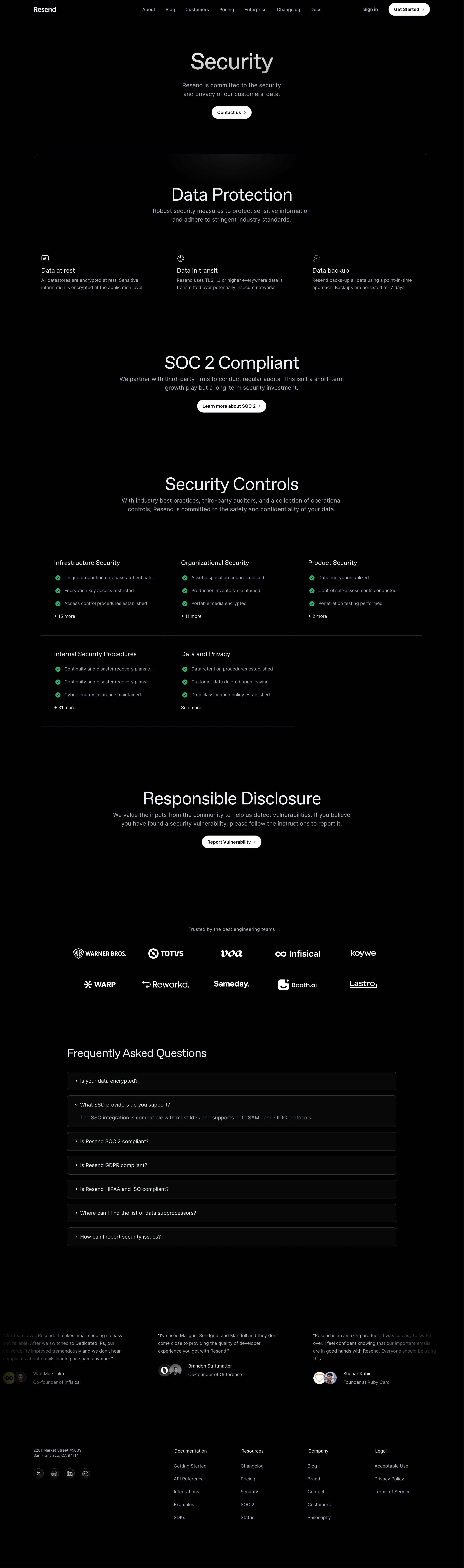
Resend’s security page embodies a modern minimalist approach, blending clarity with professionalism. The whitespace-heavy layout accentuates content, while a restrained palette reinforces trust and focus. Subtle microinteractions and gently animated icons add a hint of dynamism without overwhelming users, striking a perfect balance between sophistication and approachability.
Layout and Structure
The structure is clean and logical, starting with a straightforward hero section that immediately conveys the page’s purpose. Information unfolds in clearly segmented sections: security commitments, technical details, and compliance certifications. There’s no clutter—each block of content is well-spaced and easy to digest, guiding readers naturally down the page. The sticky top navigation enables effortless movement between sections and the broader site.
Visual Elements
Custom line illustrations and refined security-themed icons lend the page a unique visual identity and break up the textual content. There are no overpowering graphics or stock photos—visuals are purposeful and supportive, reinforcing key points. Subtle animations reinforce interactivity, such as icon hover states that animate lightly, demonstrating attention to detail.
Color Palette and Typography
Resend uses a palette anchored by deep navy and crisp whites, with occasional accents in muted blue and green for highlights and status cues. Typography is crisp and modern—likely a geometric sans-serif—providing strong contrast and a clear hierarchy, making headings pop and body text effortlessly readable.
User Experience Patterns
Navigation is intuitive, with clear CTAs directing users to documentation or support. Content layout avoids walls of text, instead employing concise copy, bullet points, and visual cues for maximum clarity. The smooth scroll animations and sticky header anchor the experience, ensuring users never feel lost.
Unique or Notable Design Choices
A standout element is the page’s single-minded focus—security messaging remains central, with no sales pitches or pricing distractions. This sharp focus builds credibility and trust. Carefully crafted icons and subtle animation cues add polish, setting the page apart from more generic SaaS security implementations.
Tone and Feel
The overall tone is unwaveringly trustworthy and reassuring. Every design decision—from color choices to content density—signals reliability and transparency, reinforcing Resend’s commitment to user data security.