Overall Style and Aesthetic
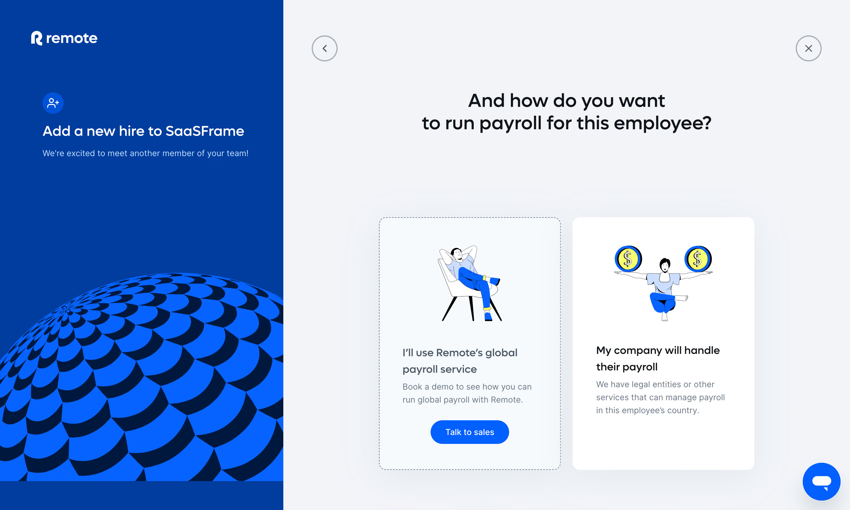
Remote’s “Add People” dashboard exemplifies a crisp, professional, and approachable SaaS design. The minimalist interface centers on clarity and efficiency, using abundant white space and gentle shadows to create a sense of depth and modernity. The page feels clean and uncluttered, inviting users to focus on essential tasks without distraction. The overall atmosphere balances professionalism with an understated friendliness, suitable for HR and operational users. Layout and Structure
The layout is intuitive, centering content within a contained, bordered card to guide user attention. Clear section headings and a progress indicator create a logical, step-by-step flow, ideal for onboarding complex data. The absence of a sprawling hero area or superfluous content ensures the user’s focus remains fixed on accomplishing the form-driven task at hand. Visual Elements
Subtle iconography and micro-illustrations breathe warmth into the form fields, supporting quick scanning and lowering cognitive load. Visual hierarchy is reinforced with contrasting button designs and soft accent icons for guidance and feedback. The experience feels interactive, aided by responsive focus states and streamlined modals. Color Palette and Typography
The palette is composed mainly of white, gentle grays, and a blue-violet accent that punctuates CTAs and highlights. Typography leans on rounded sans-serif fonts, conveying both sophistication and approachability. Bold font weights for instructions enhance hierarchy, while smaller, softer labels offer supportive context. User Experience Patterns
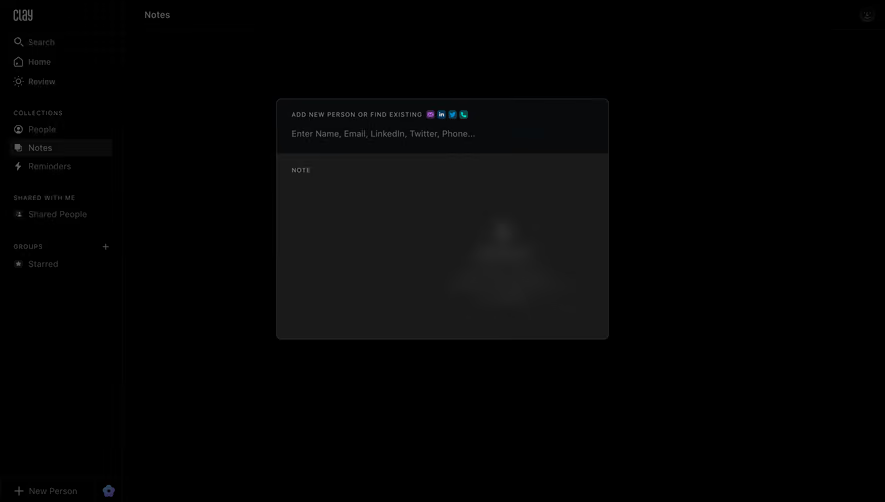
Dynamic form validation, sticky navigation, and clear primary CTAs shape a frictionless user journey. Progress is gently surfaced to reduce anxiety over task length, and thoughtful form organization (toggles, dropdowns) maintains context. The entire experience exudes clarity, confidence, and attention to detail—excellent benchmarks for savvy SaaS designers.