
Thank you! Your submission has been received!
Oops! Something went wrong while submitting the form.
Get SaaSFrame Pro
Monthly
$18
Quarterly
$48
Yearly
$180
Upgrade to access this feature
Browse all screens & flows
Filter and search screens & flows
Access Figma files
Access mobile versions
Bookmark screens & flows
Join now
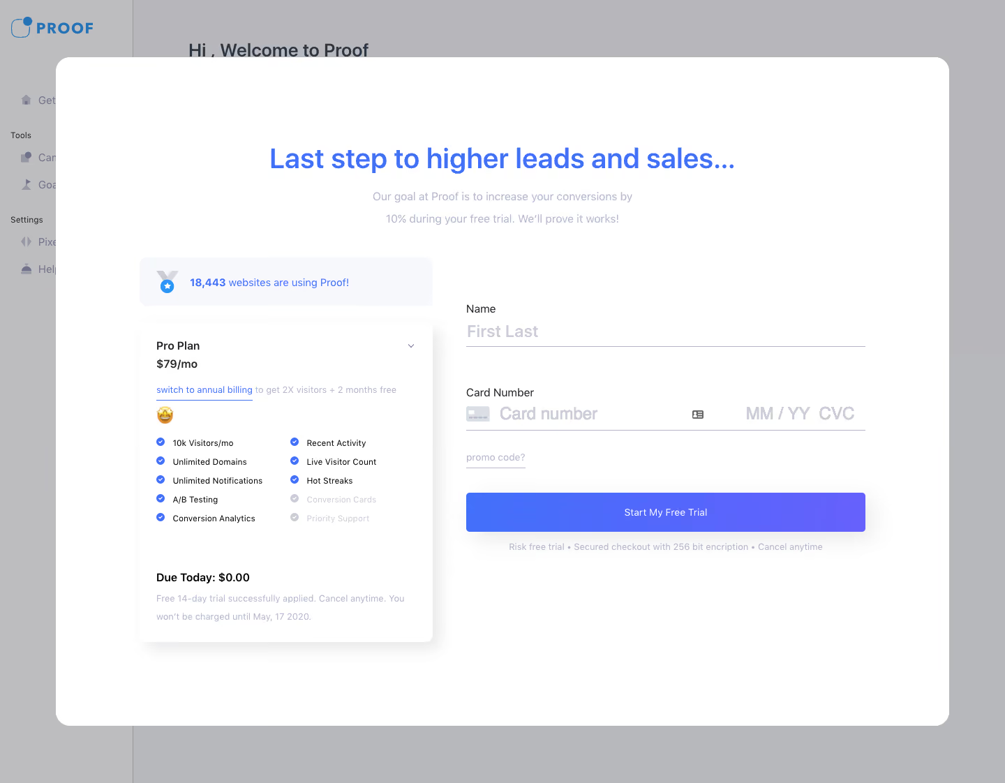
Proof Sign Up Flow

Proof
Boost Your Conversion Rate
Designed by
No items found.

Bookmark
Bookmark

Design with AI
Thank you! Your submission has been received!
Oops! Something went wrong while submitting the form.
# Design from Reference: Proof Sign Up Flow
Create an original, high-fidelity visual design inspired by the reference. Prioritize composition, typography, colors, spacing, and component styling over technical implementation.
## Reference
- **Product:** Proof
- **Category:** Account Setup
- **Screenshot:** https://cdn.prod.website-files.com/5e9dc792e1210c5325f7ebbc/6acbc899d69dbc5db10092e8_6acbc6276b0a1061299ae801_cms-e4865be9d7de4910f52212f8.webp
Analyze the screenshot first. If inaccessible, request it rather than guessing.
## Content
{{content.instructions}}
{{content.data}}
Preserve essential messaging and factual accuracy. Adapt structure and copy length for visual balance; never invent product claims.
## Visual Design
### Overall aesthetic
- **Style:** Trial checkout modal over a dimmed onboarding application, combining plan reassurance with a minimal payment form.
- **Character:** Large white rounded dialog, blue/violet accents, pale supporting text and a softly elevated pricing card.
- **Captured state:** Background application is covered by a gray scrim. Its sampled colors are composited overlay values, not confirmed base-theme tokens.
### Page composition
- **Capture dimensions:** 1440 × 1122 image px. CSS reconstruction estimates assume an unverified 1× capture.
- **Background:** Left navigation and a welcome heading remain partly visible behind the overlay.
- **Modal:** Approximately 1280 × 960 px, centered with around 80 px side margins and 20 px corner radii.
- **Intro:** Large centered blue headline and two short pale supporting lines occupy the upper dialog.
- **Left column:** Approximately 420 px wide, beginning beneath the intro with a social-proof banner and a plan-summary card.
- **Plan card:** Plan selector/name, price, annual-billing link, two-column feature list and due-today/trial information.
- **Right column:** Approximately 570 px wide, containing name, card details, promo-code link, wide trial action and a small reassurance line.
- **Spacing:** Broad white margins surround both columns; no dialog close button is visible in the capture.
### Information hierarchy
- **Primary promise:** Blue headline dominates the modal; supporting conversion claim remains smaller and lighter.
- **Plan hierarchy:** Plan name/price lead, then features, then stronger Due Today line and small trial terms.
- **Form hierarchy:** Visible labels precede underline-style fields; the full-width blue/violet action is the strongest form element.
- **Trust:** Social-proof count, feature checks and security/cancellation text support the decision.
- **Captured state:** Payment/name fields are empty. No validation, successful trial activation or expanded plan menu is shown.
- **Evidence limit:** Prices, dates and promotional claims are screenshot content and must not be assumed current.
### Typography
- **Family:** Neutral sans serif; exact identity is unverified.
- **Headline:** Approximately 38–40 px, semibold, with 48 px leading.
- **Intro copy:** Approximately 16 px with 30–32 px leading, pale lavender-gray.
- **Plan title/price:** Approximately 16 px, medium/semibold.
- **Feature list:** Approximately 12–13 px with compact 26–28 px row spacing.
- **Form labels:** Approximately 16 px; placeholders around 24 px, light gray and heavier.
- **Action/legal:** Button around 14 px; reassurance and trial notes around 13–14 px.
- **Measurement limit:** All values are visual CSS estimates under the assumed 1× scale.
### Colors & surfaces
- **Modal/card:** Sampled sRGB #FFFFFF fills the active surfaces.
- **Pale banner:** Sampled #F7F8FB supplies the social-proof surface.
- **Action blue:** Sampled #4370FB is a principal blue reference among the active elements.
- **Overlay:** Sampled #B7B8BB, #B7B7BB and #BCBCBE describe the dimmed background composition.
- **Accent treatment:** The main action visibly shifts from blue toward violet; exact gradient endpoint is not established by the dominant-color sample.
- **Secondary text:** Very pale lavender-gray supports field placeholders, trial notes and unavailable-looking features.
- **Contrast caution:** Reconstruct supporting copy with readable contrast rather than blindly preserving the faintest raster text.
### Components
- **Dialog:** Large white rounded rectangle without an obvious border or heavy outer shadow.
- **Social-proof banner:** Pale rounded rectangle with small medal/star symbol and blue count/message.
- **Plan card:** White low-radius surface with soft lower shadow, about 24 px internal padding.
- **Feature indicators:** Small blue circular checks; two lower features appear much lighter than the others.
- **Plan selector:** Small downward chevron at the card's upper right.
- **Name field:** Label above large placeholder and a thin lavender-gray underline.
- **Card row:** Card icon, number placeholder and expiry/CVC placeholders share one line above an underline.
- **Promo route:** Small underlined text link beneath the card fields.
- **Trial action:** Approximately 570 × 56 px, blue/violet fill, modest radius and white centered label.
- **Reassurance line:** Compact centered text beneath the action, separated by dot bullets.
### Visual rhythm
- **Two-column balance:** Dense plan details on the left balance a lighter payment form on the right.
- **Whitespace:** Large gaps around the headline and between fields prevent the checkout from feeling cramped.
- **Alignment:** Form labels/underlines/action share a stable left/right boundary; plan content follows its own inset.
- **Accent repetition:** Blue headline, links, checks and action connect reassurance with the conversion path.
### Responsive
- **Evidence limit:** Only desktop is shown; recommendations below are not observed behavior.
- **Modal recommendation:** Use viewport-safe width/height and scrollable content on small screens.
- **Columns recommendation:** Stack plan context and payment form, preserving trial terms near the action.
- **Fields recommendation:** Separate card number and expiry/CVC when needed without reducing text size.
- **Accessibility recommendation:** Provide field labels, clear validation, keyboard focus management and an appropriate dismissal route; these behaviors are not verified by the screenshot.
### Adaptation guidance
- **Use accurate commercial content:** Replace prices, trial duration, billing dates, feature allowances and social proof with verified target information.
- **Preserve decision clarity:** Keep chosen plan and due-today amount visible alongside payment entry.
- **Avoid unsupported promises:** Do not copy conversion/security/cancellation claims automatically.
- **Retain visual hierarchy:** Use one prominent action, concise reassurance and a clearly separated plan summary.
- **State accuracy:** Derive availability and submission feedback from real validation; the screenshot does not establish completion behavior.
Use this context to reproduce the reference's visual language: layout, typography, colors, spacing, borders, radii, and distinctive elements. The screenshot takes priority if descriptions conflict.
## Direction
{{preferences.fidelityInstructions}}
## Output
{{output.instructions}}
Deliver a polished, cohesive design with precise alignment, hierarchy, and spacing. Produce the requested visual artifact, not just a description. If unsupported, explain the limitation.


Category
Patterns
No items found.
Tech Stack



Added on
February 4, 2023
Found in 1 flow

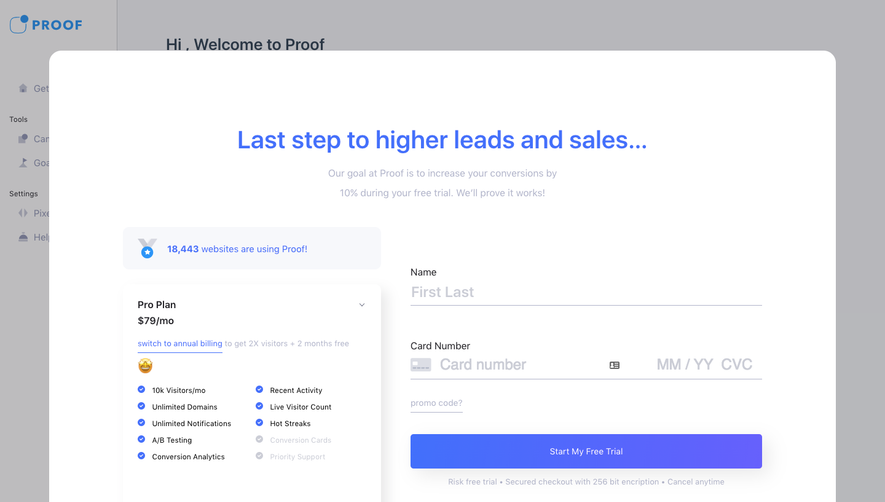
Similar screens
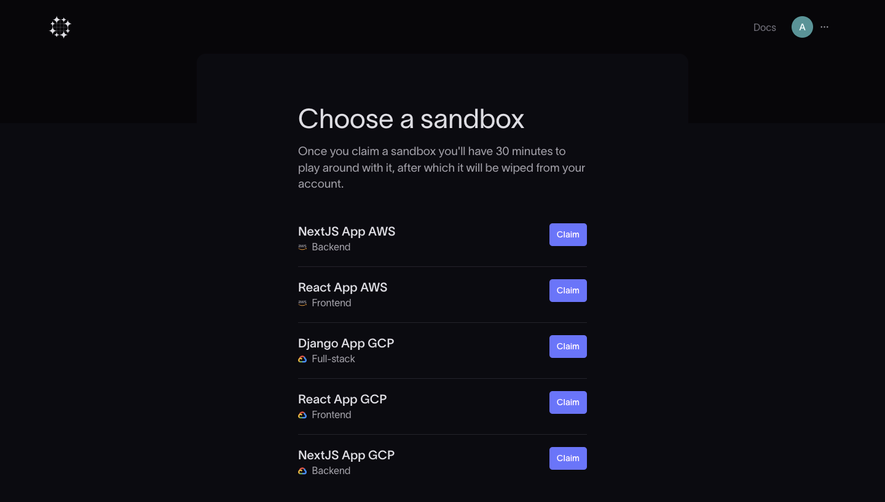


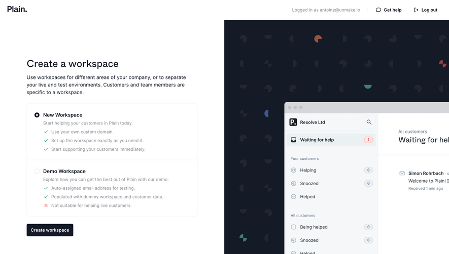



Upgrade to SaaSFrame Pro now to see similar examples.
Monthly
$18 /month
Billed $18 monthly
Browse all screens & flows
Filter and search screens & flows
Search text in screenshots
Access Figma files
Access mobile versions
Join now
Quarterly
$16 /month
Billed $48 quarterly
Browse all screens & flows
Filter and search screens & flows
Search text in screenshots
Access Figma files
Access mobile versions
Join now
Yearly
$15 /month
Billed $180 yearly
Browse all screens & flows
Filter and search screens & flows
Search text in screenshots
Access Figma files
Access mobile versions
Join now