Generate a new design based on this screen using your own content.
Thank you! Your submission has been received!
Oops! Something went wrong while submitting the form.
# Design from Reference: Prelude Pricing Page
Create an original, high-fidelity visual design inspired by the reference. Prioritize composition, typography, colors, spacing, and component styling over technical implementation.
## Reference
- **Product:** Prelude
- **Category:** Pricing Page
- **Screenshot:** https://cdn.prod.website-files.com/5e9dc792e1210c5325f7ebbc/6acad3a8c2028efdec71affa_6acad150286c0f56719bf876_cms-54c2af973d8127a327d5b6f2.webp
Analyze the screenshot first. If inaccessible, request it rather than guessing.
## Content
{{content.instructions}}
{{content.data}}
Preserve essential messaging and factual accuracy. Adapt structure and copy length for visual balance; never invent product claims.
## Visual Design
Use this context to reproduce the reference's visual language: layout, typography, colors, spacing, borders, radii, and distinctive elements. The screenshot takes priority if descriptions conflict.
## Direction
{{preferences.fidelityInstructions}}
## Output
{{output.instructions}}
Deliver a polished, cohesive design with precise alignment, hierarchy, and spacing. Produce the requested visual artifact, not just a description. If unsupported, explain the limitation.
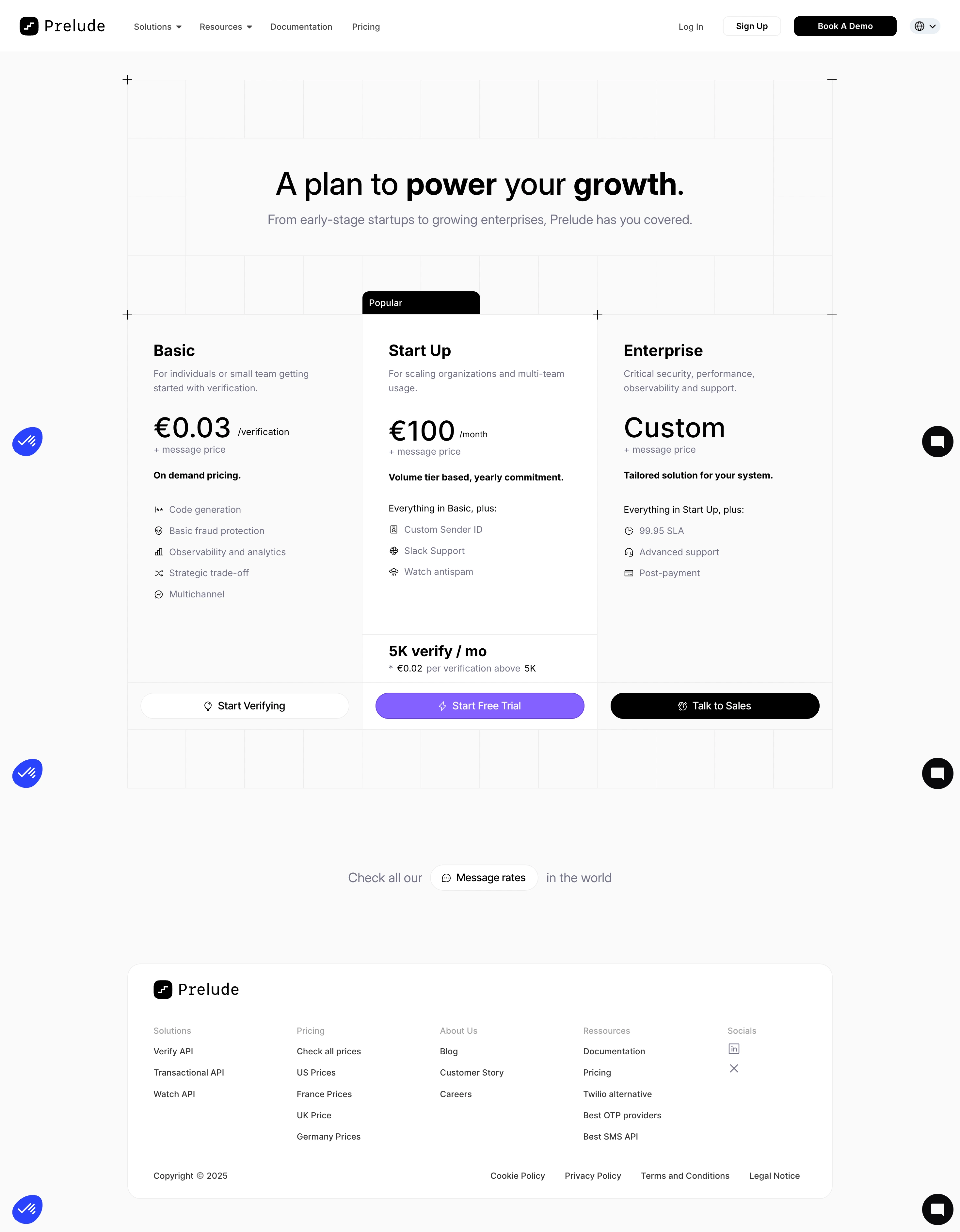
First thing you notice is how much whitespace this page has. Prelude's pricing page doesn't crowd you. The grid background adds subtle texture without competing with the content, and those small "+" markers at the corners give it a quiet structural feel that's pretty distinctive.
Three Tiers, Zero Confusion
The layout is classic three-column pricing but executed with restraint. The "Popular" badge on Start Up is a solid black pill that draws your eye to the middle tier naturally. Typography is doing heavy lifting here. The euro pricing uses large bold numerals against smaller descriptor text, making the cost instantly scannable. "Custom" for Enterprise is set in the same weight, which keeps things balanced even without a number.
What Makes It Work
Monochrome palette with just black, white, and gray. No gradients, no color coding per tier. The CTAs differentiate through fill vs outline, guiding you toward that free trial button. Feature lists use tiny custom icons that feel intentional. Footer is well organized without being overwhelming. Simple, confident, gets out of your way.