Overall Style and Aesthetic
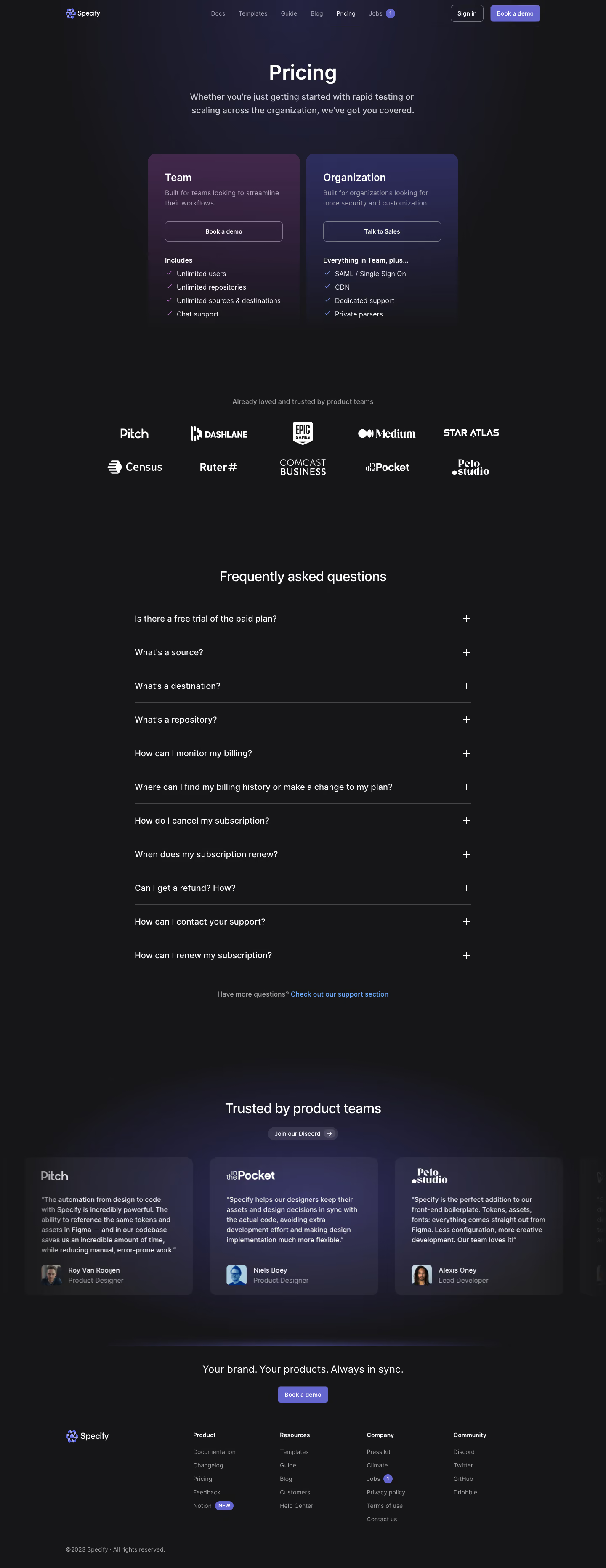
Specify’s pricing page exemplifies a crisp, modern aesthetic with a clear emphasis on minimalism and professionalism. The interface feels both approachable and smart—balancing whitespace and color to keep the content inviting without clutter. There’s a deliberate calmness to the design, suggesting reliability and clarity. Layout and Structure
The page follows a logical, user-friendly structure: an immediate hero section with a headline inviting users to compare plans, followed by a prominent, side-by-side pricing grid. Each plan’s details are succinctly displayed, making comparisons simple. Beneath the grid, a neatly organized FAQ accordion preempts common concerns, while a sticky call-to-action bar remains visible as users scroll. The footer is clean, with resource links and understated branding. Visual Elements
Distinctive, soft-toned illustrations and crisp vector icons update the experience with a contemporary touch. The friendly hand-drawn feel of the icons, paired with subtle, interactive highlights on hover, adds playfulness and visual delight. There’s a lack of clutter—no distracting patterns, videos, or stock photography—keeping users focused on their decision. Color Palette and Typography
A palette grounded in whites and soft grays is accented by confident blues and subtle purples, used sparingly for calls-to-action and highlights. Typography is modern and geometric, leaning into clarity with bold headings and generous spacing, creating effortless hierarchy while guiding the eye to key information. User Experience Patterns
Navigation remains simple, bolstered by persistent CTAs and friendly microinteractions. Pricing toggles, clear plan breakdowns, and frictionless contact prompts reduce cognitive load. Notably, the sticky CTA at the bottom ensures action is always just a click away—a thoughtful touch for conversion. Notable Design Choices and Tone
The page’s standout feature is its visual restraint: instead of overwhelming users with options, Specify showcases transparency and trustworthiness through design simplicity. The tone is quietly innovative—inviting, professional, and easy to navigate without losing its creative edge. This blend of clarity and personality makes it a standout example for SaaS pricing pages.