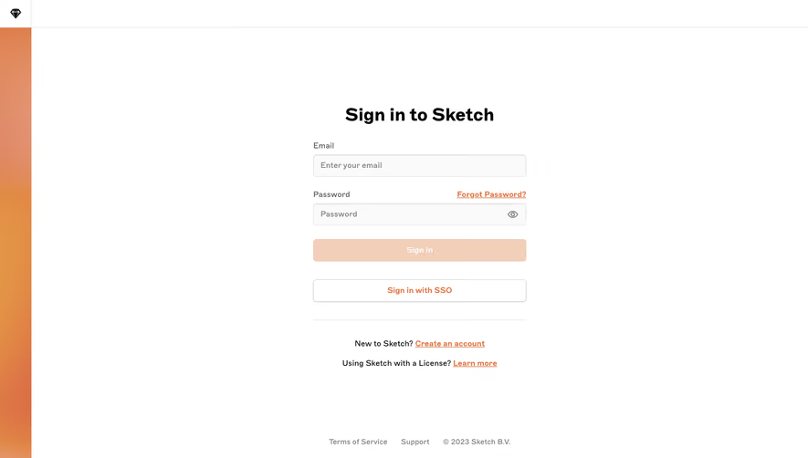
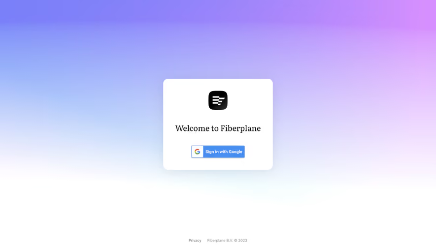
Generate a new design based on this screen using your own content.
Thank you! Your submission has been received!
Oops! Something went wrong while submitting the form.
# Design from Reference: Prelude Login
Create an original, high-fidelity visual design inspired by the reference. Prioritize composition, typography, colors, spacing, and component styling over technical implementation.
## Reference
- **Product:** Prelude
- **Category:** Login
- **Screenshot:** https://cdn.prod.website-files.com/5e9dc792e1210c5325f7ebbc/697b76226613e39a5453df1c_BJrrTAb5y5IkD1-_8I4UwhWI-JSR0dG2LGX7ysd5MWI.avif
Analyze the screenshot first. If inaccessible, request it rather than guessing.
## Content
{{content.instructions}}
{{content.data}}
Preserve essential messaging and factual accuracy. Adapt structure and copy length for visual balance; never invent product claims.
## Visual Design
Use this context to reproduce the reference's visual language: layout, typography, colors, spacing, borders, radii, and distinctive elements. The screenshot takes priority if descriptions conflict.
## Direction
{{preferences.fidelityInstructions}}
## Output
{{output.instructions}}
Deliver a polished, cohesive design with precise alignment, hierarchy, and spacing. Produce the requested visual artifact, not just a description. If unsupported, explain the limitation.
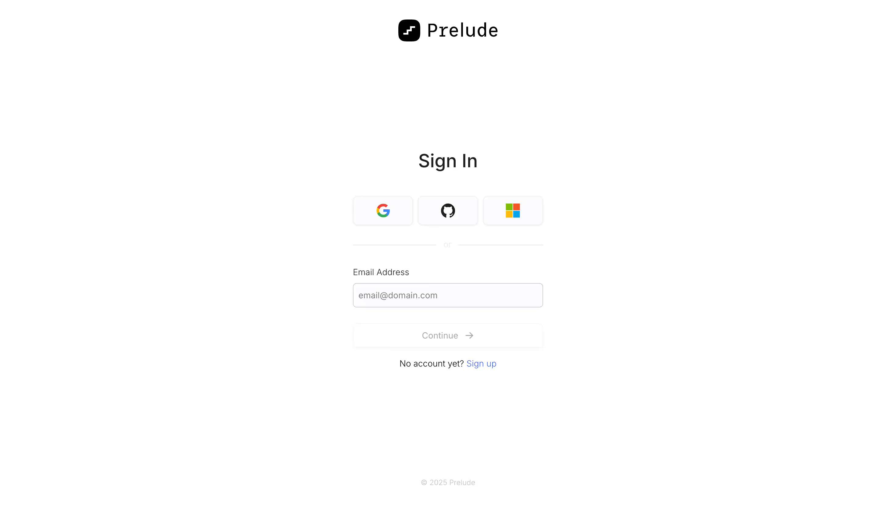
Prelude's sign-in page is almost aggressively minimal and it works. The entire screen is white space with a centered card that gets straight to business. No hero images, no marketing fluff. Just the logo up top, a bold "Sign In" heading, and three OAuth buttons for Google, GitHub, and Microsoft sitting in a neat row. That trio immediately tells you this is a dev-focused product.
Typography That Does the Heavy Lifting
The sans-serif type is crisp and well-spaced. "Sign In" is large enough to anchor the page without screaming. The "or" divider between social auth and the email field is subtle, almost whispered. Smart hierarchy throughout.
What Makes It Stand Out
The "Continue" button is intentionally muted with a light gray fill and a small arrow icon. It doesn't activate visually until you've entered something. That's a deliberate choice that reduces cognitive noise. The "Sign up" link in blue at the bottom is the only real color on the page, which pulls your eye exactly where it needs to go for secondary actions. Restrained and purposeful.