
Thank you! Your submission has been received!
Oops! Something went wrong while submitting the form.
Get SaaSFrame Pro
Monthly
$18
Quarterly
$48
Yearly
$180
Upgrade to access this feature
Browse all screens & flows
Filter and search screens & flows
Access Figma files
Access mobile versions
Bookmark screens & flows
Join now
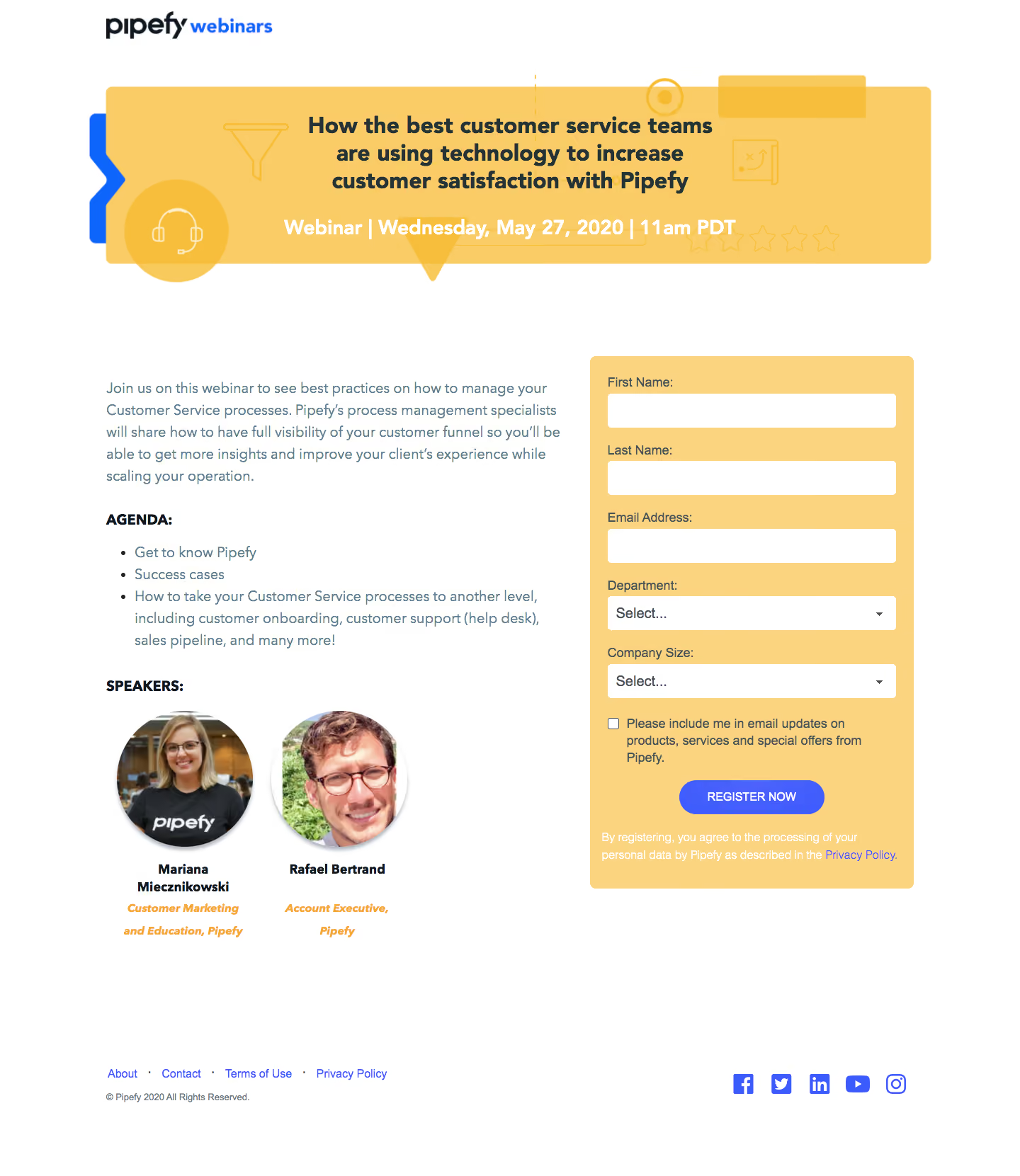
Pipefy Webinars

Pipefy
Workflow Management
Designed by
No items found.

Bookmark
Bookmark

Design with AI
Thank you! Your submission has been received!
Oops! Something went wrong while submitting the form.
# Design from Reference: Pipefy Webinars
Create an original, high-fidelity visual design inspired by the reference. Prioritize composition, typography, colors, spacing, and component styling over technical implementation.
## Reference
- **Product:** Pipefy
- **Category:** Webinars Page
- **Screenshot:** https://cdn.prod.website-files.com/5e9dc792e1210c5325f7ebbc/6acbc9491790037d3e0592d7_6acbc66009854ea4af81133c_cms-1b5f52848515acac05fad077.webp
Analyze the screenshot first. If inaccessible, request it rather than guessing.
## Content
{{content.instructions}}
{{content.data}}
Preserve essential messaging and factual accuracy. Adapt structure and copy length for visual balance; never invent product claims.
## Visual Design
### Overall aesthetic
- **Character:** Bright webinar registration page with a warm yellow illustrated banner, white reading surface and blue-violet form action.
- **Evidence and scale:** Screenshot measures 1440 × 1661 image pixels. Sizes estimate 1× CSS capture; actual DPR and font identity remain unverified.
### Page composition
- **Brand/banner:** Small webinar brand at upper-left precedes a wide yellow event banner with centered multi-line title and date/time.
- **Main split:** Left column around 640px contains event introduction, agenda and two speaker portraits; right column around 455px contains a yellow registration panel.
- **Form sequence:** First/last name, email, department select, company-size select, unchecked updates preference, register action and privacy sentence.
- **Footer:** Small legal/navigation links and copyright align left, with blue social icons at right.
### Information hierarchy
- **Event identity:** Large dark banner title and white date line provide the strongest top-level information.
- **Registration:** Contrasting yellow panel isolates the task from explanatory text.
- **Agenda/speakers:** Bold uppercase subheadings separate list and speaker proof; circular portraits lead to bold names and orange italic roles.
- **Consent:** Updates checkbox and privacy sentence remain smaller, distinct from the primary registration action.
### Typography
- **Banner title:** Approximately 32px CSS bold sans-serif with 38px leading; event line around 28px bold.
- **Body:** Around 20px with 30px leading in muted blue-gray.
- **Form:** Labels around 18px, input/select text similar scale; action label around 16px uppercase.
- **Speaker/footer:** Names around 18px bold, roles around 16px bold italic; footer links around 16px. Exact family remains unverified.
### Colors & surfaces
- **Measured foundation:** White #FFFFFF dominates the page.
- **Measured warm surfaces:** Yellow #F9CC66 and #FAD47E form banner/form areas; #F7BE3B appears in decorative accents.
- **Measured text:** Dark #263238 supports titles; muted #607D8B supports body copy.
- **Action color:** Strong blue/violet buttons and links contrast with yellow. Banner decorations use translucent yellow line icons and a blue edge accent.
### Components
- **Banner:** Approximately 1165 × 250px CSS, rounded corners near 8px, layered geometric shapes and line-art headset/filter/chart/star motifs.
- **Registration panel:** Approximately 455 × 750px, yellow fill, 8px radius and about 24px padding.
- **Fields:** White inputs/selects around 406 × 48px, small radii near 5px, labels above and chevrons at right for selects.
- **Preference/action:** Small unchecked square beside wrapped updates text; centered blue-violet pill around 205 × 48px.
- **Speakers:** Two circular portraits around 190px diameter with soft shadows, centered name and role blocks beneath.
- **Footer:** Minimal inline links and social symbols, without a large colored footer shell.
### Visual rhythm
- **Container:** Main content spans roughly 1160px centered, with side gutters near 150px.
- **Vertical spacing:** Large gap separates banner from content; agenda/speaker groups use roughly 32–40px breaks.
- **Form cadence:** Repeated label/field pairs use consistent 24px spacing, followed by preference and action.
- **Alignment:** Left copy and right form share the same top region; footer aligns to the content frame.
### Responsive
- **Observed limit:** Desktop only; dropdown choices, validation, registration and mobile behavior are unobserved.
- **Recommended stacking:** Place event summary and form in a clear single-column order; scale banner text and simplify ornament.
- **Recommended controls:** Keep fields full-width, checkbox copy readable and action comfortably tappable.
- **Recommended speakers/footer:** Allow portraits to stack and footer links/social icons to wrap naturally.
### Adaptation guidance
- **Preserve the pattern:** Event identity first, concise agenda and speaker proof beside a clearly separated registration form.
- **Use warm contrast:** Yellow surfaces and a single strong blue action provide a coherent event-specific palette.
- **Implementation:** Provide real form labels, accessible consent controls, validation and focus. Event dates, agenda and speaker affiliations are historical captured content requiring separate verification.
Use this context to reproduce the reference's visual language: layout, typography, colors, spacing, borders, radii, and distinctive elements. The screenshot takes priority if descriptions conflict.
## Direction
{{preferences.fidelityInstructions}}
## Output
{{output.instructions}}
Deliver a polished, cohesive design with precise alignment, hierarchy, and spacing. Produce the requested visual artifact, not just a description. If unsupported, explain the limitation.


Category
Patterns
No items found.
Tech Stack


Added on
February 4, 2023
Similar screens
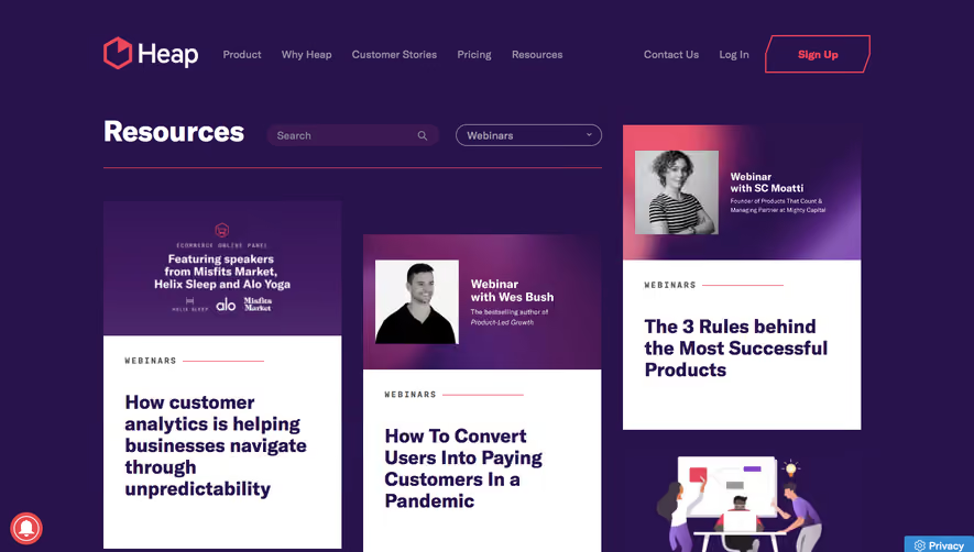

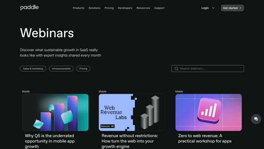


Upgrade to SaaSFrame Pro now to see similar examples.
Monthly
$18 /month
Billed $18 monthly
Browse all screens & flows
Filter and search screens & flows
Search text in screenshots
Access Figma files
Access mobile versions
Join now
Quarterly
$16 /month
Billed $48 quarterly
Browse all screens & flows
Filter and search screens & flows
Search text in screenshots
Access Figma files
Access mobile versions
Join now
Yearly
$15 /month
Billed $180 yearly
Browse all screens & flows
Filter and search screens & flows
Search text in screenshots
Access Figma files
Access mobile versions
Join now