Overall Style and Aesthetic
Payhawk’s Contact Us page embodies a contemporary, business-forward sophistication. The minimalist design sensibility emphasizes function without sacrificing elegance—ample white space, subtle gradients, and crisp edges create an approachable yet highly professional ambiance. This streamlined style supports credibility while staying visually engaging. Layout and Structure
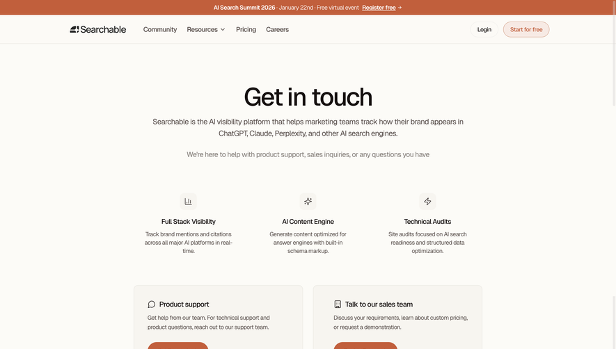
The page opens with a focused hero area featuring a concise headline, inviting visitors to connect. The main content is cleanly partitioned: a clear, approachable form occupies center stage, flanked by quick-access cards for global office locations. Additional navigation stays discreet, allowing the central action to shine. The footer is subdued and functional, maintaining brand cohesion. Visual Elements
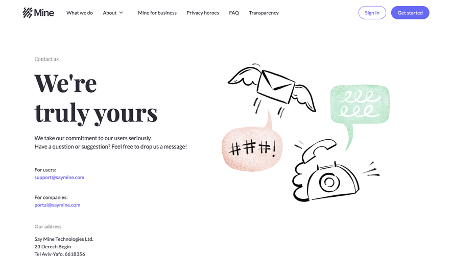
Custom vector illustrations—showcasing friendly faces and collaborative work scenes—inject personality and warmth, alleviating any sense of corporate coldness. Iconography is simple, intuitive, and sized for clarity, guiding users effortlessly. Visual cues, such as hover effects and soft highlight animations, reinforce interactivity throughout. Color Palette and Typography
Brand greens dominate, complemented by a supporting suite of cool grays and deep blues. Pops of gold serve as call-to-action accents. Modern sans-serif typefaces anchor the content, aiding scanability and hierarchy with bold headings, clear subheadings, and light body text to ensure effortless reading flow. User Experience Patterns
Navigation is frictionless with sticky menus and a single, visually prioritized form. CTAs are generously sized and unmistakable. The contact form is streamlined, minimizing fields and including intelligent field validation, aiming for swift, frustration-free completion. Unique or Notable Design Choices
A standout feature is the visually engaging office finder—users can instantly identify HQs worldwide at a glance. Warm, human-centric illustration elevates this beyond the standard utilitarian contact page, leaving visitors with a personable, trustworthy impression. The entire tone remains calm, supportive, and thoroughly user-centric: perfect inspiration for SaaS teams seeking to balance utility with brand personality.