
Thank you! Your submission has been received!
Oops! Something went wrong while submitting the form.
Get SaaSFrame Pro
Monthly
$18
Quarterly
$48
Yearly
$180
Upgrade to access this feature
Browse all screens & flows
Filter and search screens & flows
Access Figma files
Access mobile versions
Bookmark screens & flows
Join now
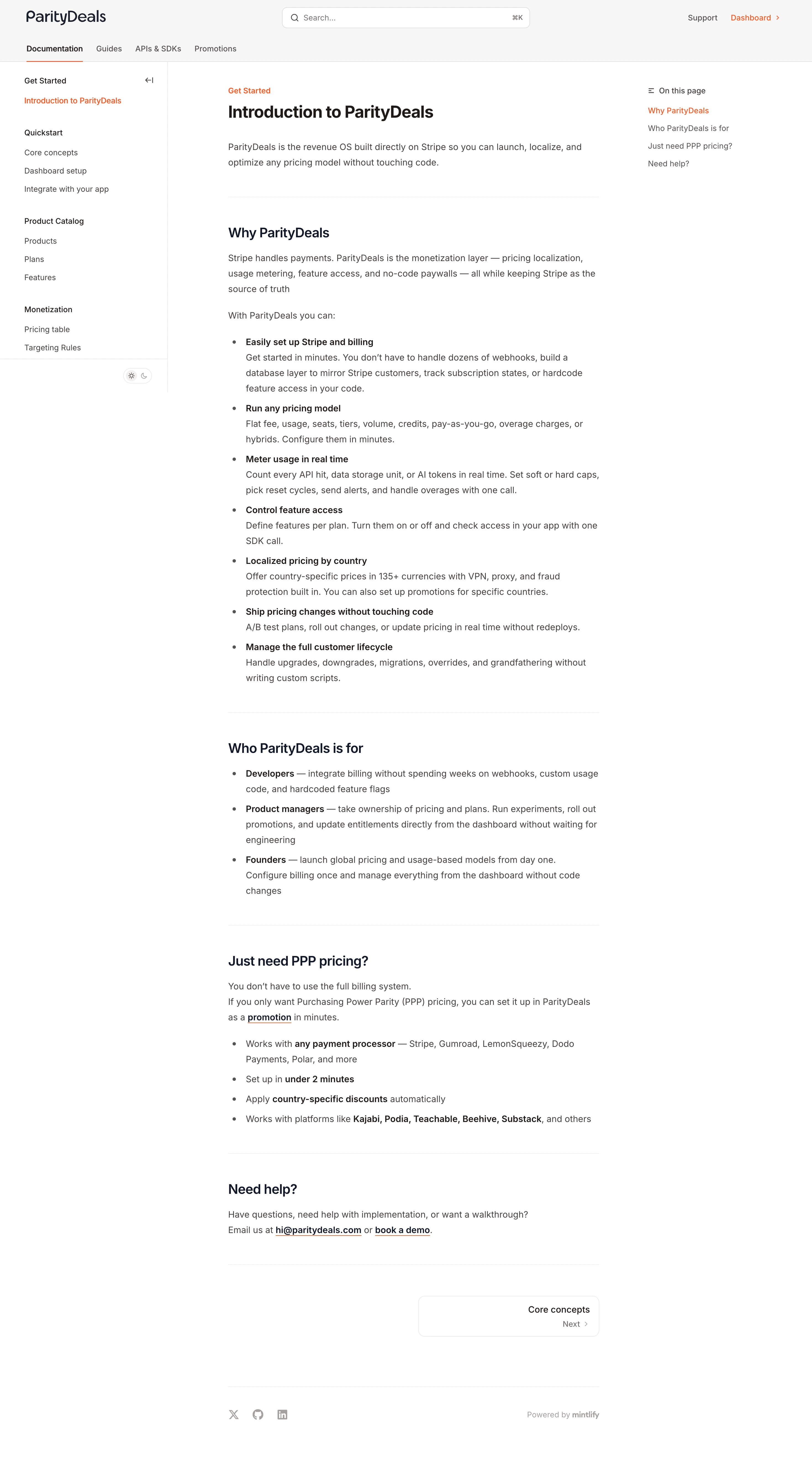

ParityDeals Documentation

ParityDeals
Pricing command center
Designed by
No items found.

Bookmark
Bookmark

Design with AI
Thank you! Your submission has been received!
Oops! Something went wrong while submitting the form.
# Design from Reference: ParityDeals Documentation
Create an original, high-fidelity visual design inspired by the reference. Prioritize composition, typography, colors, spacing, and component styling over technical implementation.
## Reference
- **Product:** ParityDeals
- **Category:** Documentation
- **Screenshot:** https://cdn.prod.website-files.com/5e9dc792e1210c5325f7ebbc/6acad3a0c2028efdec71af26_6acad14811963fdadfb4c70b_cms-1b7e7cbbe9316eec16e4d439.webp
Analyze the screenshot first. If inaccessible, request it rather than guessing.
## Content
{{content.instructions}}
{{content.data}}
Preserve essential messaging and factual accuracy. Adapt structure and copy length for visual balance; never invent product claims.
## Visual Design
### Overall aesthetic
- **Character:** A conventional light documentation interface with three-column navigation, warm dark text and a small orange accent.
- **Evidence scale:** Original 2940 × 5364 pixels, inspected through both readable crops. CSS estimates assume an unverified approximately 2× capture scale.
### Page composition
- **Header:** Brand at left, centered search field with keyboard hint and support/dashboard utilities at right.
- **Tabs:** Documentation, Guides, APIs & SDKs and Promotions form a second header row; Documentation has an orange underline.
- **Left navigation:** Approximately 300 px sidebar with grouped introductory, quickstart, catalog and monetization links, plus a small theme toggle.
- **Article:** Roughly 670 px central column contains breadcrumb, introduction, feature bullets, audience bullets, pricing-focused section and help section.
- **Right rail:** Small On this page heading and four anchor links align near the article top.
- **Bottom:** A right-aligned next-page card precedes social icons and a muted documentation-platform attribution.
### Information hierarchy
- **Article title:** Bold introductory heading leads, with a short regular paragraph underneath.
- **Sections:** Medium-large dark headings and pale horizontal rules separate major topics.
- **Bullets:** Bold lead phrases introduce explanatory text, allowing rapid scanning of the longer feature list.
- **Active states:** Orange identifies selected document and current table-of-contents item.
- **Navigation onward:** The outlined next-page card is the principal concluding control.
### Typography
- **Title:** Unverified sans-serif, approximately 30 px bold, 38 px line height.
- **Section headings:** Around 24 px semibold with 32 px line height.
- **Body:** Approximately 16 px regular with 28 px line height; bold inline phrases use 600–700 weight.
- **Navigation:** Around 14 px regular/medium, with darker group labels.
- **Utilities:** Approximately 13–14 px; code-style keyboard hint is compact and right-aligned in search.
### Colors & surfaces
- **Base:** White #FFFFFF article and rails; very light #F7F7F7 header family.
- **Text:** Measured warm dark #46413F body and #1E1917 headings, with deep #111827 section-heading family.
- **Subtle surfaces:** #F5F0EF and #EDEAE9 appear in warm control/structural details.
- **Accent:** Orange-red links and selection underlines supply almost all interface color.
- **Rules:** Very pale warm-gray horizontal and vertical dividers preserve low visual weight.
### Components
- **Search:** Approximately 448 × 38 px white rounded rectangle, thin border, leading magnifier and trailing shortcut.
- **Sidebar:** Grouped text links, roughly 34 px pitch, fine right divider and collapse icon near the first group.
- **Table of contents:** Compact text-only anchor list with a small list icon and orange active link.
- **Article lists:** Conventional bullets with a narrow marker column and indented wrapped explanations.
- **Inline links:** Dark bold links with thin orange underlines.
- **Next card:** Approximately 328 × 74 px outlined rounded rectangle, right-aligned page name and smaller Next/chevron row.
- **Footer:** Three small gray social icons left and muted platform credit right, separated from article by a rule.
### Visual rhythm
- **Reading measure:** Central prose keeps a stable narrow width despite broad desktop space.
- **Section gaps:** Approximately 48–56 px around major separators; paragraphs use about 20 px spacing.
- **List cadence:** Bold lead and explanatory text remain close, while list items have modest vertical separation.
- **Rail balance:** Sidebars anchor navigation without competing with the main reading column.
### Responsive
- **Observed limit:** Desktop documentation only; collapsed navigation is unverified.
- **Recommendation:** Collapse left navigation and convert the right table of contents into a compact article control on narrow screens.
- **Reading handling:** Retain readable body size, natural list wrapping and a full-width next-page card.
### Adaptation guidance
- **Retain:** Use strong article hierarchy, bold bullet leads and persistent contextual navigation.
- **Implement:** Keep surfaces neutral, separators light and active navigation marked by one accent.
- **Verify:** Confirm fonts, scale and anchor/search behavior separately; product claims in the article are captured content, not independently verified current functionality.
Use this context to reproduce the reference's visual language: layout, typography, colors, spacing, borders, radii, and distinctive elements. The screenshot takes priority if descriptions conflict.
## Direction
{{preferences.fidelityInstructions}}
## Output
{{output.instructions}}
Deliver a polished, cohesive design with precise alignment, hierarchy, and spacing. Produce the requested visual artifact, not just a description. If unsupported, explain the limitation.


Category
Patterns
No items found.
Tech Stack

Added on
January 13, 2026
Similar screens
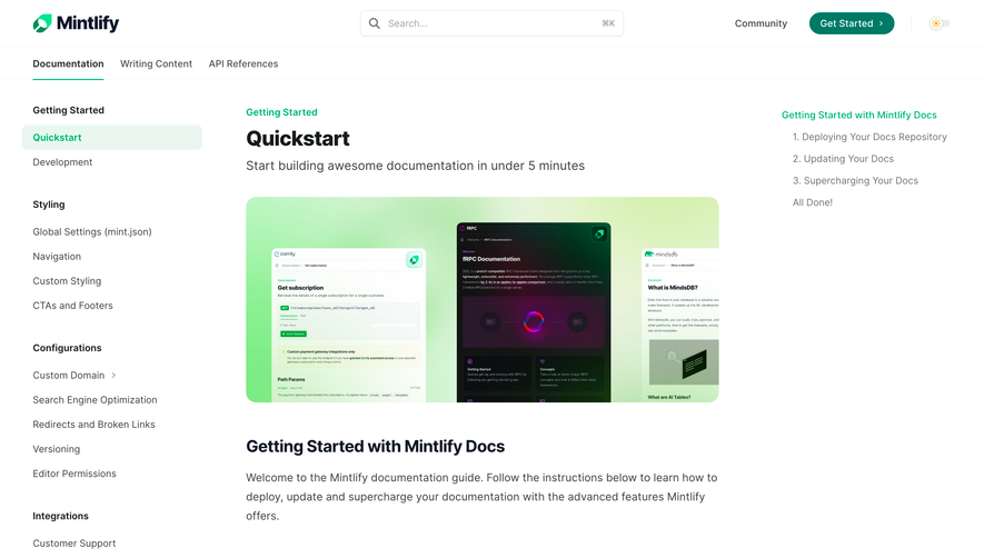


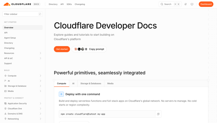

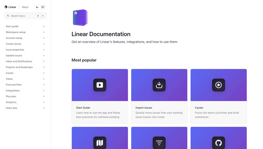

Upgrade to SaaSFrame Pro now to see similar examples.
Monthly
$18 /month
Billed $18 monthly
Browse all screens & flows
Filter and search screens & flows
Search text in screenshots
Access Figma files
Access mobile versions
Join now
Quarterly
$16 /month
Billed $48 quarterly
Browse all screens & flows
Filter and search screens & flows
Search text in screenshots
Access Figma files
Access mobile versions
Join now
Yearly
$15 /month
Billed $180 yearly
Browse all screens & flows
Filter and search screens & flows
Search text in screenshots
Access Figma files
Access mobile versions
Join now