Design with AI
Generate a new design based on this screen using your own content.
# Design from Reference: Paddle Press Page
Create an original, high-fidelity visual design inspired by the reference. Prioritize composition, typography, colors, spacing, and component styling over technical implementation.
## Reference
- **Product:** Paddle
- **Category:** Press Page
- **Screenshot:** https://cdn.prod.website-files.com/5e9dc792e1210c5325f7ebbc/6acad3b3c2028efdec71b132_6acad1675af75170c4bc18c8_cms-88c981ec8246747aa5a7ee30.webp
Analyze the screenshot first. If inaccessible, request it rather than guessing.
## Content
{{content.instructions}}
{{content.data}}
Preserve essential messaging and factual accuracy. Adapt structure and copy length for visual balance; never invent product claims.
## Visual Design
### Overall aesthetic
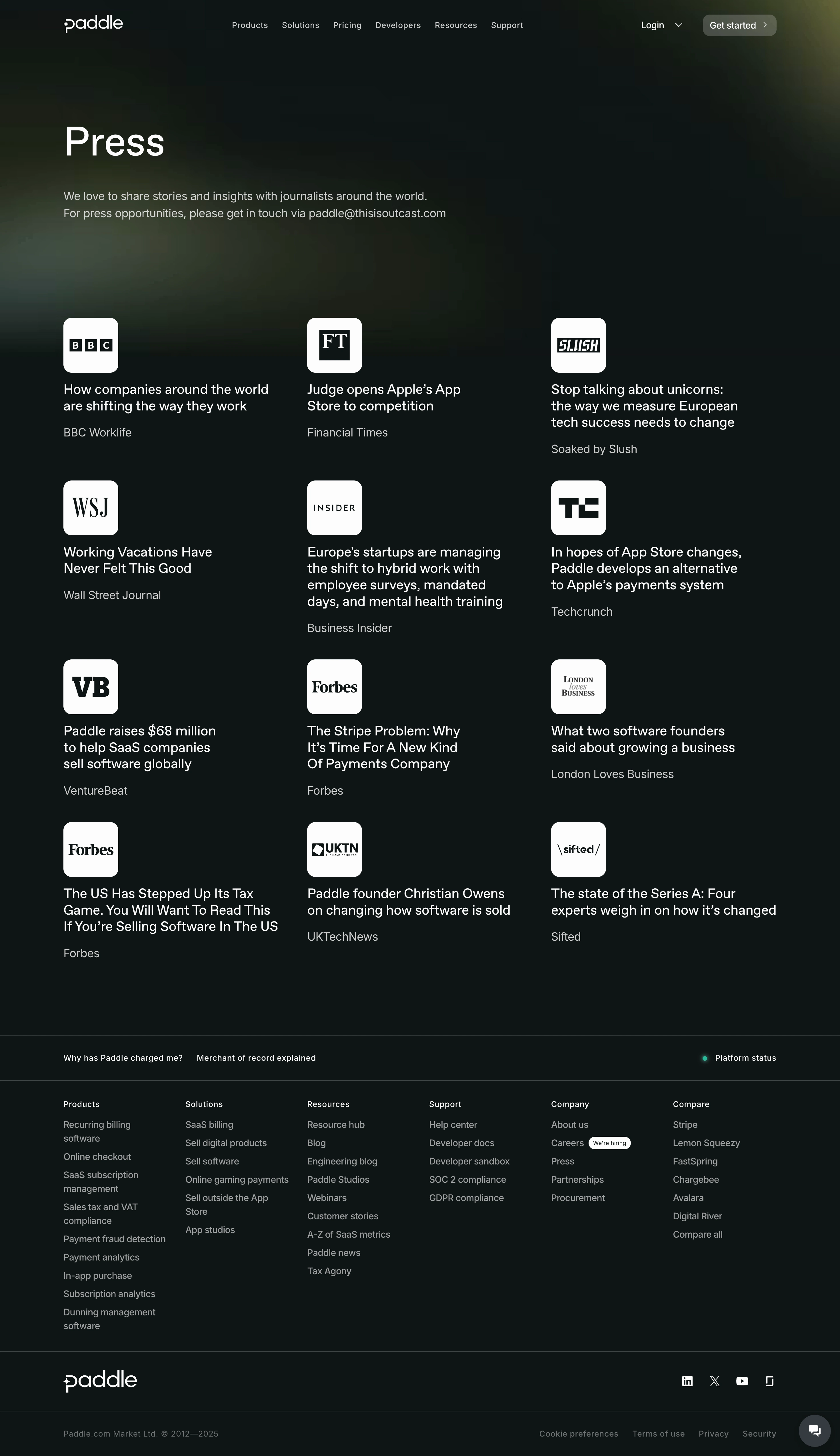
- **Character:** Dark, minimal press index with soft atmospheric glows, monochrome publication badges and straightforward typography.
### Page composition
- **Canvas:** 2940 × 5094 screenshot pixels; CSS estimates assume approximately 2× capture scale.
- **Structure:** Centered navigation, left-aligned Press heading/contact introduction, twelve articles in a three-column four-row grid, then a layered footer.
- **Width:** Main content is approximately 1250px CSS wide with broad side margins; grid columns have substantial open gutters.
### Information hierarchy
- **Priority:** Large page title introduces the archive. Each article pairs publication badge, headline and muted outlet name.
- **Closure:** A slim utility/status strip precedes six footer link columns, followed by brand/social and legal rows.
### Typography
- **Family:** Plain modern sans-serif; exact font is unverified.
- **Scale:** Estimated CSS title 64–72px, article headings 23–25px, introductory/outlet text 19–20px and navigation/footer 14–16px. Most article text is regular weight.
### Colors & surfaces
- **Sampled palette:** Near-black green #0E1414; subtle background variants #0E1515 and #0F1616; off-white badge fill #FCFCFC.
- **Atmosphere:** Muted olive and gray-green blurred glows sit behind the header and introduction. White headlines contrast with softer gray descriptions.
### Components
- **Article tiles:** Unboxed content with a roughly 96px CSS square white publication badge, approximately 14px rounded corners, then multiline headline and outlet label.
- **Navigation:** Small muted rounded Get started action and login dropdown; footer uses thin horizontal rules.
- **Utility:** Tiny glowing green status dot and a circular lower-right chat button.
### Visual rhythm
- **Spacing:** A large gap separates introduction from the archive. Tiles have roughly 20px badge-to-heading spacing and 60–80px row gaps.
- **Alignment:** Every column retains a consistent badge/text left edge, while headline lengths vary naturally.
### Responsive
- **Guidance:** Mobile is not shown. Reduce the archive to one column, maintain badge dimensions and turn dense footer groups into compact stacked sections.
### Adaptation guidance
- **Transfer:** Preserve the dark open grid and recognizable press-badge pattern. Supply authorized outlet marks, original article titles and appropriate media contact information.
Use this context to reproduce the reference's visual language: layout, typography, colors, spacing, borders, radii, and distinctive elements. The screenshot takes priority if descriptions conflict.
## Direction
{{preferences.fidelityInstructions}}
## Output
{{output.instructions}}
Deliver a polished, cohesive design with precise alignment, hierarchy, and spacing. Produce the requested visual artifact, not just a description. If unsupported, explain the limitation.