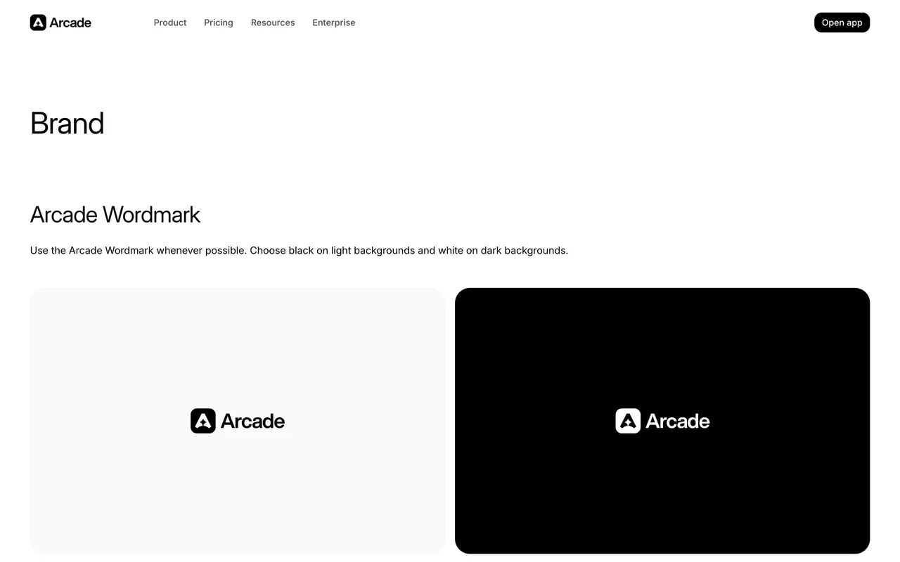
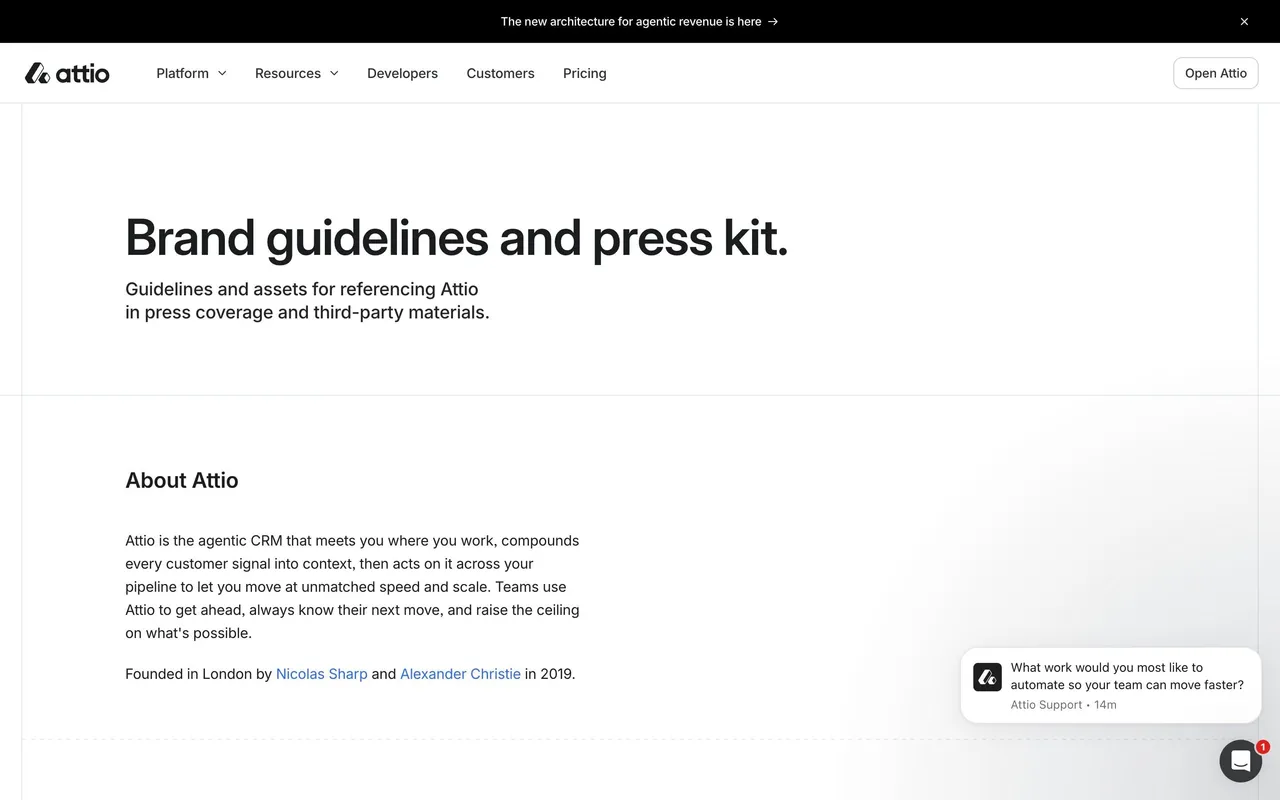
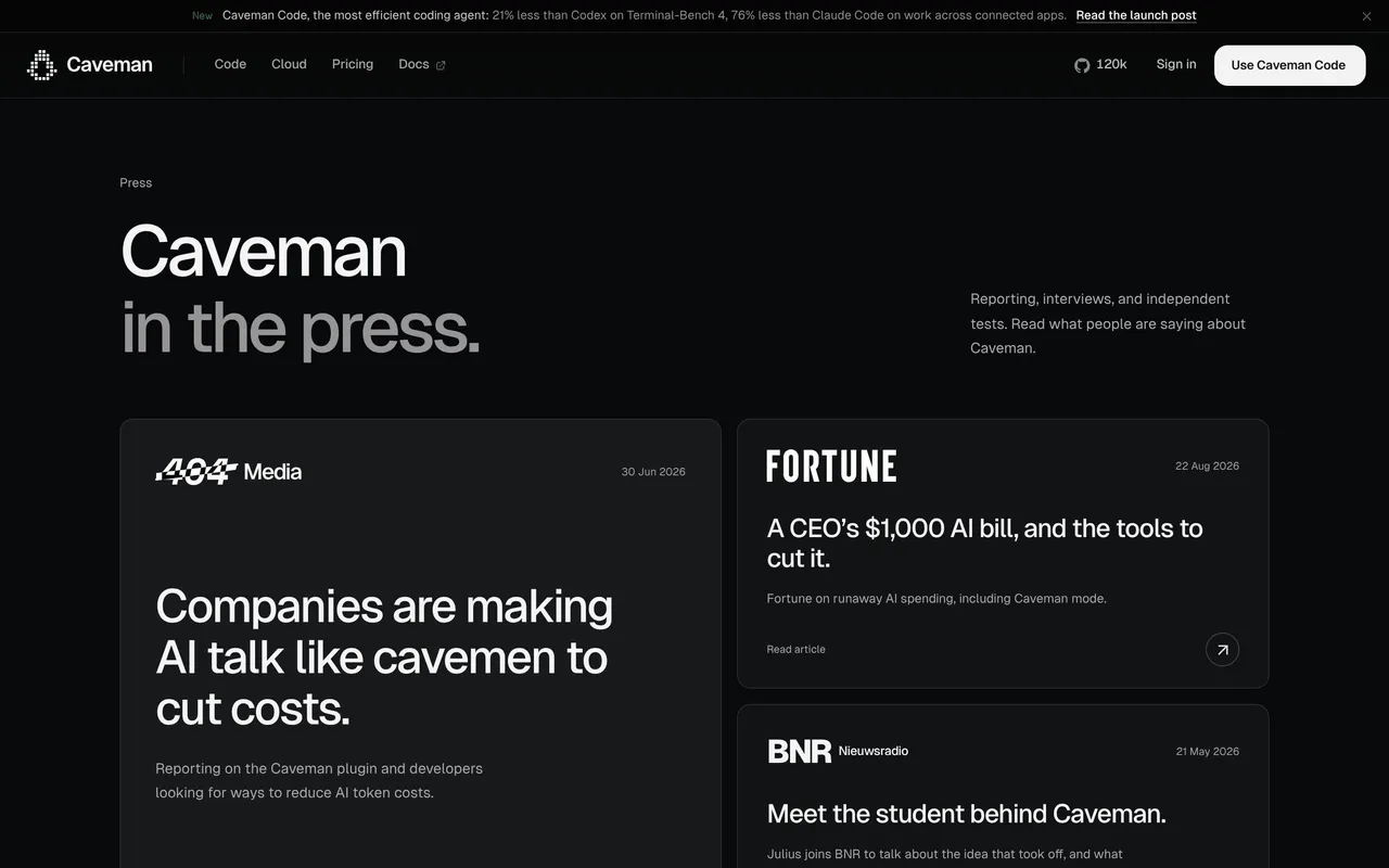
Winden’s Press Kit page radiates a crisp, contemporary minimalism, balancing professional credibility with subtle playfulness. Negative space dominates, allowing every element breathing room and the brand’s calming turquoise-accented palette to shine. The interface feels weightless and clean, effortlessly conveying trust and polish without a whiff of clutter.
Layout and Structure
The page greets visitors with a centered header and succinct explanation—no superfluous hero image, just strategic clarity. Press assets are neatly grouped into logically separated cards: logos, product images, founder headshots, and brand guidelines. A “Download” CTA anchors every asset section, supported by understated labels and concise titles. The footer is modest, echoing the site’s minimalist ethos.
Visual Elements
Elegant SVGs and high-resolution product photos sit against gentle off-white backdrops, amplifying a sense of openness. Each visual element—whether icon or image—aligns perfectly with the grid, reinforcing the organized and intentional aesthetic. Hover states are subtle, providing tactile feedback without overwhelming interactivity.
Color Palette and Typography
A limited palette—soft whites, sleek greys, signature teal, and black—creates a harmonious mood. Typography is modern and light, likely leveraging a geometric sans-serif that ensures readability and sophistication. Headings and CTAs use increased weight for hierarchy without resorting to aggressive contrasts.
User Experience Patterns
Navigation is frictionless: simple back-navigation at the top and intuitive download buttons for each group. There are no forms or distractions; the user flow is singular and purposeful—find, preview, and download assets. Microinteractions smooth the journey, creating a seamless experience.
Unique or Notable Design Choices
The omission of stock photos and testimonial fluff feels refreshing—putting powerful, brand-forward assets at center stage. Each asset preview is meticulously rendered, sized for clarity and quick scanning. The overall tone instills both confidence and approachability, ideal for stakeholders seeking press materials or designers seeking UX inspiration.
 SaaSFrame