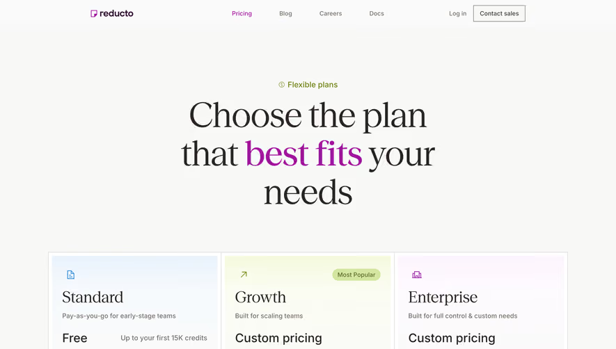
Generate a new design based on this screen using your own content.
Thank you! Your submission has been received!
Oops! Something went wrong while submitting the form.
# Design from Reference: Mixpanel Pricing Page
Create an original, high-fidelity visual design inspired by the reference. Prioritize composition, typography, colors, spacing, and component styling over technical implementation.
## Reference
- **Product:** Mixpanel
- **Category:** Pricing Page
- **Screenshot:** https://cdn.prod.website-files.com/5e9dc792e1210c5325f7ebbc/62eca44608e2d8748a29f399_1659675074264-62ec9ca8bf75bb5e25ce6ef2_screenshot-device-85177a965a27e754fd5842c981179f14-1659618386834.webp
Analyze the screenshot first. If inaccessible, request it rather than guessing.
## Content
{{content.instructions}}
{{content.data}}
Preserve essential messaging and factual accuracy. Adapt structure and copy length for visual balance; never invent product claims.
## Visual Design
Use this context to reproduce the reference's visual language: layout, typography, colors, spacing, borders, radii, and distinctive elements. The screenshot takes priority if descriptions conflict.
## Direction
{{preferences.fidelityInstructions}}
## Output
{{output.instructions}}
Deliver a polished, cohesive design with precise alignment, hierarchy, and spacing. Produce the requested visual artifact, not just a description. If unsupported, explain the limitation.
Mixpanel's pricing page nails the hierarchy game. Three tiers up top with a dark hero section that makes those plan cards pop. The "Free" plan gets a subtle outline while "Growth" gets the purple CTA treatment. Smart move. You immediately know where they want you to click.
Feature Comparison Done Right
The long feature table below is broken into logical sections like Analytics, Data Governance, Security and Privacy. It's not exciting, but it works. Checkmarks and "Limited" labels scan fast. The sticky plan headers would help if you're scrolling deep. Typography is tight and readable throughout, nothing fancy but zero friction.
The Details That Matter
That purple startup banner mid-page breaks up the monotony perfectly. The FAQ section at the bottom uses a bold serif for "answered." which adds personality to an otherwise utilitarian page. The add-on features section with Data Pipelines and Group Analytics cards gives upsell room without feeling pushy. Overall it's a masterclass in structured information design over decoration.