Overall Style and Aesthetic
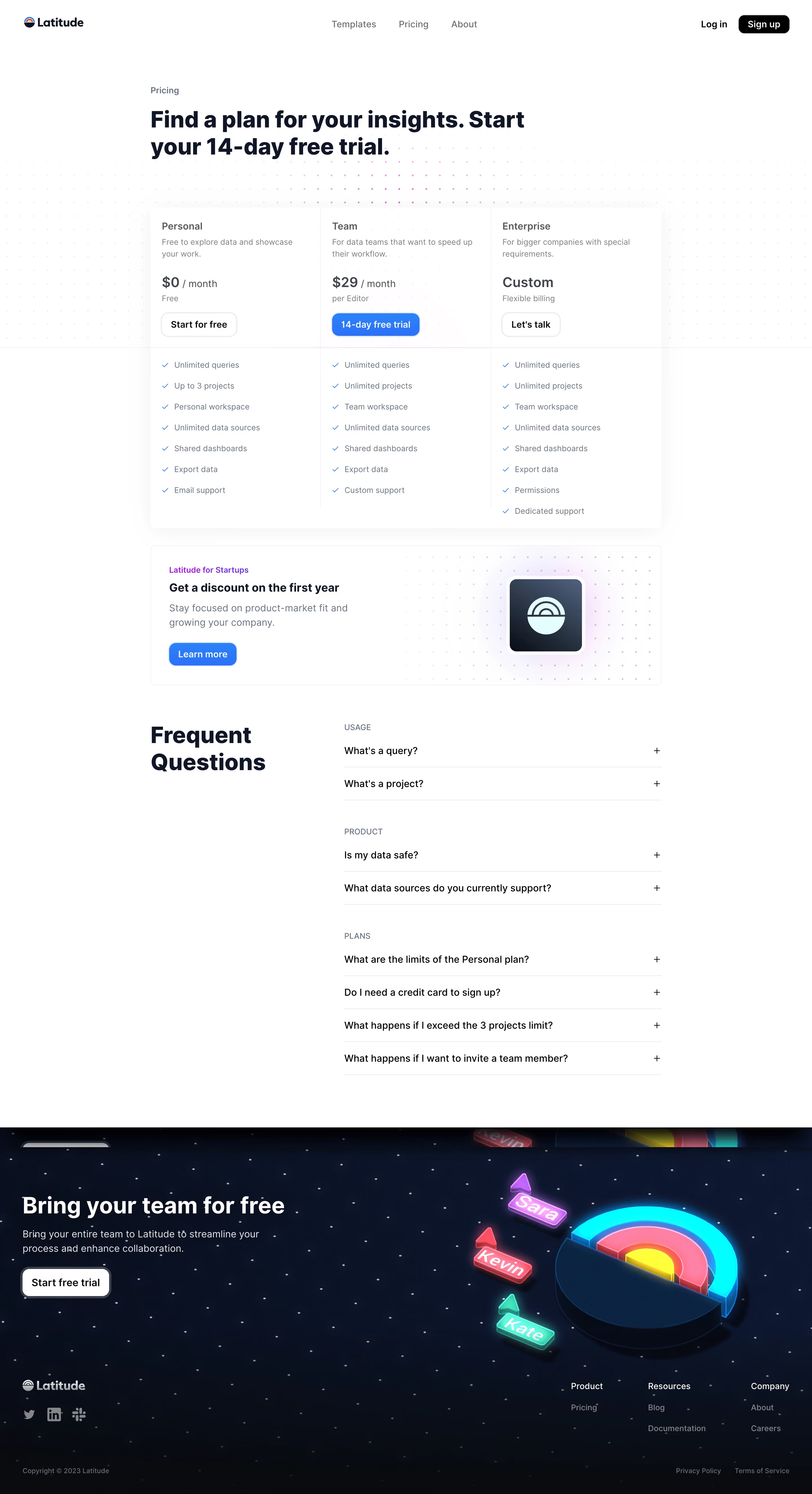
Latitude’s pricing page embodies a clean, modern minimalism infused with subtle playfulness. The ample white space allows the crisp, geometric shapes and soft gradients to breathe, creating an inviting seriousness perfect for SaaS. Guided by a trustworthy, innovative tone, the interface feels approachable yet professional. Layout and Structure
The page opens with a compact hero section—a sharp headline and a gentle subheading emphasize clarity from the start. Immediately below, a streamlined pricing table takes center stage, with three clear columns that make comparison effortless. Each plan card is neatly delineated and uses concise icons to amplify differentiators. The layout omits extraneous sections, focusing strictly on what matters for conversion, ending with a tidy footer that discreetly offers links and legal info. Visual Elements
Custom illustrations—rounded, friendly, and lightly animated—sprinkle personality across the page. The icons are line-based and unified in style, aiding navigation without visual clutter. Animated toggles (e.g., “Monthly/Yearly” switch) create a dynamic, interactive feel, while subtle hover states add tactile feedback to buttons and cards. Color Palette and Typography
A soothing palette of gentle blues, whites, and muted gradients supports the organized aesthetic, while accent colors provide subtle contrast for CTAs. Typography is intentionally hierarchical: bold, sans-serif headlines catch the eye, while supporting text is light and legible, ensuring smooth scanning. User Experience Patterns and Notable Design Choices
Navigation remains sticky yet unobtrusive, and CTAs like “Get started” are prominent but never intrusive. The simple, inline signup form streamlines the user journey. Notably, plan recommendations (“Popular!” badge) and inline microcopy help users choose confidently—small touches that boost usability and trust.