
Thank you! Your submission has been received!
Oops! Something went wrong while submitting the form.
Get SaaSFrame Pro
Monthly
$18
Quarterly
$48
Yearly
$180
Upgrade to access this feature
Browse all screens & flows
Filter and search screens & flows
Access Figma files
Access mobile versions
Bookmark screens & flows
Join now


Maze About Page

Maze
Design that works
Designed by
No items found.

Bookmark
Bookmark

Design with AI
Thank you! Your submission has been received!
Oops! Something went wrong while submitting the form.
# Design from Reference: Maze About Page
Create an original, high-fidelity visual design inspired by the reference. Prioritize composition, typography, colors, spacing, and component styling over technical implementation.
## Reference
- **Product:** Maze
- **Category:** About Page
- **Screenshot:** https://cdn.prod.website-files.com/5e9dc792e1210c5325f7ebbc/62eca438eb86d30e968475a1_1659674783215-62ec9c9aa4f21f5577a27546_screenshot-device-aa518fbdc3b5cec1f7747a7c3db157a3-1659616538567.webp
Analyze the screenshot first. If inaccessible, request it rather than guessing.
## Content
{{content.instructions}}
{{content.data}}
Preserve essential messaging and factual accuracy. Adapt structure and copy length for visual balance; never invent product claims.
## Visual Design
### Overall aesthetic
- **Character:** A people-focused company page combines oversized black headings, bright team photography and expansive white space.
- **Identity:** Curved photo masks and a pale rounded values panel provide a distinctive soft geometry; blue actions and small icons remain selective accents.
### Page composition
- **Capture:** The source is 1440 × 6256 image pixels, inspected throughout. Measurements approximate image pixels; CSS scale is unverified.
- **Opening:** A teal announcement strip and corporate navigation precede a large centered company-story heading and multiline introduction.
- **Photo framing:** A wide group photograph is flanked by cropped team images and sweeping curved white cutouts.
- **Story:** A narrow centered reading column contains several paragraphs and a bold subsection heading.
- **Values:** A large pale rounded panel pairs a left title/photo region with six icon-led values in a two-column, three-row arrangement.
- **People and investors:** A centered recruitment introduction leads into an irregular eight-image portrait mosaic. Eight investor entries follow in a four-column grid.
- **Closing:** Centered signup/plan actions precede a wide multi-column footer; a cookie-preference card overlaps the lower-left area.
### Information hierarchy
- **Human emphasis:** Large team imagery appears before detailed company narrative.
- **Values:** A broad headline introduces six named principles, each with small icon, bold title and paragraph.
- **Recruitment:** A centered heading, playful small badge, short paragraph and outlined open-roles action lead into portraits.
- **Credibility and conversion:** Investor logos/names precede the final two-button invitation.
### Typography
- **Family:** Bold modern sans serif headings pair with regular sans-serif body copy; exact family is unverified.
- **Hero:** Approximately 64 pixels, bold with compact leading; introductory copy is about 28 pixels with 34-pixel leading.
- **Sections:** Major headings are around 40 pixels; story subsection around 36 pixels.
- **Values:** Titles are approximately 24 pixels and bold; descriptions around 16–18 pixels with 24–26-pixel leading.
- **Utilities:** Navigation/buttons use approximately 16 pixels; footer links are gray and similarly sized, while cookie copy is smaller.
### Colors & surfaces
- **Measured foundation:** White #FFFFFF dominates; pale #F8FAFB supports the values panel and nearby #F5F7F9 appears in soft surfaces.
- **Measured contrast:** Black #000000 anchors headings and primary text.
- **Measured announcement:** Teal #0B8A81 supplies the top announcement band.
- **Accent relationships:** Bright blue actions/icons complement vivid blue, yellow and mint photographic backgrounds; investor marks retain their own colors.
### Components
- **Navigation actions:** A compact blue capsule signup button accompanies a simple login link.
- **Photo masks:** Large curved edges and circular cutouts frame the opening collage; the values panel includes another large curved photo crop.
- **Portrait mosaic:** Eight varied rectangles have approximately 14-pixel radii, with mixed widths/heights and consistent white gaps.
- **Values entries:** Small blue/black line icons precede bold titles; the groups remain unboxed within one pale panel.
- **Investor entries:** Small rounded pale logo tiles sit above bold names and short role descriptions.
- **Closing buttons:** Filled blue and black-outlined white capsules share similar heights and centered labels.
- **Cookie card:** A small white shadowed panel includes explanatory copy, customization text and outlined/filled choice buttons.
### Visual rhythm
- **Whitespace:** Major sections are separated by large roughly 160–220-pixel pauses.
- **Reading width:** Narrative copy stays around 620 pixels wide, while photo and values layouts span most of the viewport.
- **Grid cadence:** Values, portraits and investor entries each use consistent internal gutters despite differing layout systems.
### Responsive
- **Observed state:** Only a desktop page is provided; compact behavior is unverified.
- **Recommended flow:** Stack values and investor entries, simplify photo masks and make portraits a regular smaller grid.
- **Recommended type:** Reduce hero scale and avoid forced desktop line breaks on narrow screens.
- **Recommended overlays:** Keep cookie choices accessible without covering essential footer content.
### Adaptation guidance
- **Preserve character:** Prioritize candid team photos, curved crops and generous spacing.
- **Maintain hierarchy:** Keep story, values, people, investors and final invitation as distinct sections.
- **Content fidelity:** Treat names, roles and company claims as captured content, not independently verified current facts.
- **Accessibility:** Provide appropriate photo alternatives, descriptive recruitment links and keyboard-accessible preference controls.
Use this context to reproduce the reference's visual language: layout, typography, colors, spacing, borders, radii, and distinctive elements. The screenshot takes priority if descriptions conflict.
## Direction
{{preferences.fidelityInstructions}}
## Output
{{output.instructions}}
Deliver a polished, cohesive design with precise alignment, hierarchy, and spacing. Produce the requested visual artifact, not just a description. If unsupported, explain the limitation.


Category
Patterns
Tech Stack




Added on
May 8, 2020
Similar screens


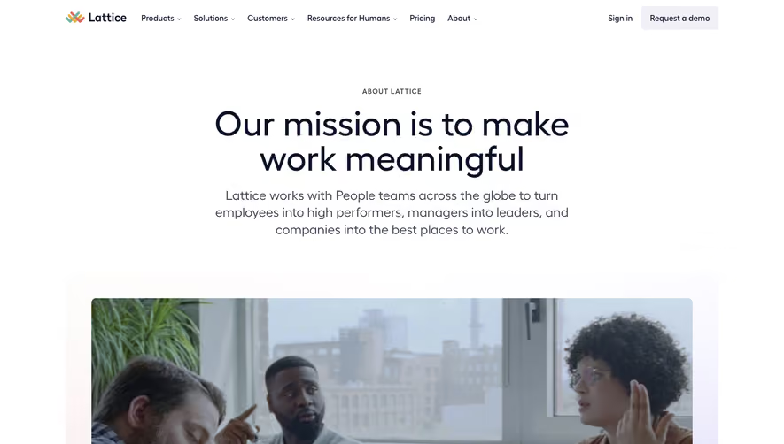

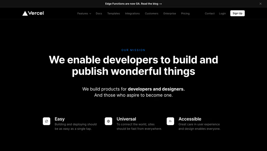

Upgrade to SaaSFrame Pro now to see similar examples.
Monthly
$18 /month
Billed $18 monthly
Browse all screens & flows
Filter and search screens & flows
Search text in screenshots
Access Figma files
Access mobile versions
Join now
Quarterly
$16 /month
Billed $48 quarterly
Browse all screens & flows
Filter and search screens & flows
Search text in screenshots
Access Figma files
Access mobile versions
Join now
Yearly
$15 /month
Billed $180 yearly
Browse all screens & flows
Filter and search screens & flows
Search text in screenshots
Access Figma files
Access mobile versions
Join now